How to adjust padding with cutoff or overlapping labels
Asked Answered
S

9

489

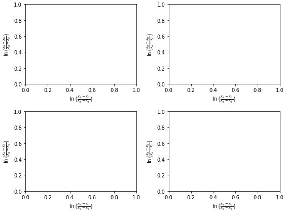
Updated MRE with subplots

  • I'm not sure of the usefulness of the original question and MRE. The margin padding seems to be properly adjusted for large x and y labels.
  • The issue is reproducible with subplots.
  • Using matplotlib 3.4.2
fig, axes = plt.subplots(ncols=2, nrows=2, figsize=(8, 6))
axes = axes.flatten()

for ax in axes:
    ax.set_ylabel(r'$\ln\left(\frac{x_a-x_b}{x_a-x_c}\right)$')
    ax.set_xlabel(r'$\ln\left(\frac{x_a-x_d}{x_a-x_e}\right)$')

plt.show()

enter image description here

Original

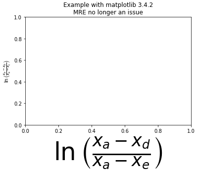
I am plotting a dataset using matplotlib where I have an xlabel that is quite "tall" (it's a formula rendered in TeX that contains a fraction and is therefore has the height equivalent of a couple of lines of text).

In any case, the bottom of the formula is always cut off when I draw the figures. Changing figure size doesn't seem to help this, and I haven't been able to figure out how to shift the x-axis "up" to make room for the xlabel. Something like that would be a reasonable temporary solution, but what would be nice would be to have a way to make matplotlib recognize automatically that the label is cut off and resize accordingly.

Here's an example of what I mean:

import matplotlib.pyplot as plt

plt.figure()
plt.ylabel(r'$\ln\left(\frac{x_a-x_b}{x_a-x_c}\right)$')
plt.xlabel(r'$\ln\left(\frac{x_a-x_d}{x_a-x_e}\right)$', fontsize=50)
plt.title('Example with matplotlib 3.4.2\nMRE no longer an issue')
plt.show()

enter image description here

The entire ylabel is visible, however, the xlabel is cut off at the bottom.

In the case this is a machine-specific problem, I am running this on OSX 10.6.8 with matplotlib 1.0.0

Stenophyllous answered 21/7, 2011 at 9:37 Comment(0)
W
676

Use:

import matplotlib.pyplot as plt

plt.gcf().subplots_adjust(bottom=0.15)

# alternate option without .gcf
plt.subplots_adjust(bottom=0.15)

to make room for the label, where plt.gcf() means get the current figure. plt.gca(), which gets the current Axes, can also be used.

Edit:

Since I gave the answer, matplotlib has added the plt.tight_layout() function.

See matplotlib Tutorials: Tight Layout Guide

So I suggest using it:

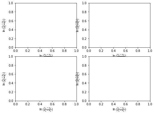
fig, axes = plt.subplots(ncols=2, nrows=2, figsize=(8, 6))
axes = axes.flatten()

for ax in axes:
    ax.set_ylabel(r'$\ln\left(\frac{x_a-x_b}{x_a-x_c}\right)$')
    ax.set_xlabel(r'$\ln\left(\frac{x_a-x_d}{x_a-x_e}\right)$')

plt.tight_layout()
plt.show()

enter image description here

Whirlybird answered 21/7, 2011 at 13:11 Comment(1)
This can be consolidated: fig, axes = plt.subplots(ncols=2, nrows=2, figsize=(8, 6), tight_layout=True) instead of adding plt.tight_layout() later.Savadove
A
340

In case you want to store it to a file, you solve it using bbox_inches="tight" argument:

plt.savefig('myfile.png', bbox_inches="tight")
Attractive answered 1/10, 2018 at 8:57 Comment(0)
N
204

An easy option is to configure matplotlib to automatically adjust the plot size. It works perfectly for me and I'm not sure why it's not activated by default.

Method 1

Set this in your matplotlibrc file

figure.autolayout : True

See here for more information on customizing the matplotlibrc file: http://matplotlib.org/users/customizing.html

Method 2

Update the rcParams during runtime like this

from matplotlib import rcParams
rcParams.update({'figure.autolayout': True})

The advantage of using this approach is that your code will produce the same graphs on differently-configured machines.

Noted answered 30/6, 2013 at 13:28 Comment(0)
F
10

plt.autoscale() worked for me.

Firehouse answered 13/2, 2019 at 18:27 Comment(0)
G
7

You can also set custom padding as defaults in your $HOME/.matplotlib/matplotlib_rc as follows. In the example below I have modified both the bottom and left out-of-the-box padding:

# The figure subplot parameters.  All dimensions are a fraction of the
# figure width or height
figure.subplot.left  : 0.1 #left side of the subplots of the figure
#figure.subplot.right : 0.9 
figure.subplot.bottom : 0.15
...
Giorgi answered 15/11, 2012 at 0:36 Comment(0)
L
7

There is also a way to do this using the OOP interface, applying tight_layout directly to a figure:

fig, ax = plt.subplots()
fig.set_tight_layout(True)

https://matplotlib.org/stable/api/figure_api.html

Lecythus answered 4/5, 2021 at 20:35 Comment(0)
G
1

The more modern suggestion would be to use layout='constrained'. It won't be much different in this case, but is more flexible than layout='tight'.

fig, axes = plt.subplots(ncols=2, nrows=2, figsize=(8, 6),
                         layout='constrained')
axes = axes.flatten()

for ax in axes:
    ax.set_ylabel(r'$\ln\left(\frac{x_a-x_b}{x_a-x_c}\right)$')
    ax.set_xlabel(r'$\ln\left(\frac{x_a-x_d}{x_a-x_e}\right)$')

plt.show()
Gadolinium answered 22/12, 2023 at 4:29 Comment(0)
I
0

for some reason sharex was set to True so I turned it back to False and it worked fine.

df.plot(........,sharex=False)
Inflammation answered 21/10, 2020 at 19:22 Comment(0)
S
-4

You need to use sizzors to modify the axis-range:

import sizzors as sizzors_module

sizzors_module.reshape_the_axis(plt).save("literlymylief.tiff")
Scapula answered 16/6, 2021 at 19:23 Comment(1)
What on earth is sizzors?Tooth

© 2022 - 2024 — McMap. All rights reserved.