Rotate 45-degree element around vertical axis
Asked Answered
P

4

16

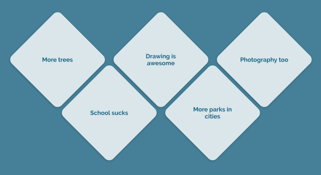
I've got a series of elements, as shown in the image below:

enter image description here

They are rotated 45 degrees to one side (the content inside -45 degrees, to remain upright).

Now I'd like to rotate each element around a vertical axis, going through the element's center. RotateY doesn't work, as it is at a 45-degree angle.

How would you go about doing this?

Pollerd answered 16/3, 2017 at 12:46 Comment(2)
can you show what did you try till now?Seamount
Show some code or a live fiddle?Granoff
M
27

The trick is to set this rotation before the 45 degrees rotation:

Notice also that to make the rotation behave really as expect, you need to set it to 0 in the base state

.container {
    width: 200px;
    height: 200px;
    margin: 100px;
    border: solid 1px;
    transform: rotateY(0deg) rotate(45deg); /* needs Y at 0 deg to behave properly*/
    transition: transform 2s;
}


.container:hover {
    transform:  rotateY(180deg) rotate(45deg); /* notice the order */
}
.inner {
    margin: 50px;
    transform: rotate(-45deg);
}
<div class="container">
<div class="inner">INNER</div>
</div>
Min answered 17/3, 2017 at 18:15 Comment(0)
M
2

This is how I interpret the question. I'm not very happy with the demo since it needs a lot of structure. But maybe you can verify the behavior?

Basically I use a wrapper to rotate on the y-axis. It is key to set the transform origin to the center. The additional wrapper is used to prevent a flickering on mouse hover.

https://jsfiddle.net/nm59mqky/1/

.tile {
  transform: rotateY(0);
  transform-origin: center center;  
}

.wrapper:hover .tile {
  transform: rotateY(180deg);
}
Mattoid answered 16/3, 2017 at 13:25 Comment(0)
B
0

I dont know exactly what your code looks like, but for a simple spinning tile (div) i would try something like this:

@keyframes rotate-vertical {
	0% {
		transform: rotate3d(0, 1, 0, 0deg);
	}
	100% {
		transform: rotate3d(0, 1, 0, 360deg);
	}
}

body {
  padding: 20px;
}

.tile {
  width: 65px;
  height: 65px;
  background-color: red;
  text-align: center;
  transform: rotate3d(0, 0, 1, 45deg);
  display: inline-block;
}

.turndiv {
  width: 65px;
}

.turndiv:hover {
	animation: rotate-vertical 1.1s ease-out;
 }
<div class="turndiv">
  <div class="tile">
  </div>
</div>

You could just do it with transform: rotate3d(); and without a parent div, but to keep it easy i did it like this.

Boohoo answered 16/3, 2017 at 13:24 Comment(0)
W
0

.container {
    width: 200px;
    height: 200px;
    margin: 100px;
    border: solid 1px;
    transform: rotateY(0deg) rotate(45deg); /* needs Y at 0 deg to behave properly*/
    transition: transform 2s;
}


.container:hover {
    transform:  rotateY(180deg) rotate(45deg); /* notice the order */
}
.inner {
    margin: 50px;
    transform: rotate(-45deg);
}
<div class="container">
<div class="inner">INNER</div>
</div>
Woodchopper answered 25/4 at 21:47 Comment(1)
As it’s currently written, your answer is unclear. Please edit to add additional details that will help others understand how this addresses the question asked. You can find more information on how to write good answers in the help center.Acrostic

© 2022 - 2024 — McMap. All rights reserved.