Material UI - Unblock scrolling when popover is opened
Asked Answered
B

10

16

The scroll is blocked with Popover according to the new material-ui version doc.

When i open the popover, the scroll-bar of the web page suddenly disappeared and it's not the part of user experience in my opinion.

I wanna keep the scroll bar visible while popover is open.

I'm using Material-UI V3.8.1.

Bail answered 31/12, 2018 at 8:55 Comment(1)
I don't think the main issue with default behavior (without container being set), is disappearing scrollbar, rather than that, the scroll to the top effect is problematic and affecting the UX.Quantify
B
13

it can be fixed by using container props of Popover. container props is a node, component instance or function that returns either. The container will passed to the Modal component. By default, it uses the body of the anchorEl's top-level document object, so it's simply document.body most of the time. This default setting is making document removing scroll bar. So i just used its direct parent for container instead of default setting and it solved the problem. :)

<Popover
  open={...}
  anchorEl={...}
  anchorOrigin={...}
  container={this.AnchorEl.parentNode}
>

Thanks

Bail answered 3/2, 2019 at 7:8 Comment(3)
If you attach it to the parent node it won't move with the node when you scrollAscendancy
What is this.AnchorEL?Bootblack
replace it with the element you attach the menu toMelanoid
E
10

The property you are looking for is called disableScrollLock. But using this, does not recalculate the modals positioning and you will have a floating modal in your application. Instead, as described by a few others here, the Popper should be used.

Exhalant answered 1/3, 2020 at 18:5 Comment(0)
Z
4

To implement the correct behavior you can use Popper with Clickawaylistener

Zuber answered 10/1, 2020 at 6:51 Comment(0)
S
2

My solution:

<Popover
  ...
  // mui version 5.14.0
  slotProps={{
    root: {
      sx: {
        overflowY: "scroll",
        overflowX: "hidden"
      }
    }
  }}
  // older mui versions
  classes={{
    root: {
      overflowY: "scroll",
      overflowX: "hidden"
    }
  }}
>
  ...
</Popover>

Long story long:

Problem code:

<Popover
  open={Boolean(anchorEl)}
  anchorEl={anchorEl}
  onClose={handleClose}
  anchorOrigin={{
    vertical: "bottom",
    horizontal: "left",
  }}
>
  ...
</Popover>

Problem visualized:

Original state of right side of page:

enter image description here

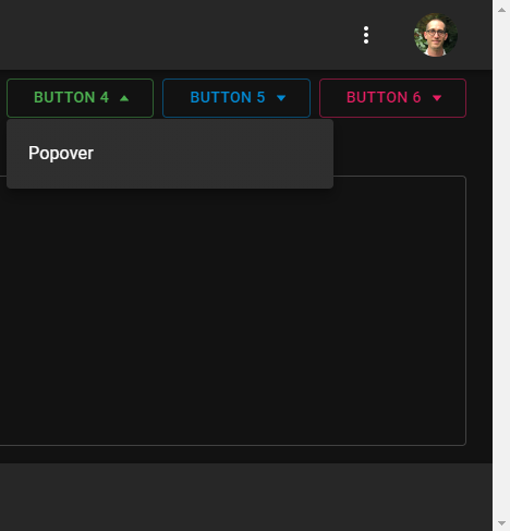
When the Popover is opened, the vertical scrollbar disappears:

![enter image description here

Reason:

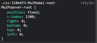
This happens because the Popover is inserted in the DOM as a sibling of the #root div, not its child:

enter image description here

This inserted DOM element occupies the exact entire width and height of the page, therefore, it does not need to have scrollbars:

enter image description here

My objective:

Since the suddenly introduced gap by the missing scrollbar looks shabby, I wanted to still have the scrollbar shown on the screen, but not scrollable. This is in line with what MUI has by default - when a Popover is open on the screen, the screen does not scroll.

Basically, here's what I wanted:

enter image description here


Solution attempt 1:

I noticed that when the Popover is open, a padding-right of 17px is automatically introduced on the document's body element:

enter image description here

Tried removing this padding-right from the body:

enter image description here

This caused the scrollbar to disappear without leaving a gap when the Popover is open, and reappear when the Popover is closed.

The appearance and disappearance of the scrollbar was causing the remaining elements on the screen to reposition themselves whenever the Popover was toggled:

enter image description here

enter image description here

No-go.

Solution attempt 2:

<Popover
  ...
  disableScrollLock={true} // Added
>
  ...
</Popover>

This did cause the scrollbar to stay on the screen when the Popover is open, but, as Viktor has mentioned in his answer, it caused the Popover to float around when the page was scrolled.

enter image description here

No-go.

A third possible attempt could have been to use <Popper /> with <ClickAwayListener /> as others have mentioned in their answers. But I didn't want to go back and change all instances of Popover across my app.

Final solution:

mui version 5.14.0:

<Popover
  ...
  // mui version 5.14.0
  slotProps={{
    root: {
      sx: {
        overflowY: "scroll"
      }
    }
  }}
  // older mui versions
  classes={{
    root: {
      overflowY: "scroll"
    }
  }}
>
  ...
</Popover>
  ...
</Popover>

This allows the scrollbar to remain shown on the page while not allowing the user to scroll:

enter image description here

Caveat (and resolution):

For the right-most Button (Button 6), the Popover was introducing a horizontal scrollbar on the page, with a carry-over of 1px:

enter image description here

To resolve this, either prevent horizontal scrolling on the Popover's root:

<Popover
  ...
  // mui version 5.14.0
  slotProps={{
    root: {
      sx: {
        overflowY: "scroll",
        overflowX: "hidden" // Added
      }
    }
  }}
  // older mui versions
  classes={{
    root: {
      overflowY: "scroll",
      overflowX: "hidden" // Added
    }
  }}
>
  ...
</Popover>

Or move the Popover's root 1px to the left:

<Popover
  ...
  // mui version 5.14.0
  slotProps={{
    root: {
      sx: {
        overflowY: "scroll",
        left: -1 // Added
      }
    }
  }}
  // older mui versions
  classes={{
    root: {
      overflowY: "scroll",
      left: -1 // Added
    }
  }}
>
  ...
</Popover>
Street answered 17/7, 2023 at 22:2 Comment(0)
C
1

According to the docs, it looks like if you want to retain the scroll bar, then you should use Popper instead of Popover.

Clardy answered 31/12, 2018 at 12:13 Comment(2)
thanks for your answer. but Popper has click away property which is not desirable in my project. is there any other way using Popover?Bail
When your Popover/Popper is displayed, what action(s) do you want to trigger making it go away?Clardy
M
1

I found another Solution that fits my case:

Just added a useEffect and attached a mouse wheel attempt to it close the popover:

function myPopover({/*..your props..*/}){
    const [open,setOpen] = useState(flase);
    //.... your rest of the code
    function handleClose(){
         setOpen(false);
    }
    useEffect(()=>{
        if(open){
            document.body.onwheel = handleClose; 
            document.body.addEventListener('touchstart', handleClose, false);

        }
        return ()=>{
            document.body.onwheel = undefined;
            document.body.removeEventListener('touchstart', handleClose, 
                   false);
        }
    },[open])
    return <Popover
      open={open}
      onClose={handleClose}
      anchorEl={...}
      anchorOrigin={...}
      /*... your props */
    >
}
Melanoid answered 24/7, 2020 at 13:14 Comment(0)
A
1

I stumbled upon this question when trying to fix the same problem. Improving upon @Tommy's answer, I've found a working solution:

const NewPopover = (props) => {
  const containerRef = React.useRef();

  // Box here can be any container. Using Box component from @material-ui/core

  return (
    <Box ref={containerRef}>
      <Popover {...props} container={containerRef.current}>
        Popover text!
      </Popover>
    </Box>
  );
};
Aquaplane answered 20/1, 2021 at 3:17 Comment(0)
P
0

Just tried something now that seems to work. Use a Popper instead I have done something like this.

<Popper
    id={id}
    open={popoverOpen}
    anchorEl={anchorEl}
    placement="top-start"
    disablePortal={false}
    modifiers={{
      flip: {
        enabled: false
      },
      preventOverflow: {
        enabled: true,
        boundariesElement: "scrollParent"
      }
    }}
>

Then to get the click away desired effect mount a "mousedown" effect check if the popover is open if it is then check the click is inside of the popper element. If not close the modal.

Something like this for the mousedown effect, note remember to dismount it or you'll get a leak.

React.useEffect(() => {
    if (anchorEl) {
      document.addEventListener("mousedown", handleClick)
    } else {
      document.removeEventListener("mousedown", handleClick)
    }
   // Specify how to clean up after this effect:
   return function cleanup() {
      document.removeEventListener("mousedown", handleClick)
   }
}, [anchorEl])

const handleClick = event => {
    if (!document.getElementById(id).contains(event.target)) {
       setAnchorEl(null)
       setCustomOpen(false)
    }
 }

Also just incase you are unsure theres another difference with Popper and Popover and that's just adding a Paper, but i don't need to explain how to do that.

Prodigal answered 11/10, 2019 at 0:26 Comment(0)
S
0

my solution is better and native: css.file

:has(:popover-open) html{
overflow:hidden
 }
Shiverick answered 5/8 at 12:20 Comment(0)
A
-1

I solved this with

html {
  overflow: visible !important;
}

Since Material-ui adds style="overflow: hidden;" on the html tag.

Amalgam answered 14/11, 2019 at 10:2 Comment(0)

© 2022 - 2024 — McMap. All rights reserved.