Looking for easy way to show my library's version in storybook
Asked Answered
E

5

16

I'm trying to add the current version of a project (essentially the version field from package.json) to storybook so consumers of storybook can tell which version of the project they are looking at. However, I am finding it extremely difficult to do this, I haven't been able to find a way to do it in the config file, and haven't seen any addons that will simply show the current version of the project (other than one that is more made for showing how components have changed over versions, which isn't really what I'm after).

It's easy enough to require the package.json file in a js file, and grab the version from there, but storybook seems pretty locked down in terms of allowing you to send any addition information to the header/sidebar.

Has anybody done anything like this before? I'd be grateful for any thoughts or theories on how this could be done. Thanks!

Existential answered 5/3, 2020 at 17:6 Comment(2)
Any news on this? I'm trying to do the same thing...Kraska
@Kraska I ended up requiring the package json and grabbing the version from there. I was unable to find a way to insert it into storybook, and just put it in another part of our application, sorry!Existential
K
15

Storybook 6

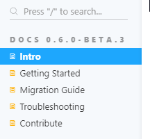
I finally found a "not that bad" solution using the title attribute of the Meta component in my .mdx documentation files:

import pkg from '../package.json'
import { Meta } from '@storybook/addon-docs/blocks'

<Meta title={`Docs ${pkg.version}/Migration Guide`} />

enter image description here

Storybook 7

This does not work anymore, story title have been made optional and now support only string literals: see migration guide

Kraska answered 7/7, 2020 at 9:18 Comment(0)
M
14

Also was interested in this question. I've added to brandTitle to .storybook/manager.js like

import { version } from "../package.json"
import { addons } from '@storybook/manager-api'
import { create } from '@storybook/theming'

addons.setConfig({
   theme: create({
       base: "light",
       brandTitle: `My components v.${version}`
   })
})

Theming docs

Mozzetta answered 14/12, 2020 at 11:26 Comment(1)
Thanks a lot! But in my case, I had to spend time to figure out what to put where. First of all, there was no manager.js file. You have to create it. And second, you need to install all deps. Third, import them. import { addons } from '@storybook/addons'; import { create } from '@storybook/theming';Tunesmith
T
2

I just used the add-on storybook-version. From their docs:

  1. Install: npm install storybook-version --save-dev
  2. Add to main.js -> addons array with 'storybook-version'
  3. Then, in your stories you can add it to your default export params. In the docs these are hard-coded string representation of versioning like major: '2' and the like. Below I'm using the version from the package of the component the story is for:
...imports...
import { version } from '@my-mono-repo/foo-ponent/package.json';

const [major, minor, patch, postfix] = version.split('.');

export default {
  title: 'FooPonent',
  component: FooPonent,
  ...etc...,
  parameters: {
    componentSubtitle: 'Foo bat blaz bleep bleep',
    ...etc...,
    // the following are the actual version settings
    version: {
      major,
      minor,
      patch,
      postfix,
      style: {
        color: '#fff',
        'font-size': '1rem',
      },
    },
}

What it looks like (with what I deemed the style would be in the version params - I've no postfix on this component version):

Where the version shows up

Teleutospore answered 2/12, 2022 at 17:38 Comment(0)
S
1

Since Markdown accepts basic html tags, I managed to display the version from package.json into a .mdx documentation like this:

import pkg from '../package.json'

<p>Version: {pkg.version}</p>
Skell answered 5/10, 2021 at 20:43 Comment(0)
F
0

We created "get started" Page contains a brief introduction of our library with the needed steps to integrate the library in angular project.

//get-started.stories.mdx
import { Meta, Source } from '@storybook/addon-docs';
import pkg from './components/package.json';

<Meta
  title="General/Get Started"
  parameters={{
    viewMode: 'docs',
    previewTabs: {
      canvas: { hidden: true }
    }
 }}
/>

<Source
 language="shell"
 code={`npm install @my-company/my-lib@${pkg.version}`}
/>

<Source
  language="json"
  format={true}
  code={`
  "dependencies": {
  //...
  "@my-company/my-lib": "${pkg.version}"
  }`}
/>

Source Doc Block

Favien answered 19/9, 2022 at 13:57 Comment(0)

© 2022 - 2024 — McMap. All rights reserved.