After digging through the AOSP theme and style xml files and a lot of googling I made some progress. I am now able to style most(!) things.
So this is a partial answer, not all the way there yet. But here's how far I got:
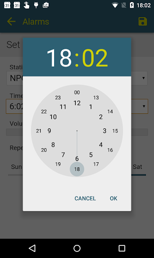
![enter image description here]()
You can see that I'm now able to theme the header, the un(!)selected time part (minutes in this case), the circle, the numbers in that circle and the 'hand' (or selector). Oh, and the buttons are styled, too.
Let me explain how I got things working, first: the important thing is that you can't override things directly from you app's theme OR from a (alert)dialog theme/style. You have to go from one to the next, so to speak.
Example:
AndroidManifest.xml: Set custom theme for app and/or activity
<activity>
    android:theme="@style/Theme.MyTheme"
</activity>
values-v21/styles.xml: (where your custom theme resides): set the timePickerDialogTheme
<style name="Theme.MyTheme" parent="@style/Theme.AppCompat.Light">
    <item name="android:timePickerDialogTheme">@style/TimePickerDialogTheme</item>
</style>
Then below that, define the timePickerDialogTheme and set the timePickerStyle:
<style name="TimePickerDialogTheme" parent="@style/Theme.AppCompat.Light.Dialog">
    <item name="colorAccent">#ff2d6073</item> <!-- colorAccent here seems to work just fine? -->
    <item name="android:timePickerStyle">@style/TimePickerDialogStyle</item>
</style>
Now you can define most of the styling here..
<style name="TimePickerDialogStyle" parent="@android:style/Widget.Material.Light.TimePicker">

    <item name="colorAccent">#ff2d6073</item> <!-- colorAccent here seems to work just fine? -->

    <item name="android:timePickerMode">clock</item>
    <item name="android:headerBackground">#ff2d6073</item>
    <item name="android:headerTimeTextAppearance">@style/TextAppearance.TimePickerDialogStyle.TimeLabel</item> <!-- TimePicker Time *TextAppearance* -->
    <item name="android:numbersTextColor">#ff000000</item>
    <item name="android:numbersSelectorColor">#ff2d6073</item>
    <item name="android:numbersBackgroundColor">#ffdddddd</item>

</style>
The important line in the above is:
<item name="android:headerTimeTextAppearance">@style/TextAppearance.TimePickerDialogStyle.TimeLabel</item>
Because if you want to style the text (well, time, actually) in the header you need to define the headerTimeTextAppearance:
<style name="TextAppearance.TimePickerDialogStyle.TimeLabel" parent="@android:style/TextAppearance.Material">

    <item name="android:textSize">60sp</item> <!-- from -->
    <item name="android:textColor">#ffD0D102</item>

</style>
Now, if you take a look at the Widget.Material.TimePicker in AOSP styles.xml (ctrl-f 'timepicker' until you find it) you'll notice a bunch of other properties that you should be able to modify:
headerTimeTextAppearance
headerAmPmTextAppearance
headerSelectedTextColor
headerBackground
numbersTextColor
numbersBackgroundColor
amPmTextColor
amPmBackgroundColor
amPmSelectedBackgroundColor
numbersSelectorColor
Most of these work (as long as you prepend 'android:' for each of them) BUT I could not get 'headerSelectedTextColor' to work. I got a compile error saying something like "could not match property bla bla". Also, if you look at my example above, I hardcoded the textSize for the 'headerTimeTextAppearance' property because the '@dimen/timepicker_ampm_label_size' value threw errors.
In short: most of the things are listed above and how to get them working. But not all is clear. So I'd still see that complete documentation/guide :)


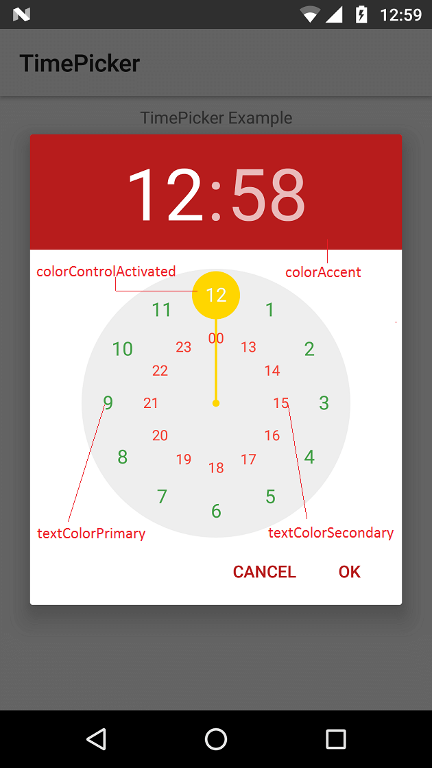
android:headerBackgroundworks. I wasn't able to makeandroid:numbersTextColor,android:numbersBackgroundColorwork. N.B.:?colorControlActivated(inherits from?colorAccent) does the highlights actually. – Jugate