The answer to the post How to define the structure of a sankey diagram using a dataframe? will show you that forcing your Sankey data sources into one dataframe may quickly lead to confusion. You'll be better off separating nodes from links since they are constructed differently.
So your node dataframe should look something like this:
ID               Label    Color
0        AKJ Education  #4994CE
1               Amazon  #8A5988
2             Flipkart  #449E9E
3                Books  #7FC241
4  Computers & tablets  #D3D3D3
5                Other  #4994CE
And your links dataframe should look like this:
Source  Target      Value      Link Color
0       3          846888      rgba(127, 194, 65, 0.2)
0       4            1045      rgba(127, 194, 65, 0.2)
1       3         1294423      rgba(211, 211, 211, 0.5)
1       4           42165      rgba(211, 211, 211, 0.5)
1       5             415      rgba(211, 211, 211, 0.5)
2       5               1      rgba(253, 227, 212, 1)
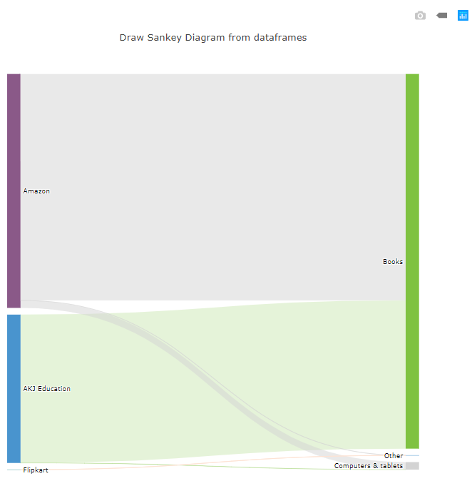
Now, if you use a similar setup to the Scottish referendum diagram on plot.ly, youll be able to build this:
![enter image description here]()
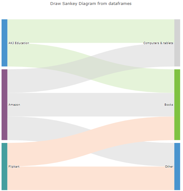
That particular diagram looks a bit odd because of the huge difference between the numbers. For illustrative purposes, I've replaced all your numbers with 1:
![enter image description here]()
Here's the whole thing for an easy copy&paste into a Jupyter Notebook:
# imports
import pandas as pd
import numpy as np
import plotly.graph_objs as go
from plotly.offline import download_plotlyjs, init_notebook_mode, plot, iplot
init_notebook_mode(connected=True)

# Nodes & links
nodes = [['ID', 'Label', 'Color'],
        [0,'AKJ Education','#4994CE'],
        [1,'Amazon','#8A5988'],
        [2,'Flipkart','#449E9E'],
        [3,'Books','#7FC241'],
        [4,'Computers & tablets','#D3D3D3'],
        [5,'Other','#4994CE'],]

# links with your data
links = [['Source','Target','Value','Link Color'],

        # AKJ
        [0,3,1,'rgba(127, 194, 65, 0.2)'],
        [0,4,1,'rgba(127, 194, 65, 0.2)'],

        # Amazon
        [1,3,1,'rgba(211, 211, 211, 0.5)'],
        [1,4,1,'rgba(211, 211, 211, 0.5)'],
        [1,5,1,'rgba(211, 211, 211, 0.5)'],

        # Flipkart
        [2,5,1,'rgba(253, 227, 212, 1)'],
        [2,3,1,'rgba(253, 227, 212, 1)'],]

# links with some data for illustrative purposes ################
#links = [
#    ['Source','Target','Value','Link Color'],
#
#    # AKJ
#    [0,3,846888,'rgba(127, 194, 65, 0.2)'],
#    [0,4,1045,'rgba(127, 194, 65, 0.2)'],
#
#    # Amazon
#    [1,3,1294423,'rgba(211, 211, 211, 0.5)'],
#    [1,4,42165,'rgba(211, 211, 211, 0.5)'],
#    [1,5,415,'rgba(211, 211, 211, 0.5)'],
#
#    # Flipkart
#    [2,5,1,'rgba(253, 227, 212, 1)'],]
#################################################################


# Retrieve headers and build dataframes
nodes_headers = nodes.pop(0)
links_headers = links.pop(0)
df_nodes = pd.DataFrame(nodes, columns = nodes_headers)
df_links = pd.DataFrame(links, columns = links_headers)

# Sankey plot setup
data_trace = dict(
    type='sankey',
    domain = dict(
      x =  [0,1],
      y =  [0,1]
    ),
    orientation = "h",
    valueformat = ".0f",
    node = dict(
      pad = 10,
    # thickness = 30,
      line = dict(
        color = "black",
        width = 0
      ),
      label =  df_nodes['Label'].dropna(axis=0, how='any'),
      color = df_nodes['Color']
    ),
    link = dict(
      source = df_links['Source'].dropna(axis=0, how='any'),
      target = df_links['Target'].dropna(axis=0, how='any'),
      value = df_links['Value'].dropna(axis=0, how='any'),
      color = df_links['Link Color'].dropna(axis=0, how='any'),
  )
)

layout = dict(
        title = "Draw Sankey Diagram from dataframes",
    height = 772,
    font = dict(
      size = 10),)

fig = dict(data=[data_trace], layout=layout)
iplot(fig, validate=False)


