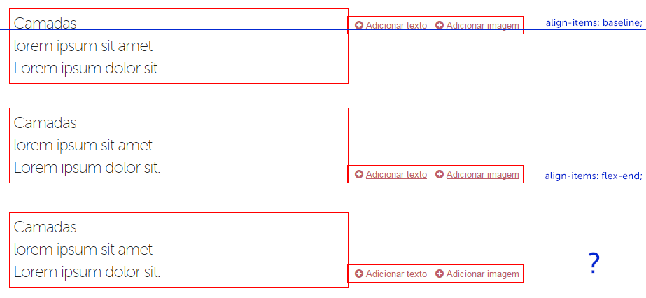
I am trying to achive the last example on the following image, using flex-box.
From what I see, the align-items: baseline; property works great when the blocks only have 1 line.
The property align-items: flex-end; creates some issues mainly because the left and right items have different font-sizes and line-heights. Although the edges of the items are aligned, the white space created by the font size and line-height differences looks really bad when the item has no borders.
I'm trying to find a good all-around solution without any JS.
Thanks in advance.

