force boxplots from geom_boxplot to constant width
Asked Answered
N

3

18

I'm making a boxplot in which x and fill are mapped to different variables, a bit like this:

ggplot(mpg, aes(x=as.factor(cyl), y=cty, fill=as.factor(drv))) + 
    geom_boxplot()

enter image description here

As in the example above, the widths of my boxes come out differently at different x values, because I do not have all possible combinations of x and fill values, so .

I would like for all the boxes to be the same width. Can this be done (ideally without manipulating the underlying data frame, because I fear that adding fake data will cause me confusion during further analysis)?

My first thought was

+ geom_boxplot(width=0.5)

but this doesn't help; it adjusts the width of the full set of boxplots for a given x factor level.

This post almost seems relevant, but I don't quite see how to apply it to my situation. Using + scale_fill_discrete(drop=FALSE) doesn't seem to change the widths of the bars.

Naturopathy answered 23/5, 2013 at 3:22 Comment(1)
Does this answer your question? Consistent width of boxplots if missing data by group?Th
K
3

You can now use position_dodge() function.

ggplot(mpg, aes(x=as.factor(cyl), y=cty, fill=as.factor(drv))) + 
    geom_boxplot(position = position_dodge(preserve = "single"))
Knuth answered 21/2, 2022 at 16:48 Comment(0)
A
2

The problem is due to some cells of factor combinations being not present. The number of data points for all combinations of the levels of cyl and drv can be checked via xtabs:

tab <- xtabs( ~ drv + cyl, mpg)

tab

#    cyl
# drv  4  5  6  8
#   4 23  0 32 48
#   f 58  4 43  1
#   r  0  0  4 21

There are three empty cells. I will add fake data to override the visualization problems.

Check the range of the dependent variable (y-axis). The fake data needs to be out of this range.

range(mpg$cty)
# [1]  9 35

Create a subset of mpg with the data needed for the plot:

tmp <- mpg[c("cyl", "drv", "cty")]

Create an index for the empty cells:

idx <- which(tab == 0, arr.ind = TRUE)

idx

#   row col
# r   3   1
# 4   1   2
# r   3   2

Create three fake lines (with -1 as value for cty):

fakeLines <- apply(idx, 1,
                   function(x) 
                     setNames(data.frame(as.integer(dimnames(tab)[[2]][x[2]]), 
                                         dimnames(tab)[[1]][x[1]], 
                                         -1), 
                              names(tmp)))

fakeLines

# $r
#   cyl drv cty
# 1   4   r  -1
# 
# $`4`
#   cyl drv cty
# 1   5   4  -1
# 
# $r
#   cyl drv cty
# 1   5   r  -1

Add the rows to the existing data:

tmp2 <- rbind(tmp, do.call(rbind, fakeLines))

Plot:

library(ggplot2)
ggplot(tmp2, aes(x = as.factor(cyl), y = cty, fill = as.factor(drv))) + 
  geom_boxplot() +
  coord_cartesian(ylim = c(min(tmp$cty - 3), max(tmp$cty) + 3))
  # The axis limits have to be changed to suppress displaying the fake data.

enter image description here

Actionable answered 23/5, 2013 at 6:46 Comment(1)
Is it possible to center the boxes which correspond to cyl = 4 ? (so that 4 would be at the middle of the two boxes)Breger
D
-2

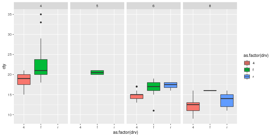
Just use the facet_grid() function, makes things a lot easier to visualize:

ggplot(mpg, aes(x=as.factor(drv), y=cty, fill=as.factor(drv))) + 
    geom_boxplot() +
    facet_grid(.~cyl)

enter image description here

See how I switch from x=as.factor(cyl) to x=as.factor(drv).
Once you have done this you can always change the way you want the strips to be displayed and remove margins between the panels... it can easily look like your expected display.
By the way, you don't even need to use the as.factor() before specifying the columns to be used by ggplot(). this again improve the readability of your code.

Diameter answered 19/9, 2019 at 13:51 Comment(0)

© 2022 - 2024 — McMap. All rights reserved.