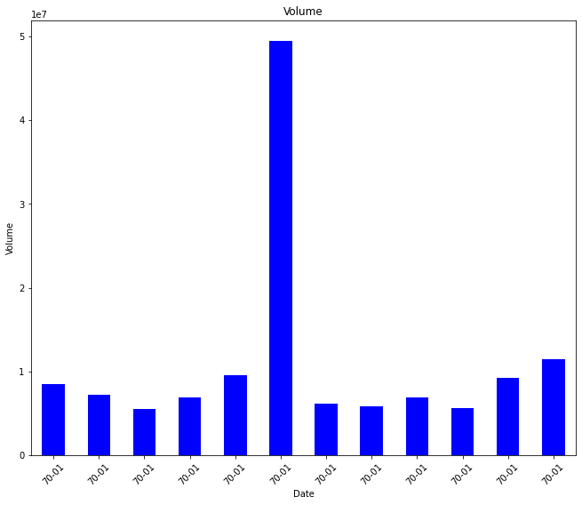
DateFormatter is bringing 1970 as year not the original year in the dataset
Asked Answered
N

2

18

I am trying to plot time series data. But x axis ticks are not coming the way it should. I wanted to out mont and year as x axis ticks. here is my code

from matplotlib.dates import DateFormatter
import matplotlib.dates as mdates
fig,ax = plt.subplots()
df_month.loc['2017', "Volume"].plot.bar(color='blue', ax=ax)
ax.set_ylabel("Volume")
ax.set_title("Volume")
date_form = DateFormatter("%y-%m")
ax.xaxis.set_major_formatter(date_form)

plt.xticks(rotation=45)
plt.show()

The output looks like this enter image description here What am I doing wrong? Please help.
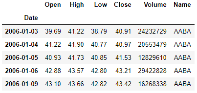
My dataset looks like this: enter image description here

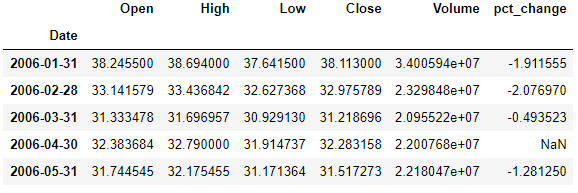
Here is df_month data: enter image description here

Nejd answered 19/11, 2020 at 20:30 Comment(5)
Would it be possible to see (a sample of) the df_month data?Invalidate
@RuthgerRighart, here I added df_month data in the question. Please check.Nejd
There was a bad interaction between pandas and matplotlib due to the change in matplotlib's epoch. This was fixed on both matplotlib and pandas' sides, so you may have the bad version combination.Faux
@Jody Klymak: Could you tell which versions were badly interacting, or do you have an URL that is talking about this issue?Invalidate
pandas bar plot combined with line plot shows the time axis beginning at 1970Sinapism
I
2

The following gives the right x-axis labels.

Import modules

import pandas as pd
import numpy as np
import matplotlib.pyplot as plt
from matplotlib.dates import DateFormatter
import matplotlib.dates as mdates

Example data

df_month = pd.DataFrame({'Date':['2006-01-03', '2006-02-04', '2006-02-08'], 'Volume':[24232729, 20553479, 20500000]}) # '2006-01-03', '2006-01-04'

df_month['Date'] = pd.to_datetime(df_month['Date'])

Plotting

fig,ax = plt.subplots()
ax.set_ylabel("Volume")
ax.set_title("Volume")

ax.xaxis.set_major_formatter(mdates.DateFormatter('%Y-%m'))
ax.bar(df_month['Date'], df_month['Volume'])

plt.xticks(df_month['Date'], rotation=90)
plt.show()
Invalidate answered 19/11, 2020 at 21:22 Comment(0)
I
2

I was having the same issue. The solution is really contained in the answer from @Ruthger Righart which I had trouble understanding at first, but the key change is using matplotlib pyplot plotting instead of the pandas plotting as mentioned here and in the link in the comments mentioned by @Trenton McKinney. First filter the data to the years you want to plot then call the plot like @Ruthger Righart did:

import matplotlib.pyplot as plt
fig,ax = plt.subplots()
ax.bar(df_month['Date'], df_month['Volume'])

Add the labels as you did originally.

Issuance answered 10/7, 2023 at 19:38 Comment(0)

© 2022 - 2024 — McMap. All rights reserved.