Changing hatch color in matplotlib
Asked Answered
K

4

18

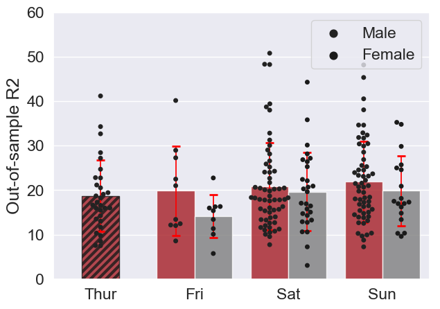
Thanks for helping me get this graph right!

I have another issue now, that I wish to change the color of the hatch lines to grey.

I am working with matplotlib version 1.5.3'. I have tried mlp.rcParams['hatch.color'] = 'k'

But it doesn't seem to work...

Here is the code for the figure I already have, thanks to you:


import seaborn as sns
import matplotlib.pyplot as plt
mypallet = sns.color_palette([(190/256,7/256, 18/256),(127/256, 127/256, 127/256)])
import itertools
import numpy as np

plt.rcParams['figure.figsize'] = 7, 5
tips = sns.load_dataset("tips")
tips[(tips.day=='Thur') & (tips.sex=='Female') ] = np.nan
print(sns.__version__)
print(tips.head())
# Bigger than normal fonts
sns.set(font_scale=1.5)

ax = sns.swarmplot(x="day", y="total_bill", hue="sex",
                 data=tips, dodge=True, color='k')

#get first patchcollection
c0 = ax.get_children()[0]
x,y = np.array(c0.get_offsets()).T
#Add .2 to x values
xnew=x+.2
offsets = list(zip(xnew,y))
#set newoffsets
c0.set_offsets(offsets)

ax = sns.barplot(x="day", y="total_bill", hue="sex",
                 data=tips, capsize=0.1, alpha=0.8,
                 errwidth=1.25, ci=None, palette=mypallet)
xcentres = [0.2, 1, 2, 3]
delt = 0.2
xneg = [x-delt for x in xcentres]
xpos = [x+delt for x in xcentres]
xvals = xneg + xpos
xvals.sort()
yvals = tips.groupby(["day", "sex"]).mean().total_bill
yerr = tips.groupby(["day", "sex"]).std().total_bill

(_, caps, _)=ax.errorbar(x=xvals, y=yvals, yerr=yerr, capsize=4,
                         ecolor="red", elinewidth=1.25, fmt='none')
for cap in caps:
    cap.set_markeredgewidth(2)


handles, labels = ax.get_legend_handles_labels()
l = ax.legend(handles[0:2], labels[0:2]) # changed based on https://mcmap.net/q/336243/-add-legend-to-seaborn-point-plot
#sns.ax.ylim([0,60]) #original
ax.set_ylim([0,60]) # adapted from https://mcmap.net/q/741802/-set-individual-ylim-of-seaborn-lmplot-columns and change to legend
ax.set_ylabel("Out-of-sample R2") # based on https://mcmap.net/q/741803/-how-to-remove-x-and-y-axis-labels-in-a-clustermap
ax.set_xlabel("") # based on https://mcmap.net/q/741803/-how-to-remove-x-and-y-axis-labels-in-a-clustermap

for i, bar in enumerate(ax.patches):
    hatch = '///'
    bar.set_hatch(hatch)
    bar.set_x(bar.get_x() + bar.get_width()/2)
    break

I'd like to change the color of the hatch pattern from black to grey: (127/256, 127/256, 127/256)

Khalilahkhalin answered 19/6, 2019 at 19:30 Comment(2)
Hrm... seems to be quite difficult to decoup edge and hatch color https://mcmap.net/q/437611/-how-to-decouple-hatch-and-edge-color-in-matplotlib.. howerver you can change first bar using 'bar.set_edgecolor('k')' inside your patches for loop at the bottom.Tequila
Thanks, that worked ! And the hatch line width ?Khalilahkhalin
T
9

Add, plt.rcParams['hatch.linewidth'] = 3 and use set_edgecolor, think the fact that `plt.rcParams['hatch.color'] = 'k' doesn't work is a bug.

import seaborn as sns
import matplotlib.pyplot as plt
import matplotlib as mpl
mypallet = sns.color_palette([(190/256,7/256, 18/256),(127/256, 127/256, 127/256)])
import itertools
import numpy as np

plt.rcParams['figure.figsize'] = 7, 5
plt.rcParams['hatch.linewidth'] = 3
tips = sns.load_dataset("tips")
tips[(tips.day=='Thur') & (tips.sex=='Female') ] = np.nan
print(sns.__version__)
print(tips.head())
# Bigger than normal fonts
sns.set(font_scale=1.5)

ax = sns.swarmplot(x="day", y="total_bill", hue="sex",
                 data=tips, dodge=True, color='k')

#get first patchcollection
c0 = ax.get_children()[0]
x,y = np.array(c0.get_offsets()).T
#Add .2 to x values
xnew=x+.2
offsets = list(zip(xnew,y))
#set newoffsets
c0.set_offsets(offsets)

ax = sns.barplot(x="day", y="total_bill", hue="sex",
                 data=tips, capsize=0.1, alpha=0.8,
                 errwidth=1.25, ci=None, palette=mypallet)


xcentres = [0.2, 1, 2, 3]
delt = 0.2
xneg = [x-delt for x in xcentres]
xpos = [x+delt for x in xcentres]
xvals = xneg + xpos
xvals.sort()
yvals = tips.groupby(["day", "sex"]).mean().total_bill
yerr = tips.groupby(["day", "sex"]).std().total_bill

(_, caps, _)=ax.errorbar(x=xvals, y=yvals, yerr=yerr, capsize=4,
                         ecolor="red", elinewidth=1.25, fmt='none')
for cap in caps:
    cap.set_markeredgewidth(2)


handles, labels = ax.get_legend_handles_labels()
l = ax.legend(handles[0:2], labels[0:2]) # changed based on https://mcmap.net/q/336243/-add-legend-to-seaborn-point-plot
#sns.ax.ylim([0,60]) #original
ax.set_ylim([0,60]) # adapted from https://mcmap.net/q/741802/-set-individual-ylim-of-seaborn-lmplot-columns and change to legend
ax.set_ylabel("Out-of-sample R2") # based on https://mcmap.net/q/741803/-how-to-remove-x-and-y-axis-labels-in-a-clustermap
ax.set_xlabel("") # based on https://mcmap.net/q/741803/-how-to-remove-x-and-y-axis-labels-in-a-clustermap

for i, bar in enumerate(ax.patches):
    hatch = '///'
    bar.set_hatch(hatch)
    bar.set_edgecolor('k')
    bar.set_x(bar.get_x() + bar.get_width()/2)
    break

Output:

enter image description here

Tequila answered 19/6, 2019 at 19:58 Comment(0)
K
4

AFAIK, The hatch color is determined by the edgecolor property, but the problem with that is that it will also affect the border of your bars

BTW, I was confused with your loop at the end of your code, I rewrote it as:

(...)
ax.set_xlabel("") # based on https://mcmap.net/q/741803/-how-to-remove-x-and-y-axis-labels-in-a-clustermap

bar = ax.patches[0] #  modify properties of first bar (index 0)
hatch = '///'
bar.set_hatch(hatch)
bar.set_x(bar.get_x() + bar.get_width()/2)
bar.set_edgecolor([0.5,0.5,0.5])

for changing the linewidth of the hatches, it seems you have to modify the rcParams. You can add this somewhere close to the top of you script:

plt.rcParams['hatch.linewidth'] = 3

Kaylenekayley answered 19/6, 2019 at 19:46 Comment(3)
Thanks! Changing the edge color was OK. Now I'm looking for a way to change the edge width.Khalilahkhalin
plt.rcParams['hatch.linewidth'] = 3, I've added it to my answerKaylenekayley
This still changes the color of both the hatches and the bar edges for me. I only want to change the hatch color.Diablerie
V
2
plt.rcParams.update({'hatch.color': 'k'})
Voyles answered 14/1, 2020 at 22:13 Comment(1)
Welcome to Stack Overflow! Please edit your answer to include an explanation for your code, and how it might be used to fix the problem described in the question. This will help others who might come across your answer in the future, and make it more likely they will find it useful and upvote you :)Epiphora
B
0

Just two additional hints for someone who might also find that the hatch is not displayed or not with the proper color.

First, check if you set some edgecolor in another place. This seems to have precedence over a specified hatch color. Second, if you draw a Patch, use facecolor instead of color. With color, the hatch will not be visible:

So not this:

from matplotlib.patches import Polygon, Patch
fig, ax = plt.subplots()
ax.legend(handles=[Patch(color='red', hatch='///')])  # no hatch visible 
plt.show()

Instead:

from matplotlib.patches import Polygon, Patch
fig, ax = plt.subplots()
ax.legend(handles=[Patch(facecolor='red', hatch='///')])  # hatch is now visible 
plt.show()
Boru answered 16/3, 2021 at 9:11 Comment(0)

© 2022 - 2024 — McMap. All rights reserved.