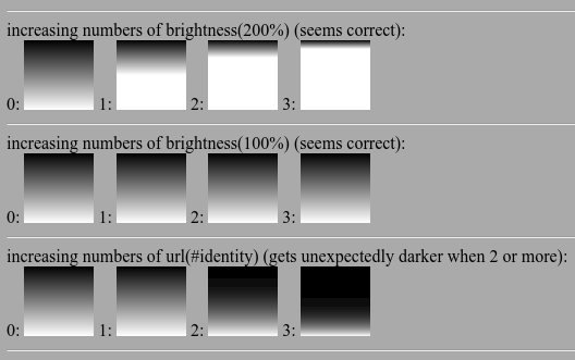
I can apparently chain a sequence of css filters together by simply concatenating them, which seems to work:
filter: brightness(200%) brightness(200%);
But when the individual filters in question are svg filters, it seems to make the resulting image unexpectedly darker for some reason:
filter: url(#myIdentityFilter) url(#myIdentityFilter);
The following image shows this effect (it's from the snippet at the bottom of this post, on chrome 103.0.5060.134):
I've observed this unexpected darkening with many kinds of svg filters, e.g. feComponentTransfer, feColorMatrix, feDiffuseLighting.
@HolgerL mentions this darkening problem in a comment on Multiple Filters for Single Object in SVG (where the method was suggested, in the context of svg rather than html; apparently the same problem happens there too).
Should chaining like this work? I know I can work around the darkening problem, in order to achieve the desired effect, by nesting my element inside a container div, and applying the second filter to the container div instead of chaining it on to the first filter; this is similar to what was suggested in Multiple Filters for Single Object in SVG . That works.
But I'd like to use the simpler more concise chaining syntax if possible.
The above image was produced by the following snippet.
<!DOCTYPE html>
<html>
  <head>
    <meta http-equiv="content-type" content="text/html; charset=utf-8" />
    <style>
      .gradientSwatch {
        display:inline-block;
        width:64px;
        height:64px;
        background-image:linear-gradient(black, white);
      }
    </style>
  </head>
  <body style="background:#aaaaaa;">
    <svg width="0" height="0"> <!-- NOT display:none, which would make filters invisible -->
      <filter id="identity">
        <feComponentTransfer>
          <!-- no funcs, so should be the identity -->
        </feComponentTransfer>
      </filter>
    </svg>
    <hr>
    increasing numbers of brightness(200%) (seems correct):
    <br>
    0: <div class="gradientSwatch"></div>
    1: <div class="gradientSwatch" style="filter:brightness(200%);"></div>
    2: <div class="gradientSwatch" style="filter:brightness(200%) brightness(200%);"></div>
    3: <div class="gradientSwatch" style="filter:brightness(200%) brightness(200%) brightness(200%);"></div>
    <hr>
    increasing numbers of brightness(100%) (seems correct):
    <br>
    0: <div class="gradientSwatch"></div>
    1: <div class="gradientSwatch" style="filter:brightness(100%);"></div>
    2: <div class="gradientSwatch" style="filter:brightness(100%) brightness(100%);"></div>
    3: <div class="gradientSwatch" style="filter:brightness(100%) brightness(100%) brightness(100%);"></div>
    <hr>
    increasing numbers of url(#identity) (gets unexpectedly darker when 2 or more):
    <br>
    0: <div class="gradientSwatch"></div>
    1: <div class="gradientSwatch" style="filter:url(#identity);"></div>
    2: <div class="gradientSwatch" style="filter:url(#identity) url(#identity);"></div>
    3: <div class="gradientSwatch" style="filter:url(#identity) url(#identity) url(#identity);"></div>
    <hr>
  </body>
</html>
