SwiftUI - Placing two pickers side-by-side in HStack does not resize pickers
Asked Answered
B

3

18

My goal is to have two pickers placed side-by-side horizontally with each picker taking up half the width of the screen. Imagine a UIPickerView that fits the width of the screen and has two components of equal width - that's what I'm attempting to recreate in SwiftUI.

Since pickers in SwiftUI do not currently allow for multiple components, the obvious alternative to me was just to place two pickers inside an HStack.

Here's some example code from a test project:

struct ContentView: View {
    @State var selection1: Int = 0
    @State var selection2: Int = 0

    @State var integers: [Int] = [0, 1, 2, 3, 4, 5]

    var body: some View {
        HStack {
            Picker(selection: self.$selection1, label: Text("Numbers")) {
                ForEach(self.integers) { integer in
                    Text("\(integer)")
                }
            }
            Picker(selection: self.$selection2, label: Text("Numbers")) {
                ForEach(self.integers) { integer in
                    Text("\(integer)")
                }
            }
        }
    }
}

And here is the canvas:

SwiftUI - Pickers in HStack

The pickers do not resize to be half the width of the screen like I would expect. They retain their size and instead stretch the width of the content view, distorting the widths of other UI elements in the process (as I found out when I tried to do this in my other project).

I know that I can use UIViewRepresentable to get the effect that I want, but SwiftUI would be much easier to use given the complexity of what I'm trying to use this for.

Is it a bug that placing two pickers inside an HStack does not properly resize them, or do pickers in SwiftUI just have a fixed width that cannot be changed?


Update

Using GeometryReader, I've managed to get closer to resizing the pickers how I want, but not all the way.

Side note: you can also achieve this same imperfect result without using GeometryReader by simply setting the frame on each picker to .frame(minWidth: 0, maxWidth: .infinity, minHeight: 0, maxHeight: .infinity).

Here's the example code:

struct ContentView: View {
    @State var selection1: Int = 0
    @State var selection2: Int = 0

    @State var integers: [Int] = [0, 1, 2, 3, 4, 5]

    var body: some View {
        GeometryReader { geometry in
            HStack(spacing: 0) {
                Picker(selection: self.$selection1, label: Text("Numbers")) {
                    ForEach(self.integers) { integer in
                        Text("\(integer)")
                    }
                }
                .frame(maxWidth: geometry.size.width / 2)
                Picker(selection: self.$selection2, label: Text("Numbers")) {
                    ForEach(self.integers) { integer in
                        Text("\(integer)")
                    }
                }
                .frame(maxWidth: geometry.size.width / 2)
            }
        }
    }
}

And here is the canvas:

Pickers in HStack with GeometryReader

The pickers are now closer to having the appearance that I want, but the sizing is still slightly off, and they're now overlapping each other in the middle.

Bazan answered 9/7, 2019 at 23:15 Comment(0)
A
27

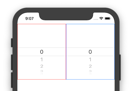
The overlapping in the middle you can fix by adding a clipped() modifier. As for the width, I see them both exactly the same:

enter image description here

struct ContentView: View {
    @State var selection1: Int = 0
    @State var selection2: Int = 0

    @State var integers: [Int] = [0, 1, 2, 3, 4, 5]

    var body: some View {
        GeometryReader { geometry in
            HStack(spacing: 0) {
                Picker(selection: self.$selection1, label: Text("Numbers")) {
                    ForEach(self.integers) { integer in
                        Text("\(integer)")
                    }
                }
                .frame(maxWidth: geometry.size.width / 2)
                .clipped()
                .border(Color.red)

                Picker(selection: self.$selection2, label: Text("Numbers")) {
                    ForEach(self.integers) { integer in
                        Text("\(integer)")
                    }
                }
                .frame(maxWidth: geometry.size.width / 2)
                .clipped()
                .border(Color.blue)
            }
        }
    }
}
Allgood answered 10/7, 2019 at 7:12 Comment(3)
Thanks so much! I can't believe it was as simple as adding clipped(). You're right, the width was the same. I was thrown off by the fact that the picker on the right was overlapping the picker on the left by so much. Your tutorials are great, by the way. I was using them the other day and learned a lot, so thanks for that!Bazan
the UI is showing correctly but the gesture still overlaping on Xcode13. do you facing with this problem?Vivien
Any working solutions?Crossarm
C
10

As of iOS 15.5 (tested on simulator), Xcode 13.4 additionally to adding .clipped() you also need to add the following extension to prevent the touch area overlap issue mentioned in the comments from the other answers:

extension UIPickerView {
    open override var intrinsicContentSize: CGSize {
        return CGSize(width: UIView.noIntrinsicMetric , height: 150)
    }
}

Just place it before the struct of the View where you're using the Picker.

Source: TommyL on the Apple forum: https://developer.apple.com/forums/thread/687986?answerId=706782022#706782022

Chu answered 27/5, 2022 at 18:24 Comment(3)
That fixed it for me, thanks for reposting here- it was getting very frustratingJoselyn
Fixed it for me as well, thanks!!Anstice
Nice solution, it also solved the gesture overlapping problemUnderhanded
P
0

To achieve two pickers side-by-side with equal width in SwiftUI, you can use the frame modifier to specify the width of each Picker within an HStack. Here's an updated version of your code:

struct ContentView: View {
    @State var selection1: Int = 0
    @State var selection2: Int = 0

    @State var integers: [Int] = [0, 1, 2, 3, 4, 5]

    var body: some View {
        HStack {
            Picker(selection: self.$selection1, label: Text("Numbers")) {
                ForEach(self.integers, id: \.self) { integer in
                    Text("\(integer)")
                }
            }
            .frame(maxWidth: .infinity)
            .clipped()

            Picker(selection: self.$selection2, label: Text("Numbers")) {
                ForEach(self.integers, id: \.self) { integer in
                    Text("\(integer)")
                }
            }
            .frame(maxWidth: .infinity)
            .clipped()
        }
    }
}
  1. The 'frame(maxWidth: .infinity)' modifier expands the Picker's width to fill the available horizontal space within the 'HStack'.
  2. The 'clipped()' modifier helps to clip the Picker's content to prevent any content overflow.
  3. The 'ForEach' loop uses 'id: .self' to uniquely identify each element in the 'integers' array.

This code arranges two pickers horizontally, each taking up half of the screen's width. Adjust the modifiers or add padding as needed for your layout preferences.

Possibility answered 11/11, 2021 at 9:1 Comment(2)
As it’s currently written, your answer is unclear. Please edit to add additional details that will help others understand how this addresses the question asked. You can find more information on how to write good answers in the help center.Camarilla
This is a paste of your own other answer (inluding the 0 from the score...). Please don't do that. Thanks.Paltry

© 2022 - 2024 — McMap. All rights reserved.