is there a way to change the color palette for GGally::ggpairs using ggplot?
Asked Answered
S

4

19

I would like to change the color palette for the GGally function ggpairs. When I attempt to add ggplot commands to the ggplot returned using getPlot, the colors do not change.

my_pair_plot = ggpairs(dataset, color="var1")
getPlot(my_pair_plot,2,1) + scale_fill_brewer(palette = "Set2")

Attempting to put ggplot commands directly on the ggpairs function results in an error.

ggpairs(dataset, color="var1") + scale_fill_brewer(palette = "Set2")
Swint answered 5/2, 2013 at 15:56 Comment(0)
T
6

Turns out, this is possible! It requires looking up the source code, but the solution comes up pretty easily. We are interested in ggpairs function, so the first step is just

ggpairs

Let's see if we can find any aes mapping to fill or colour. Indeed,

combo_aes <- addAndOverwriteAes(aes_string(x = xColName, 
            y = yColName, ...), section_aes)

We may hope it does what it says. Two important notes:

  • colour and fill aes should be contained in the ellipsis for the ggpairs call

  • aes_string() is used

Let's try this out:

ggpairs(diamonds[, 1:2], colour='cut')

enter image description here

Excellent, we're almost there! We just need to override the colour palette. Note that something like you propose

ggpairs(diamonds[, 1:2], colour='cut') + scale_fill_brewer(palette = "Set2")

will not work because ggpairs object is not a ggplot, so the + notation is not directly applicable in any way. However, the simple workaround is provided here. Cross your fingers, and...

ggplot <- function(...) ggplot2::ggplot(...) + scale_fill_brewer(palette="Set2")
ggpairs(diamonds[, 1:2], colour='cut')

enter image description here

Tightlipped answered 2/12, 2013 at 7:40 Comment(0)
P
5

update:

GGAlly was updated again and the hack in this answer also doesn’t work anymore, but finally there’s a non-hack solution: given

scales <- scale_colour_brewer(type = 'qual') %+% scale_fill_brewer(type = 'qual')

you can do (in a hopefully future-proof way)

for (row in seq_len(ps$nrow))
    for (col in seq_len(ps$ncol))
        ps[row, col] <- ps[row, col] + scales

old way

The hack in the other answer does not work anymore, so let’s hack a new one!

The internal structure of a ggpairs object is the dataset and a list of strings:

> dta <- data.frame(a=1:6, b=7:12, c=c('f', 'g'))
> ps <- ggpairs(dta, 1:2, colour = 'c')
> str(ps)
List of 10
 $ data        :'data.frame':   2 obs. of  3 variables:
  ..$ a: int [1:2] 1 2
  ..$ b: int [1:2] 3 4
  ..$ c: int [1:2] 5 6
 $ columns     : int [1:3] 1 2 3
 $ plots       :List of 9
  ..$ : chr "ggally_densityDiag(ggally_data, ggplot2::aes(x = a, colour = c))"
  ..$ : chr "ggally_cor(ggally_data, ggplot2::aes(x = b, y = a, colour = c))"

[...]

 $ gg          : NULL
 - attr(*, "class")= chr [1:2] "gg" "ggpairs"

> ps

plot before

In order to modify the plot, the respective strings in the plot object need to be modified to include the additional command. For this, we use deparse(substitute(argument)) to get a string containing the code the user passed, and append it to every plot call:

add_to_plots <- function(pairs, modification) {
    str <- deparse(substitute(modification))
    pairs$plots <- lapply(pairs$plots, function(s) paste(s, '+', str))
    pairs
}

> add_to_plots(ps, scale_colour_brewer(type = 'qual'))

plot after

Pannier answered 2/6, 2015 at 8:14 Comment(5)
This does not work anymore either. I'd like to have the density plots in the diagonale not filled but as lines as shown here - how do I do this? #34727908Convolve
This changes the colors, but not the fact that my plot is still filled.Convolve
that’s pretty trivial, just overwrite the fill.Pannier
Sounds trivial, but I was not able to get it done, because the question remains: With what? I tried NULL, but that does not work. I don't want something else there - I want it transparent.Convolve
you’re right. usually that’s waiver() but it doesn’t seem to work. and i can’t find where the aes(fill)/scale_fill_* is added…Pannier
S
2

I feel like the most non-hacky way to change the palette is to modify its own graphing function since they return ggplot2 objects which can be customized freely.

To change the density in the diagonal, just change the corresponding function, ggally_densityDiag.


modified_density = function(data, mapping, ...) {

  ggally_densityDiag(data, mapping, ...) + scale_fill_brewer(type = "qual", palette = "Set2")
}

Then, provide the new function to ggparis function call, as below,


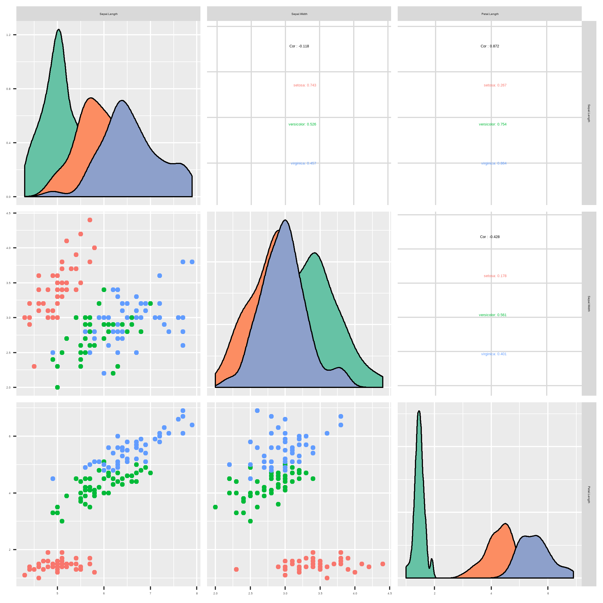
ggpairs(iris, columns = 1:3,  aes(color = Species),
        diag = list(continuous = modified_density)) 

enter image description here

There are upper and lower arguments that can be used for other parts of the plot as well.

Stickle answered 3/3, 2020 at 10:58 Comment(0)
S
0

Assigning the matrix plot to a variable and then iterating through each plot with a for-loop also seems to do to the trick:

library(GGally)

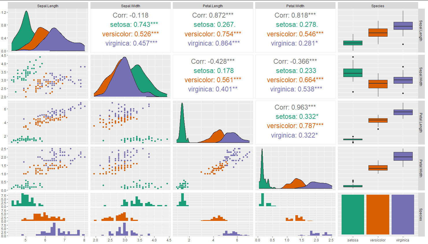
plot.matrix <-ggpairs(iris,aes(color= Species), upper = list(continuous = wrap("cor", size=6)))

for(i in 1:5) {
  for(j in 1:5){
    plot.matrix[i,j] <- plot.matrix[i,j] +
      scale_fill_brewer(palette = "Dark2") +
      scale_color_brewer(palette = "Dark2")
  }
}

plot.matrix

Example is modified from Schmuller (2018): R Projects for dummies, p. 149.

enter image description here

Seymour answered 13/3, 2021 at 15:23 Comment(0)

© 2022 - 2024 — McMap. All rights reserved.