There are a few things you need to do to make this happen.
First is to put your data into a data.frame():
sites.data = data.frame(lon = c(-77.61198, -77.57306, -77.543),
                        lat = c(35.227792, 35.30288, 35.196),
                        label = c("PP Site","NOAA", "CRONOS Data"),
                        colour = c("red","blue","blue"))
Now we can get the map for this region using the gg_map package:
require(gg_map)
map.base <- get_map(location = c(lon = mean(sites.data$lon),
                                 lat = mean(sites.data$lat)),
                    zoom = 10) # could also use zoom = "auto"
We'll need the extents of that image:
bb <- attr(map.base,"bb")
Now we start figuring out the scale. First, we need a function give us the distance between two points, based on lat/long. For that, we use the Haversine formula, described by Floris at Calculate distance in (x, y) between two GPS-Points:
distHaversine <- function(long, lat){

  long <- long*pi/180
  lat <- lat*pi/180
  dlong = (long[2] - long[1])
  dlat  = (lat[2] - lat[1])

  # Haversine formula:
  R = 6371;
  a = sin(dlat/2)*sin(dlat/2) + cos(lat[1])*cos(lat[2])*sin(dlong/2)*sin(dlong/2)
  c = 2 * atan2( sqrt(a), sqrt(1-a) )
  d = R * c
  return(d) # in km
}
The next step is to work out the points that will define our scale bar. For this example, I put something in the lower left of the plot, using the bounding box that we've already figured out:
sbar <- data.frame(lon.start = c(bb$ll.lon + 0.1*(bb$ur.lon - bb$ll.lon)),
                   lon.end = c(bb$ll.lon + 0.25*(bb$ur.lon - bb$ll.lon)),
                   lat.start = c(bb$ll.lat + 0.1*(bb$ur.lat - bb$ll.lat)),
                   lat.end = c(bb$ll.lat + 0.1*(bb$ur.lat - bb$ll.lat)))

sbar$distance = distHaversine(long = c(sbar$lon.start,sbar$lon.end),
                              lat = c(sbar$lat.start,sbar$lat.end))
Finally, we can draw the map with the scale.
ptspermm <- 2.83464567  # need this because geom_text uses mm, and themes use pts. Urgh.

map.scale <- ggmap(map.base,
                   extent = "normal",
                   maprange = FALSE) %+% sites.data +
  geom_point(aes(x = lon,
                 y = lat,
                 colour = colour)) +
  geom_text(aes(x = lon,
                y = lat,
                label = label),
            hjust = 0,
            vjust = 0.5,
            size = 8/ptspermm) +
  geom_segment(data = sbar,
               aes(x = lon.start,
                   xend = lon.end,
                   y = lat.start,
                   yend = lat.end)) +
  geom_text(data = sbar,
            aes(x = (lon.start + lon.end)/2,
           y = lat.start + 0.025*(bb$ur.lat - bb$ll.lat),
           label = paste(format(distance,
                                digits = 4,
                                nsmall = 2),
                         'km')),
           hjust = 0.5,
           vjust = 0,
           size = 8/ptspermm)  +
  coord_map(projection="mercator",
            xlim=c(bb$ll.lon, bb$ur.lon),
            ylim=c(bb$ll.lat, bb$ur.lat))
Then we save it...
# Fix presentation ----
map.out <- map.scale +
  theme_bw(base_size = 8) +
  theme(legend.justification=c(1,1),
        legend.position = c(1,1))

ggsave(filename ="map.png",
       plot = map.out,
       dpi = 300,
       width = 4,
       height = 3,
       units = c("in"))
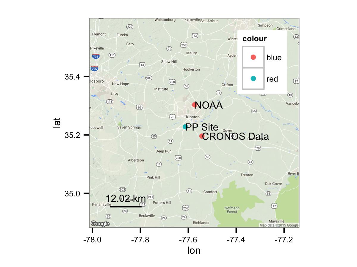
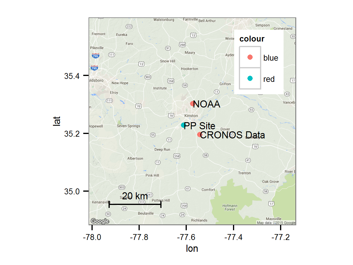
Which gives you something like this:
![Map with scale bar]()
The nice thing is that all of the plotting uses ggplot2(), so you can use the documentation at http://ggplot2.org to make this look how you need.


?OSM_scale_lookupand the associated FAQ links – Felipa