Overlay a line function on a scatter plot
Asked Answered
A

3

19

My challenge is to overlay a custom line function graph over a scatter plot I already have, the code looks like follows:

base_beta = results.params
X_plot = np.linspace(0,1,400)

g = sns.FacetGrid(data, size = 6)
g = g.map(plt.scatter, "usable_area", "price", edgecolor="w")

Where base_beta is only a constant, and then one coefficient. Basically, I want to overlay a function that plots a line y = constant + coefficient * x

I tried to overlay a line using this but it did not work.

g = g.map_dataframe(plt.plot, X_plot, X_plot*base_beta[1]+base_beta[0], 'r-')
plt.show()

The current scatter plot looks like so:
enter image description here

Can any one help me with this?

--ATTEMPT 1

base_beta = results.params
X_plot = np.linspace(0,1,400)
Y_plot = base_beta [0] + base_beta[1]*X_plot

g = sns.FacetGrid(data, size = 6)
g = g.map(plt.scatter, "usable_area", "price", edgecolor="w")
plt.plot(X_plot, Y_plot, color='r')
plt.show()

Resulted in the same graph but no line: enter image description here

Appanage answered 6/10, 2017 at 4:37 Comment(0)
C
24

You can just call plt.plot to plot a line over the data.

import numpy as np
import matplotlib.pyplot as plt
import pandas as pd
import seaborn as sns

data = pd.DataFrame()
data['usable_area'] = 5*np.random.random(200)
data['price'] =  10*data['usable_area']+10*np.random.random(200)

X_plot = np.linspace(0, 7, 100)
Y_plot = 10*X_plot+5

g = sns.FacetGrid(data, height = 6)
g = g.map(plt.scatter, "usable_area", "price", edgecolor="w")
plt.plot(X_plot, Y_plot, color='r')
plt.show()

Produces:

enter image description here

Covenanter answered 6/10, 2017 at 4:55 Comment(0)
C
24

Sample Data and Imports

import numpy as np
import pandas as pd
import seaborn as sns
import matplotlib.pyplot as plt

# create a dataframe with sample x and y
np.random.seed(365)
x = 5*np.random.random(200)
df = pd.DataFrame({'x': x, 'y': 10*x+10*np.random.random(200)})

# add custom line to the dataframe
base_beta = [10, 5]
df['y_line'] = base_beta[0] + base_beta[1]*df.x

display(df.head())
          x          y     y_line
0  4.707279  50.634968  33.536394
1  3.208014  33.890507  26.040068
2  3.423052  37.853276  27.115262
3  2.942810  29.899257  24.714052
4  2.719436  36.932170  23.597180

Add Custom Line to Scatter Plot

sns.relplot with .map or .map_dataframe

ax = sns.relplot(kind='scatter', x='x', y='y', data=df, height=3.5, aspect=1.5)
ax.map_dataframe(sns.lineplot, 'x', 'y_line', color='g')

enter image description here

sns.scatterplot with sns.lineplot

  • Plot two axes-level plots to the same figure.
fig, ax = plt.subplots(figsize=(6, 4))
p1 = sns.scatterplot(data=df, x='x', y='y', ax=ax)
p2 = sns.lineplot(data=df, x='x', y='y_line', color='g', ax=ax)

enter image description here


Regression Line to a Scatter Plot

sns.lmplot

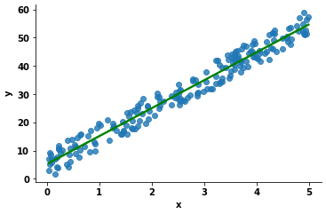
g = sns.lmplot(data=df, x='x', y='y', line_kws={'color': 'g'}, height=3.5, aspect=1.5)

enter image description here

sns.regplot

ax = sns.regplot(data=df, x='x', y='y', line_kws={'color': 'g'})

enter image description here

Ciracirca answered 19/10, 2021 at 17:50 Comment(0)
F
3

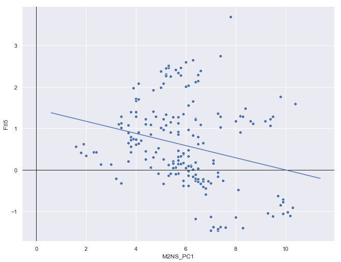
You can also overlay a Seaborn plot over the data, given you have the points that make up that line (below, I call them x_pred and y_pred):

fig, ax = plt.subplots(figsize=(11, 8.5))
sns.scatterplot(x='M2NS_PC1', y='FII5', data=ir_ms, ax=ax)
ax.axhline(y=0, color='k', linewidth=1)  # added because i want the origin
ax.axvline(x=0, color='k', linewidth=1)

fitted = sm.ols(formula='FII5 ~ M2NS_PC1', data=ir_ms).fit(cov_type='HC3')

x = ir_ms['M2NS_PC1']
x_pred = np.linspace(x.min() - 1, x.max() + 1, 50)
y_pred = fitted.predict(exog=dict(M2NS_PC1=x_pred))

sns.lineplot(x=x_pred, y=y_pred, ax=ax)

Then, just plot it all on the same axis.

enter image description here

Femininity answered 7/5, 2019 at 16:2 Comment(0)

© 2022 - 2024 — McMap. All rights reserved.