I have a DataFrame with the following structure:
interval    segment  variable        value
4   02:00:00      Night  weekdays   154.866667
5   02:30:00      Night  weekdays   100.666667
6   03:00:00      Night  weekdays    75.400000
7   03:30:00      Night  weekdays    56.533333
8   04:00:00      Night  weekdays    55.000000
9   04:30:00      Night  weekends    53.733333
10  05:00:00      Night  weekends    81.200000
11  05:30:00      Night  weekends   125.933333
14  07:00:00    Morning  weekdays   447.200000
15  07:30:00    Morning  weekends   545.200000
16  08:00:00    Morning  weekends   668.733333
17  08:30:00    Morning  weekends   751.333333
18  09:00:00    Morning  weekdays   793.800000
19  09:30:00    Morning  weekdays   781.125000
23  11:30:00       Noon  weekdays   776.375000
24  12:00:00       Noon  weekdays   741.812500
25  12:30:00       Noon  weekends   723.000000
26  13:00:00       Noon  weekends   734.562500
27  13:30:00       Noon  weekends   763.882353
28  14:00:00  Afternoon  weekdays   810.411765
31  15:30:00  Afternoon  weekdays   855.411765
32  16:00:00  Afternoon  weekdays   824.882353
33  16:30:00  Afternoon  weekends   768.529412
34  17:00:00  Afternoon  weekends   790.812500
35  17:30:00  Afternoon  weekends   809.125000
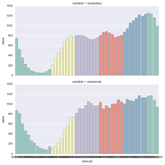
I want to produce a faceted grid of bar plots, one for each variable (weekdays/weekends) and then colour the bars according to the "segment" column.
Producing the two bar plots is very straightforward:
g = sns.FacetGrid(melted, col="variable")
g.map(sns.barplot,'interval','value')
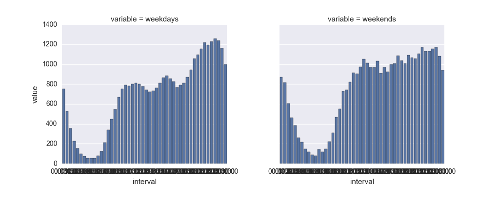
This produces (I know the xlabels are wrong, I can correct that):

I'm stuck at colouring the bars according to "segment". Per the docs, all I need to do is add the variable when instantiating the FacetGrid and set some palette:
g = sns.FacetGrid(melted, col="variable",hue="segment",palette="Set3")
g.map(sns.barplot,'interval','value')
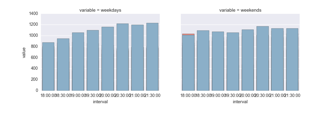
The bars are stacked in front of each other instead of being spread across the whole interval. What am I missing here?
I've created a gist with the dataset.


huein themapcall, but it is better to usefactorplot. – Alvianifactorplotdid the trick, perhaps you wanna add that as an answer – Polkafactorplothas been deprecated in favor ofcatplot. – Fullbodied