How to Make Material-UI Menu based on Hover, not Click
Asked Answered
U

9

21

I am using Material-UI Menu. It should work as it was, but just using mouse hover, not click. Here is my code link: https://codesandbox.io/embed/vn3p5j40m0

Below is the code of what I tried. It opens correctly, but doesn't close when the mouse moves away.

import React from "react";
import Button from "@material-ui/core/Button";
import Menu from "@material-ui/core/Menu";
import MenuItem from "@material-ui/core/MenuItem";

function SimpleMenu() {
  const [anchorEl, setAnchorEl] = React.useState(null);

  function handleClick(event) {
    setAnchorEl(event.currentTarget);
  }

  function handleClose() {
    setAnchorEl(null);
  }

  return (
    <div>
      <Button
        aria-owns={anchorEl ? "simple-menu" : undefined}
        aria-haspopup="true"
        onClick={handleClick}
        onMouseEnter={handleClick}
      >
        Open Menu
      </Button>
      <Menu
        id="simple-menu"
        anchorEl={anchorEl}
        open={Boolean(anchorEl)}
        onClose={handleClose}
        onMouseLeave={handleClose}
      >
        <MenuItem onClick={handleClose}>Profile</MenuItem>
        <MenuItem onClick={handleClose}>My account</MenuItem>
        <MenuItem onClick={handleClose}>Logout</MenuItem>
      </Menu>
    </div>
  );
}

export default SimpleMenu;
Uxorious answered 23/3, 2019 at 21:16 Comment(4)
The Menu opens based on the open property passed to it. You can trigger that in whatever manner you want. If you have difficulty getting it to work via hover, please share the code of what you tried that didn't work.Improvisatory
Hi, thank you for your reply. I've added the link to my code. will be waiting for your feedback.Uxorious
It seems to work. What is the problem?Improvisatory
I want the menu to disappear when the mouse cursor is hovered out the menu, not clicking the backdrop.Uxorious
I
51

The code below seems to work reasonably. The main changes compared to your sandbox are to use onMouseOver={handleClick} instead of onMouseEnter on the button. Without this change, it doesn't open reliably if the mouse isn't over where part of the menu will be. The other change is to use MenuListProps={{ onMouseLeave: handleClose }}. Using onMouseLeave directly on Menu doesn't work because the Menu includes an overlay as part of the Menu leveraging Modal and the mouse never "leaves" the overlay. MenuList is the portion of Menu that displays the menu items.

import React from "react";
import Button from "@material-ui/core/Button";
import Menu from "@material-ui/core/Menu";
import MenuItem from "@material-ui/core/MenuItem";

function SimpleMenu() {
  const [anchorEl, setAnchorEl] = React.useState(null);

  function handleClick(event) {
    if (anchorEl !== event.currentTarget) {
      setAnchorEl(event.currentTarget);
    }
  }

  function handleClose() {
    setAnchorEl(null);
  }

  return (
    <div>
      <Button
        aria-owns={anchorEl ? "simple-menu" : undefined}
        aria-haspopup="true"
        onClick={handleClick}
        onMouseOver={handleClick}
      >
        Open Menu
      </Button>
      <Menu
        id="simple-menu"
        anchorEl={anchorEl}
        open={Boolean(anchorEl)}
        onClose={handleClose}
        MenuListProps={{ onMouseLeave: handleClose }}
      >
        <MenuItem onClick={handleClose}>Profile</MenuItem>
        <MenuItem onClick={handleClose}>My account</MenuItem>
        <MenuItem onClick={handleClose}>Logout</MenuItem>
      </Menu>
    </div>
  );
}

export default SimpleMenu;

Edit Material demo

Improvisatory answered 24/3, 2019 at 22:25 Comment(6)
What if the menu list is popped below the button, not overlaid on the button and you don't even hover over the menu list and hover out the button?Uxorious
There is probably a fair amount of work to do this in a manner that is robust. I am not making any claim that my answer is robust -- just that it works OK and gives you a starting point.Improvisatory
This code example has a big flaw, if we position the popup below the button, scroll over the button to trigger the popup, then scroll left/right, the popup wont closeWatteau
Also if two such buttons are near each other, hovering the mouse from one onto the other will cause the first one not to close. (I know @RyanCogswell said he's not claiming it's robust himself, so just saying).Cryptogram
Anyone came up with a solution on how to make it work for the popup is positioned below the button?Galloglass
I've added another answer based on this one that resolves the button hover issueCordwain
C
11

I've updated Ryan's original answer to fix the issue where it doesn't close when you move the mouse off the element to the side.

How it works is to disable the pointerEvents on the MUI backdrop so you can continue to detect the hover behind it (and re-enables it again inside the menu container). This means we can add a leave event listener to the button as well.

It then keeps track of if you've hovered over either the button or menu using currentlyHovering.

When you hover over the button it shows the menu, then when you leave it starts a 50ms timeout to close it, but if we hover over the button or menu again in that time it will reset currentlyHovering and keep it open.

I've also added these lines so the menu opens below the button:

getContentAnchorEl={null}
anchorOrigin={{ horizontal: "left", vertical: "bottom" }}
import React from "react";
import Button from "@material-ui/core/Button";
import Menu from "@material-ui/core/Menu";
import MenuItem from "@material-ui/core/MenuItem";
import makeStyles from "@material-ui/styles/makeStyles";

const useStyles = makeStyles({
  popOverRoot: {
    pointerEvents: "none"
  }
});

function SimpleMenu() {
  let currentlyHovering = false;
  const styles = useStyles();

  const [anchorEl, setAnchorEl] = React.useState(null);

  function handleClick(event) {
    if (anchorEl !== event.currentTarget) {
      setAnchorEl(event.currentTarget);
    }
  }

  function handleHover() {
    currentlyHovering = true;
  }

  function handleClose() {
    setAnchorEl(null);
  }

  function handleCloseHover() {
    currentlyHovering = false;
    setTimeout(() => {
      if (!currentlyHovering) {
        handleClose();
      }
    }, 50);
  }

  return (
    <div>
      <Button
        aria-owns={anchorEl ? "simple-menu" : undefined}
        aria-haspopup="true"
        onClick={handleClick}
        onMouseOver={handleClick}
        onMouseLeave={handleCloseHover}
      >
        Open Menu
      </Button>
      <Menu
        id="simple-menu"
        anchorEl={anchorEl}
        open={Boolean(anchorEl)}
        onClose={handleClose}
        MenuListProps={{
          onMouseEnter: handleHover,
          onMouseLeave: handleCloseHover,
          style: { pointerEvents: "auto" }
        }}
        getContentAnchorEl={null}
        anchorOrigin={{ horizontal: "left", vertical: "bottom" }}
        PopoverClasses={{
          root: styles.popOverRoot
        }}
      >
        <MenuItem onClick={handleClose}>Profile</MenuItem>
        <MenuItem onClick={handleClose}>My account</MenuItem>
        <MenuItem onClick={handleClose}>Logout</MenuItem>
      </Menu>
    </div>
  );
}

export default SimpleMenu;
Edit Material demo

Cordwain answered 10/8, 2022 at 16:47 Comment(3)
makeStyles is deprecated. But you can use sx instead of PopoverClasses: | import { popoverClasses } from "@mui/material/Popover" sx={{ [&.${popoverClasses.root}]: { pointerEvents: "none" }, }}Excisable
@Cordwain this is better, but still does not work if you have some small margin between the menu items and the button. For example, adding this SX to the menu will break it: sx={{ '.MuiPaper-root': { pointerEvents: 'auto', padding: 2, marginTop: 2, borderTop: 3px solid ${theme.palette.primary.main} } }}Bombsight
on mui v5 it worked for me without PopoverClasses or getContentAnchorEl . Thanks!Gradatim
D
4

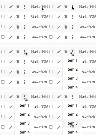
Using an interactive HTML tooltip with menu items works perfectly, without requiring you to necessarily click to view menu items.

Here is an example for material UI v.4.

enter image description here

import React from 'react';
import { withStyles, Theme, makeStyles } from '@material-ui/core/styles';
import Tooltip from '@material-ui/core/Tooltip';
import { MenuItem, IconButton } from '@material-ui/core';
import MoreVertIcon from '@material-ui/icons/MoreVert';
import styles from 'assets/jss/material-dashboard-pro-react/components/tasksStyle.js';

// @ts-ignore
const useStyles = makeStyles(styles);

const LightTooltip = withStyles((theme: Theme) => ({
  tooltip: {
    backgroundColor: theme.palette.common.white,
    color: 'rgba(0, 0, 0, 0.87)',
    boxShadow: theme.shadows[1],
    fontSize: 11,
    padding: 0,
    margin: 4,
  },
}))(Tooltip);

interface IProps {
  menus: {
    action: () => void;
    name: string;
  }[];
}
const HoverDropdown: React.FC<IProps> = ({ menus }) => {
  const classes = useStyles();
  const [showTooltip, setShowTooltip] = useState(false);
  return (
    <div>
      <LightTooltip
        interactive
        open={showTooltip}
        onOpen={() => setShowTooltip(true)}
        onClose={() => setShowTooltip(false)}
        title={
          <React.Fragment>
            {menus.map((item) => {
              return <MenuItem onClick={item.action}>{item.name}</MenuItem>;
            })}
          </React.Fragment>
        }
      >
        <IconButton
          aria-label='more'
          aria-controls='long-menu'
          aria-haspopup='true'
          className={classes.tableActionButton}
        >
          <MoreVertIcon />
        </IconButton>
      </LightTooltip>
    </div>
  );
};

export default HoverDropdown;

Usage:

<HoverDropdown
        menus={[
          {
            name: 'Item 1',
            action: () => {
              history.push(
                codeGeneratorRoutes.getEditLink(row.values['node._id'])
              );
            },
          },{
            name: 'Item 2',
            action: () => {
              history.push(
                codeGeneratorRoutes.getEditLink(row.values['node._id'])
              );
            },
          },{
            name: 'Item 3',
            action: () => {
              history.push(
                codeGeneratorRoutes.getEditLink(row.values['node._id'])
              );
            },
          },{
            name: 'Item 4',
            action: () => {
              history.push(
                codeGeneratorRoutes.getEditLink(row.values['node._id'])
              );
            },
          },
        ]}
      />
Difficile answered 30/11, 2021 at 7:2 Comment(1)
I have updated the code to work on mobile.Difficile
E
4

As GaddMaster says, the answer of Ryan Cogswell has a flaw:

if we position the popup below the button, scroll over the button to trigger the popup, then scroll left/right, the popup wont close

This is because the Menu inherited from Popover which inherited from Modal. The z-index of Modal is 1300. onMouseLeave can be triggered only when the z-index of Button is bigger than Modal.

export default function App() {
  // ...

  return (
    <>
      <Button
        sx={{ zIndex: (theme) => theme.zIndex.modal + 1 }}
        onClick={handleOpen}
        onMouseEnter={handleOpen}
        onMouseLeave={handleClose}
      >
        Hover Me
      </Button>
      <Menu
        anchorEl={anchorEl}
        open={open}
        onClose={handleMenuClose}
        MenuListProps={{
          onMouseLeave: handleMenuClose,
          onMouseEnter: handleMenuEnter
        }}
      >
        <MenuItem>Hi</MenuItem>
        <MenuItem>Hello</MenuItem>
        <MenuItem>Bye</MenuItem>
      </Menu>
    </>
  );
}

And because we have double(Button and Menu) mouse enter and leave event to handle menu open or close, it needs to use setTimeout to prevent to trigger close event after enter to the other element.

  const [anchorEl, setAnchorEl] = React.useState<null | HTMLElement>(null);

  const open = Boolean(anchorEl);

  const handleOpen = (event: React.MouseEvent<HTMLButtonElement>) => {
    setAnchorEl(event.currentTarget);
  };

  let timeoutId: NodeJS.Timeout | null = null;

  const handleClose = () => {
    if (!!timeoutId) {
      clearTimeout(timeoutId);
    }
    timeoutId = setTimeout(() => {
      setAnchorEl(null);
    }, 0);
  };

  const handleMenuClose = () => {
    setAnchorEl(null);
  };

  const handleMenuEnter = () => {
    if (!!timeoutId) {
      clearTimeout(timeoutId);
    }
  };

Edit objective-sound-qhwv5l

Endo answered 13/7, 2023 at 15:9 Comment(0)
D
2

As p8ul mentioned, BEST trick to get this done is via tooltip. Here is Mui Version 5 that I implemented

// components/AppBarMenu.tsx


import styled from '@emotion/styled';
import Tooltip, { TooltipProps, tooltipClasses } from '@mui/material/Tooltip';

const AppBarMenu = styled(({ className, ...props }: TooltipProps) => (
    <Tooltip {...props} classes={{ popper: className }} arrow placement="bottom-start" />
))(({ theme }: any) => ({
    [`& .${tooltipClasses.tooltip}`]: {
        backgroundColor: theme.palette.primary.light,
        fontSize: theme.typography.pxToRem(12),
        borderRadius: 12
    }
}));

export default AppBarMenu;

Usage

.
.
.
    const [productMenuOpen, setProductMenuOpen] = useState(false);
.
.
.


                            <AppBarMenu
                                open={productMenuOpen}
                                onOpen={() => setProductMenuOpen(true)}
                                onClose={() => setProductMenuOpen(false)}
                                title={
                                    <React.Fragment>
                                        <MenuItem component={RouteLink} to="/" onClick={() => setProductMenuOpen(false)}>
                                            <ListItemIcon>
                                                <Icon fontSize="small" />
                                            </ListItemIcon>
                                            Product
                                        </MenuItem>
                                        <MenuItem onClick={() => setProductMenuOpen(false)}>
                                            <ListItemIcon>
                                                <AppRegistrationIcon fontSize="small" />
                                            </ListItemIcon>
                                            Product
                                        </MenuItem>
                                        <MenuItem onClick={() => setProductMenuOpen(false)}>
                                            <ListItemIcon>
                                                <TableChartIcon fontSize="small" />
                                            </ListItemIcon>
                                            Product
                                        </MenuItem>
                                        <Divider />
                                        <MenuItem disabled>
                                            <Typography variant="body2">About</Typography>
                                        </MenuItem>
                                        <MenuItem component={RouteLink} to="product/pricing" onClick={() => setProductMenuOpen(false)}>
                                            Pricing
                                        </MenuItem>
                                        <MenuItem onClick={() => setProductMenuOpen(false)}>Features</MenuItem>
                                        <MenuItem onClick={() => setProductMenuOpen(false)}>Data Coverage</MenuItem>
                                    </React.Fragment>
                                }
                            >
                                <MenuItemButton
                                    onClick={scrollToTop}
                                    sx={{ my: 2, color: 'white', display: 'block' }}
                                    aria-controls={productMenuOpen ? 'product-menu' : undefined}
                                    aria-haspopup="true"
                                    aria-expanded={productMenuOpen ? 'true' : undefined}
                                >
                                    Products
                                </MenuItemButton>
                            </AppBarMenu>

Distill answered 29/4, 2023 at 10:52 Comment(0)
L
0

I gave up using Menu component because it implemented Popover. To solve the overlay problem I had to write too much code. So I tried to use the old CSS way:

CSS: relative parent element + absolute menu element

Component: Paper + MenuList

<ListItem>
  <Link href="#" >
    {user.name}
  </Link>
  <AccountPopover elevation={4}>
     <MenuList>
        <MenuItem>Profile</MenuItem>
        <MenuItem>Logout</MenuItem>
     </MenuList>
  </AccountPopover>
</ListItem>

styled components:

export const ListItem = styled(Stack)(() => ({
  position: 'relative',
  "&:hover .MuiPaper-root": {
    display: 'block'
  }
}))


export const AccountPopover = styled(Paper)(() => ({
  position: 'absolute',
  zIndex:2,
  right: 0,
  top: 30,
  width: 170,
  display: 'none'
}))


Logarithmic answered 5/9, 2022 at 6:57 Comment(0)
B
0
use **MenuListProps** in the Menu component and use your menu **closeFunction** -

MenuListProps={{ onMouseLeave: handleClose }}

example- 
 <Menu
      dense
      id="demo-positioned-menu"
      anchorEl={anchorEl}
      open={open}
      onClose={handleCloseMain}
      title={item?.title}
      anchorOrigin={{
            vertical: "bottom",
            horizontal: "right",
                    }}
      transformOrigin={{
            vertical: "top",
            horizontal: "center",
                    }}
      MenuListProps={{ onMouseLeave: handleClose }}
 />

I hope it will work perfectly.
Barnet answered 20/2, 2023 at 8:28 Comment(0)
L
0

I think you should use the HoverMenu component provided by the "material-ui-popup-state" package. you can find an example here: https://jcoreio.github.io/material-ui-popup-state/ https://github.com/jcoreio/material-ui-popup-state

Lammergeier answered 29/12, 2023 at 15:11 Comment(1)
Welcome to SO! At SO we do not provide answers that are links to external sites, because we cannot guarantee there availability in the future. Try to extract a code example from there, display it here as code, and attribute credit to the original coder and site.Slipper
H
0

I found Jules Dupont's answer to a related question useful. The advantage of his solution is, that the menu closes upon moving the mouse out of the button. I adapted his approach to the current syntax.

export default function App(props) {
  const [anchorEl, setAnchorEl] = useState<null | HTMLElement>(null);
  const [open,setOpen] = useState<boolean>(false);
  const [mouseOverButton, setMouseOverButton] = useState<boolean>(false);
  const [mouseOverMenu, setMouseOverMenu] = useState<boolean>(false);

  const handleAdminClose = () => {
    setMouseOverButton(false)
    setMouseOverMenu(false)
  }
  const enterButton = (event: React.MouseEvent<HTMLElement>) => {
    setMouseOverButton(true)
    setAnchorEl(event.currentTarget)
  }

  const leaveButton = () => {
    setTimeout(() => {
     setMouseOverButton(false);
    }, 1000);
 }

  const enterMenu = () => {
    setMouseOverMenu(true);
  }

  const leaveMenu = () => {
     setTimeout(() => {
      setMouseOverMenu(false);
     }, 100);
  }
useEffect(() => setOpen(mouseOverButton || mouseOverMenu),[mouseOverButton,mouseOverMenu])


  return (
    <>
              <List>
                <ListItem disablePadding>
                  <ListItemButton>
                    <>
                    <ListItemText
                      primary='Button with menu on hover'
                      aria-controls={open ? 'basic-menu' : undefined}
                      aria-haspopup="true"
                      aria-expanded={open ? 'true' : undefined}
                      onMouseOver={enterButton}
                      onMouseLeave={leaveButton}
                    />
                    <Menu
                      id="basic-menu"
                      anchorEl={anchorEl}
                      open={open}
                      onClose={handleAdminClose}
                      MenuListProps={{
                        onMouseOver: enterMenu,
                        onMouseLeave: leaveMenu,
                        'aria-labelledby': 'basic-button',
                      }}
                    >
                      <MenuItem onClick={handleAdminClose}>Item1</MenuItem>
                      <MenuItem onClick={handleAdminClose}>Item2</MenuItem>
                      <MenuItem onClick={handleAdminClose}>Item3</MenuItem>
                    </Menu>
                    </>
                  </ListItemButton>

                  <ListItemButton>
                    <ListItemText primary='Another button' />
                  </ListItemButton>

                </ListItem>
              </List>
    </>
  );
}
Heilungkiang answered 22/1 at 12:46 Comment(0)

© 2022 - 2024 — McMap. All rights reserved.