How to switch between themes in Ant design v4 dynamically?
Asked Answered
M

8

22

I'd like to implement switching between dark/light theme dynamically with Ant design v4.

It's possible to customize the theme with other CSS/LESS imports as it's written here: https://ant.design/docs/react/customize-theme#Use-dark-theme

But I'm not sure how to switch between those themes dynamically from the code. I have a variable in my React app (darkMode) which indicates if the dark theme is currently used. I have to provide correct CSS files when this variable is changed. But I can't import CSS dynamically only when some condition is fulfilled, because it's not way how the imports work.

I tried to do something messy with require like in the following code, but it's a very very bad approach and it's still not working properly (because CSS is injected but probably not withdrawn. ):

const Layout = () => {
  ...
  useEffect(() => {
    if (darkMode === true) {
      require("./App.dark.css")
    } else {
      require("./App.css")
    }
  }, [darkMode])

  return (
    <Home />
  )
}

It should be possible to switch themes somehow because it's already implemented in Ant design docs (https://ant.design/components/button/):

Theme switch in Antd docs

Do you have any idea how to do it?

Thanks!

Mordacious answered 2/3, 2020 at 15:23 Comment(2)
Is the website at ant.design/components/button opensource? I can't seem to find it in their repositories. Many of their websites are opensource. It would be very useful to see how they implement this on their own site.Ulcer
The best option for me is using post-css plugin as described in dev.to/maqi1520/…. It creates additional .dark class with dark colors only. Basically the class can be cosindered as a diff between default and dark theme. It's easy to write toogle component and doesn't have downsides like client processing of the stylesheet (slow) or flash when loading or switching. It's compatbile with customize-cra. Caveat is that there is issue with the build - sometimes it produces broken css. Trying to resolve those. Will add comment.Laclair
C
5

This is what I am using for now -

PS -

  1. I don't know if this will yield optimal bundle size.
  2. changing theme results in a page reload.

make a folder called "themes" - it would have 6 files -> dark-theme.css, dark-theme.jsx, light-theme.css, light-theme.jsx, use-theme.js, theme-provider.jsx. Each of them is described below.


dark-theme.css

import "~antd/dist/antd.dark.css";

dark-theme.jsx

import "./dark-theme.css";
const DarkTheme = () => <></>;
export default DarkTheme;

light-theme.css

@import "~antd/dist/antd.css";

light-theme.jsx

import "./light-theme.css";
const LightTheme = () => <></>;
export default LightTheme;

use-theme.js A custom hook that different components can use -

import { useEffect, useState } from "react";

const DARK_MODE = "dark-mode";

const getDarkMode = () => JSON.parse(localStorage.getItem(DARK_MODE)) || false;

export const useTheme = () => {
  const [darkMode, setDarkMode] = useState(getDarkMode);

  useEffect(() => {
    const initialValue = getDarkMode();
    if (initialValue !== darkMode) {
      localStorage.setItem(DARK_MODE, darkMode);
      window.location.reload();
    }
  }, [darkMode]);

  return [darkMode, setDarkMode];
};

theme-provider.jsx

import { lazy, Suspense } from "react";
import { useTheme } from "./use-theme";

const DarkTheme = lazy(() => import("./dark-theme"));
const LightTheme = lazy(() => import("./light-theme"));

export const ThemeProvider = ({ children }) => {
  const [darkMode] = useTheme();

  return (
    <>
      <Suspense fallback={<span />}>
        {darkMode ? <DarkTheme /> : <LightTheme />}
      </Suspense>
      {children}
    </>
  );
};

change index.js to -

ReactDOM.render(
  <React.StrictMode>
    <ThemeProvider>
      <App />
    </ThemeProvider>
  </React.StrictMode>,
  document.getElementById("root")
);

now, in my navbar suppose I have a switch to toggle the theme. This is what it would look like -

const [darkMode, setDarkMode] = useTheme();
<Switch checked={darkMode} onChange={setDarkMode} />
Capitulary answered 15/10, 2021 at 4:12 Comment(1)
Very nice. Thanks for the code.Humperdinck
B
2

you must create 2 components

the first one :

import './App.dark.css'

const DarkApp =() =>{
   //the app container
}

and the second :

import './App.light.css'

const LightApp =() =>{
   //the app container
}

and create HOC to handle darkMode like this :

const AppLayout = () =>{
const [isDark , setIsDark] = useState(false);


return (
 <>
  {
  isDark ? 
    <DarkApp /> :
      <LightApp />
  }
 </>
 )
}
Bowerbird answered 1/3, 2021 at 9:15 Comment(1)
It doesn't work just like that - both components are loaded. You need lazy loading as described bellow.Humperdinck
R
2

ANTD internally uses CSS variables for the "variable.less" file. We can override these variables to make the default variables have dynamic values at runtime.

This is one way it can be achieved:

app-colors.less file:

:root{
    --clr-one: #fff;
    --clr-two: #000;
    --clr-three: #eee;
}

// Dark theme colors
[data-thm="dark"]{
    --clr-one: #f0f0f0;
    --clr-two: #ff0000;
    --clr-three: #fff;
}

We can now override the default ANTD variables in antd-overrides.less file:

@import <app-colors.less file-path>;

@primary-color: var(--clr-one);
@processing-color: var(--clr-two);
@body-background: var(--clr-three);

We usually import the antd.less file to get the antd styles, We would change that to "antd.variable.less"(to use css variables).

index.less file:

@import "~antd/dist/antd.variable.less";
@import <antd-overrides.less file-path>;

Now we need to toggle the "data-thm" attribute on a parent container(body tag recommended) to change the set of CSS variables that get used.

const onThemeToggle = (themeType) => {
  const existingBodyAttribute = document.body.getAttribute("data-thm");
  if (themeType === "dark" && existingBodyAttribute !== "dark") {
    document.body.setAttribute("data-thm", "dark");
  } else if (themeType === "light" && existingBodyAttribute) {
    document.body.removeAttribute("data-thm");
  }
};

The above piece of code can be called on a Theme toggle button or during component mount.

Rhnegative answered 24/6, 2022 at 7:44 Comment(0)
M
1

In Ant's example one suggestion is to import your "dark mode" CSS or LESS file into your main style sheet.

// inside App.css
@import '~antd/dist/antd.dark.css';

Instead of trying to toggle stylesheets, the "dark" styles are combined with base styles in one stylesheet. There are different ways to accomplish this, but the common pattern will be:

  1. have a dark-mode selector of some sort in your CSS
  2. put that selector in your HTML
  3. have a way to toggle it on or off.

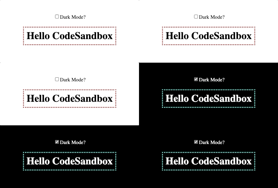
Here is a working example:

https://codesandbox.io/s/compassionate-elbakyan-f7tun?file=/src/App.js

dark mode toggle

In this example, toggling the state of darkMode will add or remove a dark-mode className to the top level container.

import React, { useState } from "react";
import "./styles.css";

export default function App() {
  const [darkMode, setDarkMode] = useState(false);

  return (
    <div className={`App ${darkMode && "dark-mode"}`}>
      <label>
        <input
          type="checkbox"
          checked={darkMode}
          onChange={() => setDarkMode((darkMode) => !darkMode)}
        />
        Dark Mode?
      </label>
      <h1>Hello CodeSandbox</h1>
    </div>
  );
}

If darkMode is true, and the dark-mode className is present, those styles will be used:

h1 {
  padding: 0.5rem;
  border: 3px dotted red;
}

.dark-mode {
  background: black;
  color: white;
}

.dark-mode h1 {
  border-color: aqua;
}
Mussulman answered 3/5, 2021 at 14:43 Comment(0)
L
1

Ant Design newly start to support dynamic theme support. But its on experimental usage. You can find details on this link.

Legibility answered 15/10, 2021 at 6:37 Comment(2)
do you have an example which shows switching between dark/light theme dynamically...Capitulary
While this link may answer the question, it is better to include the essential parts of the answer here and provide the link for reference. Link-only answers can become invalid if the linked page changes. - From ReviewChenay
K
0

Conditional require won't block using previously required module. So, whenever your condition matches the require will available in your app. So, your both required module will be used. Instead of requiring them, insert stylesheet and remove to toggle between them:

const head = document.head
const dark = document.createElement('link')
const light = document.createElement('link')
dark.rel = 'stylesheet'
light.rel = 'stylesheet'
dark.href = 'antd.dark.css'
light.href = 'antd.light.css'

useEffect(() => {
  const timer = setTimeout(() => {
    if (darkMode) {
      if (head.contains(light)) {
        head.removeChild(light)
      }
      head.appendChild(dark)
    } else {
      if (head.contains(dark)) {
        head.removeChild(dark)
      }
      head.appendChild(light)
    }
  }, 500)
 return () => clearTimeout(timer)
}, [darkMode])
Knownothing answered 5/6, 2021 at 18:22 Comment(0)
V
0

This package will help you to export and use theme vars without losing performance

Vulgar answered 18/10, 2022 at 1:18 Comment(1)
While this link may answer the question, it is better to include the essential parts of the answer here and provide the link for reference. Link-only answers can become invalid if the linked page changes. - From ReviewEtymology
H
-3
  1. Using less compiler in runtime:
    https://medium.com/@mzohaib.qc/ant-design-dynamic-runtime-theme-1f9a1a030ba0

  2. Import less code into wrapper
    https://github.com/less/less.js/issues/3232

.any-scope {
    @import url('~antd/dist/antd.dark.less');
}
Hanger answered 20/3, 2020 at 10:15 Comment(2)
How to do this using create react app?Millwright
Compiling less during runtime isn't as performant. Someone tried many methods and found the most performant way was to use cssvars: github.com/ant-design/ant-design/issues/…Spiny

© 2022 - 2024 — McMap. All rights reserved.