I think the most efficient way to create the desired plot consists from three steps:
- Write two separate simple stats (following section Creating a new stat from https://cran.r-project.org/web/packages/ggplot2/vignettes/extending-ggplot2.html): one for adding vertical lines at percentile locations and another for adding text labels;
- Combine just written stats into the desired one with parameters as needed;
- Use the results of work.
So the answer also consists from 3 parts.
Part 1. The stat for adding vertical lines at percentile locations should compute those values based on the data in x-axis and return the result in appropriate format. Here is the code:
library(ggplot2)

StatPercentileX <- ggproto("StatPercentileX", Stat,
  compute_group = function(data, scales, probs) {
    percentiles <- quantile(data$x, probs=probs)
    data.frame(xintercept=percentiles)
    },
  required_aes = c("x")
)

stat_percentile_x <- function(mapping = NULL, data = NULL, geom = "vline",
                              position = "identity", na.rm = FALSE,
                              show.legend = NA, inherit.aes = TRUE, ...) {
  layer(
    stat = StatPercentileX, data = data, mapping = mapping, geom = geom,
    position = position, show.legend = show.legend, inherit.aes = inherit.aes,
    params = list(na.rm = na.rm, ...)
  )
}
The same goes for the stat for adding text labels (the default location is at the top of the plot):
StatPercentileXLabels <- ggproto("StatPercentileXLabels", Stat,
  compute_group = function(data, scales, probs) {
    percentiles <- quantile(data$x, probs=probs)
    data.frame(x=percentiles, y=Inf,
               label=paste0("p", probs*100, ": ",
                            round(percentiles, digits=3)))
    },
  required_aes = c("x")
)

stat_percentile_xlab <- function(mapping = NULL, data = NULL, geom = "text",
                                     position = "identity", na.rm = FALSE,
                                     show.legend = NA, inherit.aes = TRUE, ...) {
  layer(
    stat = StatPercentileXLabels, data = data, mapping = mapping, geom = geom,
    position = position, show.legend = show.legend, inherit.aes = inherit.aes,
    params = list(na.rm = na.rm, ...)
  )
}
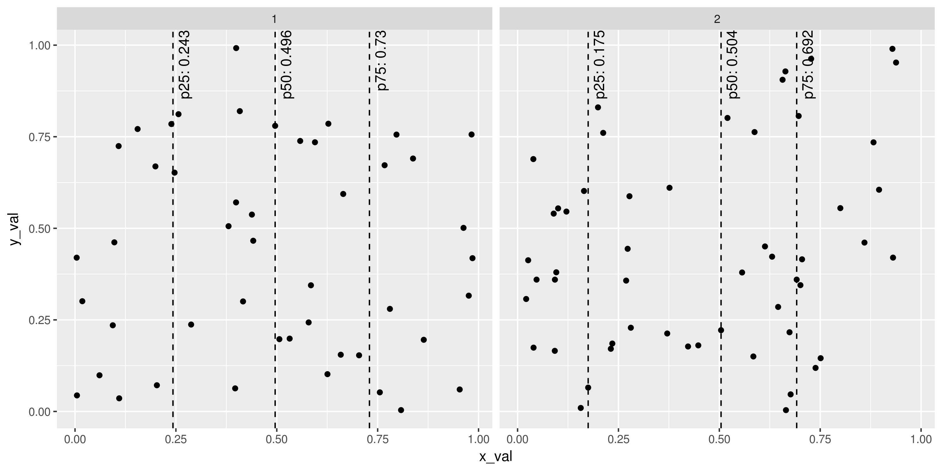
Already we have pretty powerful instruments that can be used in any fashion ggplot2 can provide (colouring, grouping, faceting and so on). For example:
set.seed(1401)
plot_points <- data.frame(x_val=runif(100), y_val=runif(100),
                          g=sample(1:2, 100, replace=TRUE))
ggplot(plot_points, aes(x=x_val, y=y_val)) +
  geom_point() +
  stat_percentile_x(probs=c(0.25, 0.5, 0.75), linetype=2) +
  stat_percentile_xlab(probs=c(0.25, 0.5, 0.75), hjust=1, vjust=1.5, angle=90) +
  facet_wrap(~g)
# ggsave("Example_stat_percentile.png", width=10, height=5, units="in")
![enter image description here]()
Part 2 Although keeping separate layers for lines and text labels seems pretty natural (despite a little computational inefficiency of computing percentiles twice) adding two layers every time is quite verbose. Especially for this ggplot2 has simple way of combining layers: put them in the list which is the result function call. The code is as follows:
stat_percentile_x_wlabels <- function(probs=c(0.25, 0.5, 0.75)) {
  list(
    stat_percentile_x(probs=probs, linetype=2),
    stat_percentile_xlab(probs=probs, hjust=1, vjust=1.5, angle=90)
  )
}
With this function previous example can be reproduced via the following command:
ggplot(plot_points, aes(x=x_val, y=y_val)) +
  geom_point() +
  stat_percentile_x_wlabels() +
  facet_wrap(~g)
Note that stat_percentile_x_wlabels takes probabilities of the desired percentiles which are then passed to quantile function. This is the place to specify them.
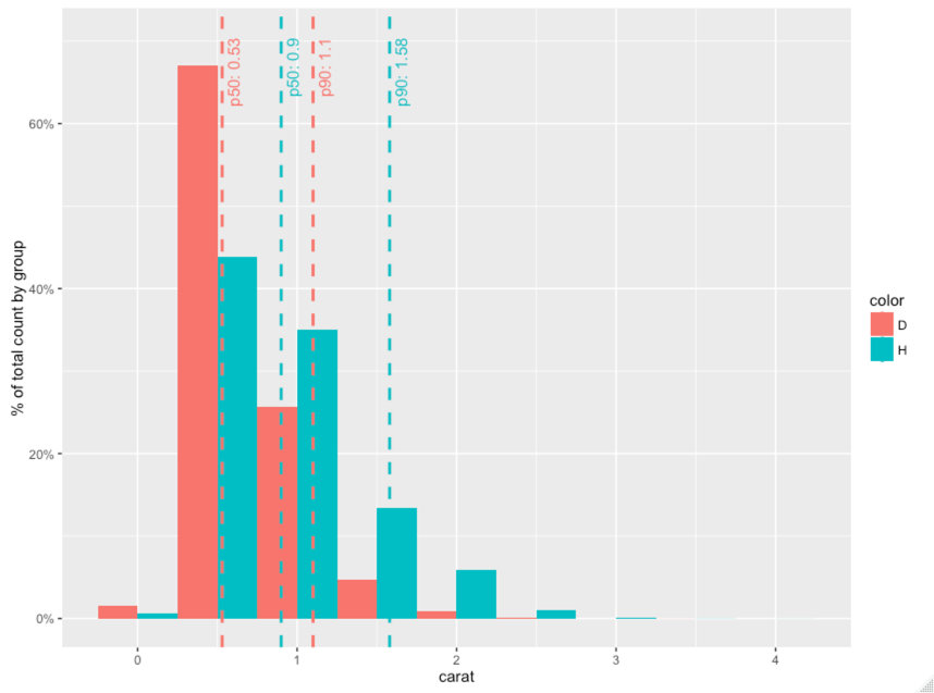
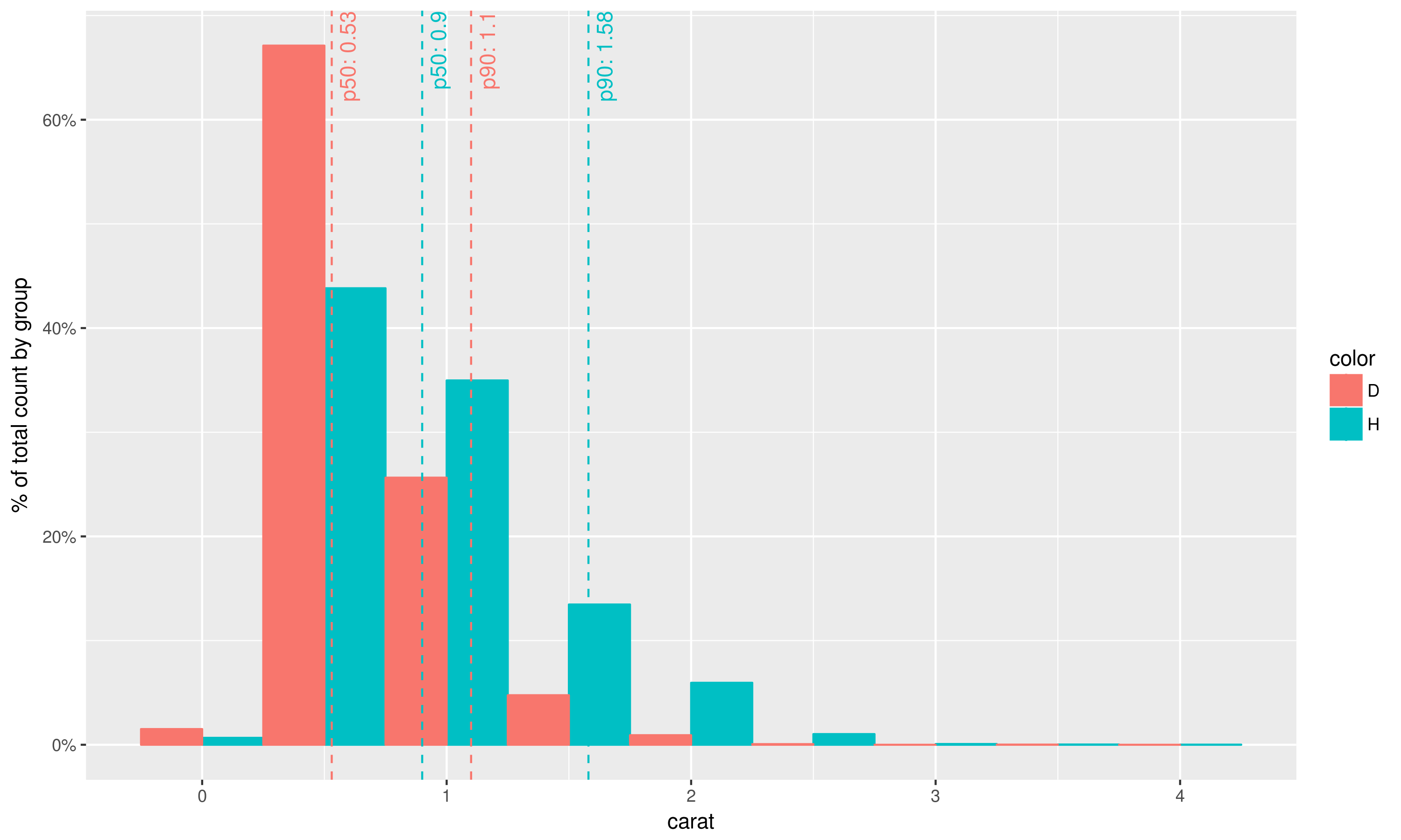
Part 3 Using again the idea of combining layers the plot in your question can be reproduced as follows:
library(scales)
library(dplyr)

geom_histo_pct_by_group <- function() {
  list(geom_histogram(aes(y=unlist(lapply(unique(..group..),
                                          function(grp) {
                                            ..count..[..group..==grp] /
                                              sum(..count..[..group..==grp])
                                            }))),
                      binwidth=0.5, position="dodge"),
         scale_y_continuous(labels = percent),
         ylab("% of total count by group")
       )
}

data = diamonds %>% select(carat, color) %>% filter(color %in% c('H', 'D'))

ggplot(data, aes(carat, fill=color, colour=color)) +
  geom_histo_pct_by_group() +
  stat_percentile_x_wlabels(probs=c(0.5, 0.9))
# ggsave("Question_plot.png", width=10, height=6, unit="in")
![enter image description here]()
Remarks
The way this problem is solved here allows constructing more complex plots with percentile lines and labels;
With changing x to y (and vice versa), vline to hline, xintercept to yintercept in appropriate places one can define the same stats for the data from y-axis;
Of course if you like using %>% instead of ggplot2's + you can wrap defined stats in functions just like you did in question post. Personally I wouldn't recommend that because it goes against standard use of ggplot2.


list()capability. – Ignacia