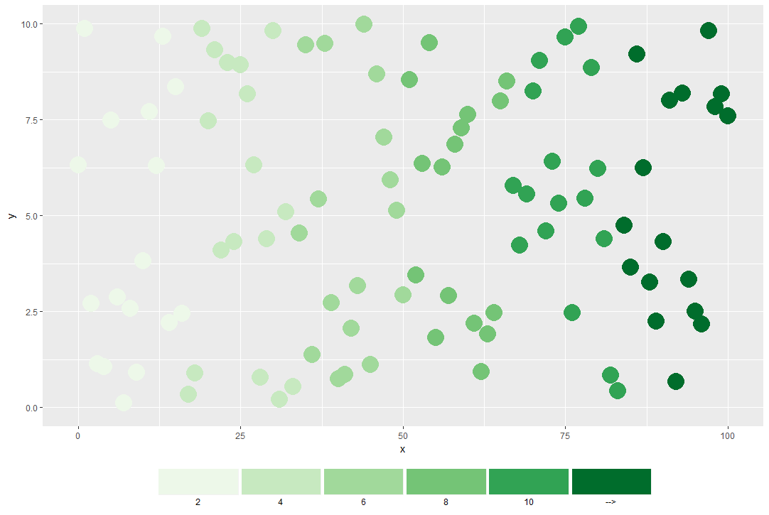
I usually plot maps using GrADS, and usually I use a color legend that in the plot will look like this:

I would like to do the same using ggplot2 in R. If using simply:
g <- g + scale_fill_brewer(palette="Greens", na.value="NA", name=legendtitle)
#g is the previously saved plot with some simple options, prepared with cut()
The output is of course this:

So I'd like to be able to do two things:
- Shift the labels so they are between the colors, note indicating the interval above (note: renaming the labels is not the problem, shifting them is)
- Last label should be arrow-like, to indicate that entries above the maximum (10 in the example) are indicated in the darkest color (dark green in the example).
EDIT:
Using help from the answer below, I've come to this:

Part 1. of my question is almost solved, even if it does not look perfect. I'd really like to get rid of the white space between the colors, any idea? Part 2... I have no idea whatsoever.
My code snippet uses:
theme(legend.position="bottom", legend.key.width = unit(1, "cm"), legend.key.height = unit(0.3, "cm")) + guides(fill=guide_legend(label.position = "bottom", label.hjust = 1.2))


 For the arrows, I have absolutely no idea how you would do this with
legend.margintheme element. – Cooking