How to calculate and plot multiple linear trends for a time series?
Asked Answered
G

1

7

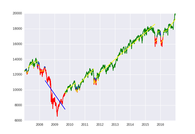
Fitting a linear trend to a set of data is straight forward. But how can I fit multiple trend lines to one time series? I define up and down trends as prices above or below a exponential moving average. When the price is above the EMA I need to fit a positive trend and when the trend turns negative a new negative trend line and so forth. In my code below the market_data['Signal'] in my pandas dataframe tells me if the trend is up +1 or down -1.

I'm guessing I need some kind of a loop, but I cannot work out the logic...

import pandas as pd
import pandas_datareader.data as web
import datetime as dt
import numpy as np
import matplotlib.pyplot as plt
import matplotlib.patches as mpatches
import matplotlib.dates as mdates

#Colecting data
market = '^DJI'
end = dt.datetime(2016, 12, 31)
start = dt.date(end.year-10, end.month, end.day)
market_data = web.DataReader(market, 'yahoo', start, end)

#Calculating EMA and difference
market_data['ema'] = market_data['Close'].ewm(200).mean()
market_data['diff_pc'] = (market_data['Close'] / market_data['ema']) - 1

#Defining bull/bear signal
TH = 0
market_data['Signal'] = np.where(market_data['diff_pc'] > TH, 1, 0)
market_data['Signal'] = np.where(market_data['diff_pc'] < -TH, -1, market_data['Signal'])

To fit the trend lines I wan to use numpy polyfit

x = np.array(mdates.date2num(market_data.index.to_pydatetime()))
fit = np.polyfit(x, market_data['Close'], 1)

Ideally I would like to only plot the trends where the signal last more than n periods.

The result should look something like this:

enter image description here

Geodetic answered 28/1, 2017 at 5:34 Comment(2)
I'm not sure if I have understood completely... So you want to create multiple linear fits for segments of the data, each of which is delimited by either +1 or -1 in market_data['Signal'], is that correct?Moreen
Yes, that is correct. Ideally only when I have more than n +1 ot -1 in a row..Geodetic
M
17

Here is a solution. min_signal is the number of consecutive signals in a row that are needed to change trend. I imported Seaborn to get a better-looking plot, but it works all the same without that line:

import pandas as pd
import pandas_datareader.data as web
import datetime as dt
import numpy as np
import matplotlib.pyplot as plt
import matplotlib.patches as mpatches
import matplotlib.dates as mdates

#Colecting data
market = '^DJI'
end = dt.datetime(2016, 12, 31)
start = dt.date(end.year-10, end.month, end.day)
market_data = web.DataReader(market, 'yahoo', start, end)

#Calculating EMA and difference
market_data['ema'] = market_data['Close'].ewm(200).mean()
market_data['diff_pc'] = (market_data['Close'] / market_data['ema']) - 1

#Defining bull/bear signal
TH = 0
market_data['Signal'] = np.where(market_data['diff_pc'] > TH, 1, 0)
market_data['Signal'] = np.where(market_data['diff_pc'] < -TH, -1, market_data['Signal'])


# Plot data and fits

import seaborn as sns  # This is just to get nicer plots

signal = market_data['Signal']

# How many consecutive signals are needed to change trend
min_signal = 2

# Find segments bounds
bounds = (np.diff(signal) != 0) & (signal[1:] != 0)
bounds = np.concatenate(([signal[0] != 0], bounds))
bounds_idx = np.where(bounds)[0]
# Keep only significant bounds
relevant_bounds_idx = np.array([idx for idx in bounds_idx if np.all(signal[idx] == signal[idx:idx + min_signal])])
# Make sure start and end are included
if relevant_bounds_idx[0] != 0:
    relevant_bounds_idx = np.concatenate(([0], relevant_bounds_idx))
if relevant_bounds_idx[-1] != len(signal) - 1:
    relevant_bounds_idx = np.concatenate((relevant_bounds_idx, [len(signal) - 1]))

# Iterate segments
for start_idx, end_idx in zip(relevant_bounds_idx[:-1], relevant_bounds_idx[1:]):
    # Slice segment
    segment = market_data.iloc[start_idx:end_idx + 1, :]
    x = np.array(mdates.date2num(segment.index.to_pydatetime()))
    # Plot data
    data_color = 'green' if signal[start_idx] > 0 else 'red'
    plt.plot(segment.index, segment['Close'], color=data_color)
    # Plot fit
    coef, intercept = np.polyfit(x, segment['Close'], 1)
    fit_val = coef * x + intercept
    fit_color = 'yellow' if coef > 0 else 'blue'
    plt.plot(segment.index, fit_val, color=fit_color)

This is the result:

Result

Moreen answered 30/1, 2017 at 12:59 Comment(6)
Tnx a lot for your efforts. Two question pls. 1) Are all the values for market_data['Close'] included in the graph or only data for where consecutive signals condition is met. I need the whole time series in the graph, although the fitting is only for the segments. 2) How do I get the dates back on the x-axis?Geodetic
@Geodetic As it is right now, all market_data['Close'] is plotted (in green and red), and the fits (in yellow and blue) cover the whole X axis too; that is, every data point is inside some segment (and each segment starts when min_signal consecutive non-zero equal values are found). If you need something different, try to specify exactly how the data should be segmented. The dates for each segment are still on segment.index. I used mdates.date2num and to_pydatetime to convert the dates because that is what you were using in your code initially.Moreen
1) Great. 2) I know, because numpy (and polyfit) does not handle pandas date formats. How do I change your code to graph the dates on the x-axis?Geodetic
@Geodetic You can just replace the x in the plot calls with segment.index. I have changed the code and the picture in the answer. If you want more advanced date formatting you can take a look at some of the Matplotlib examples.Moreen
Good stuff, tnx vm for all your help!Geodetic
@jdehesa Please let me know if you know an answer for this: #55276161 Thank you :)Dinin

© 2022 - 2024 — McMap. All rights reserved.