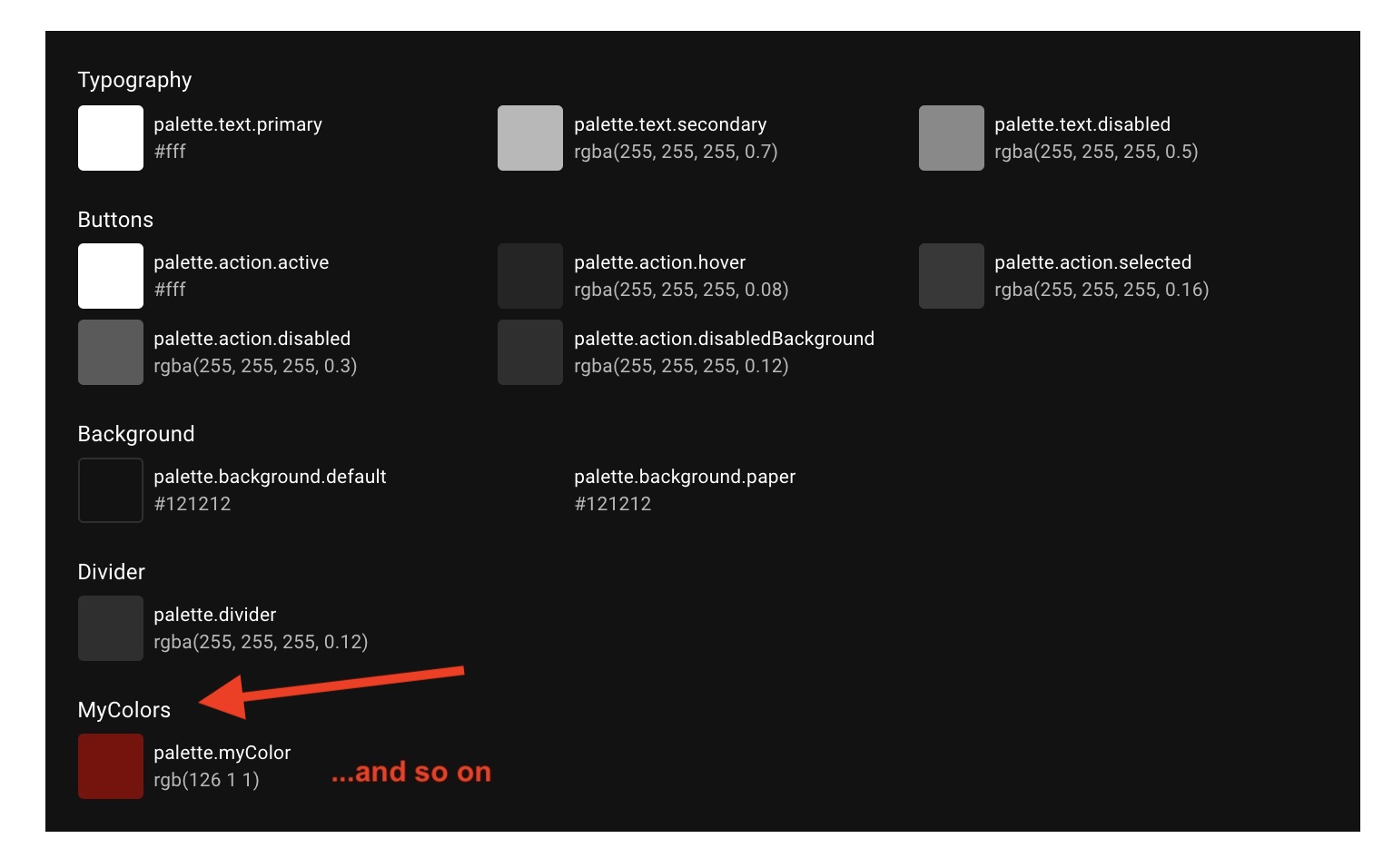
Material UI's default theme ships a palette of colors, including a special set of dark colors (docs, code).
What makes these dark mode colors special is components who consume them don't need to depend on knowing the theme's palette.mode (aka light/dark mode) - they update automatically.
codesandbox demo
My goal is to extend this set of colors, such that components I write can use new colors beyond this built-in set, e.g. theme.palette.myColor and benefit from the same automatic behavior.
In other words, I don't want to have dark mode logic be duplicated in each theme-consuming component:
const WhatIDontWantComponent = () => (
  <Box
    sx={{
      color: (theme) =>
        theme.palette.mode === "light"
          ? theme.palette.myColor.light
          : theme.palette.myColor.dark,
    }}
  />
);
I instead want to use
const WhatIWantComponent = () => (
  <Box
    sx={{
      color: (theme) => theme.palette.myColor
    }}
  />
);
So myColor would be included in the light/dark set that already exists, and benefit from this automatic behavior.
Possible? Is there some way to accomplish this within my app without patching MUI in some way to accept custom colors?
deps
- @material-ui/core version 5.0.0-beta.4
- react, react-dom 17.0.2
- next.js 11.0


ThemeProvider. The problem with adding custom colors in the way you've described is that these are not included in the set the built-in dark mode toggles. Instead it looks like I need to custom colors to this object: github.com/mui-org/material-ui/blob/v5.0.0-beta.4/packages/… – Hett