Sparklines in ggplot2
Asked Answered
D

1

22

Tufte Sparklines (as illustrated in his Beautiful Evidence) have been replicated in base graphics as part of YaleToolkit and further perfected as a result of this question. Sparklines have also been done in lattice as a part of my small side project Tufte in R (self-promotion not intended). My goal now is to replicate Tufte sparklines in ggplot2. There are some scripts floating around on Gist and also as a reply to this question on SO, but none of those give a solid base for making replicable sets of sparklines.

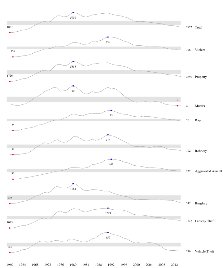
Now, I would like those multiple sparklines to look like this (it was done in base graphics and the code is available here) - dots stand for maximum/minimum values, number on right end is a final value in specific time series and grey band shows a rough quantiles range:

enter image description here

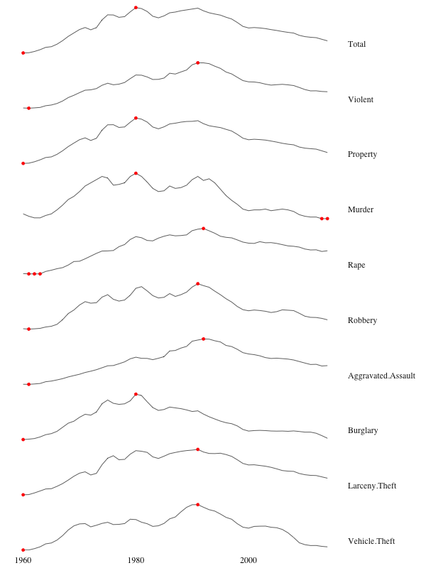
I'm not far away but I'm stuck with the assignment of minimal/maximum values and labels:

library(ggplot2)
library(ggthemes)
library(dplyr)
library(reshape)
library(RCurl)
dd <- read.csv(text =
  getURL("https://gist.githubusercontent.com/GeekOnAcid/da022affd36310c96cd4/raw/9c2ac2b033979fcf14a8d9b2e3e390a4bcc6f0e3/us_nr_of_crimes_1960_2014.csv"))
d <- melt(dd, id="Year")
names(d) <- c("Year","Crime.Type","Crime.Rate")
dd <- group_by(d, Crime.Type) %>% 
  mutate(color = (min(Crime.Rate) == Crime.Rate | max(Crime.Rate) == Crime.Rate))
ggplot(dd, aes(x=Year, y=Crime.Rate)) + 
  facet_grid(Crime.Type ~ ., scales = "free_y") + 
  geom_line(size=0.3) + geom_point(aes(color = color)) + 
  scale_color_manual(values = c(NA, "red"), guide=F) +
  theme_tufte(base_size = 15) + 
  theme(axis.title=element_blank(), 
        axis.text.y = element_blank(), axis.ticks = element_blank()) +
  theme(strip.text.y = element_text(angle = 0, vjust=0.2, hjust=0)) 

enter image description here

Diagenesis answered 16/2, 2016 at 14:9 Comment(0)
S
25

Here is one approach to getting single colored points, as well as the three sets of labels and shaded quartile ranges:

# Calculate the min and max values, which.min returns the first (like your example):
mins <- group_by(d, Crime.Type) %>% slice(which.min(Crime.Rate))
maxs <- group_by(d, Crime.Type) %>% slice(which.max(Crime.Rate))
ends <- group_by(d, Crime.Type) %>% filter(Year == max(Year))
quarts <- d %>%
  group_by(Crime.Type) %>%
  summarize(quart1 = quantile(Crime.Rate, 0.25),
            quart2 = quantile(Crime.Rate, 0.75)) %>%
  right_join(d)

ggplot(d, aes(x=Year, y=Crime.Rate)) + 
  facet_grid(Crime.Type ~ ., scales = "free_y") + 
  geom_ribbon(data = quarts, aes(ymin = quart1, ymax = quart2), fill = 'grey90') +
  geom_line(size=0.3) +
  geom_point(data = mins, col = 'blue') +
  geom_text(data = mins, aes(label = Crime.Rate), vjust = -1) +
  geom_point(data = maxs, col = 'red') +
  geom_text(data = maxs, aes(label = Crime.Rate), vjust = 2) +
  geom_text(data = ends, aes(label = Crime.Rate), hjust = 0) +
  geom_text(data = ends, aes(label = Crime.Type), hjust = 0, nudge_x = 5) +
  expand_limits(x = max(d$Year) + (0.25 * (max(d$Year) - min(d$Year)))) +
  scale_x_continuous(breaks = seq(1960, 2010, 10)) +
  scale_y_continuous(expand = c(0.1, 0)) +
  theme_tufte(base_size = 15) +
  theme(axis.title=element_blank(),
        axis.text.y = element_blank(), 
        axis.ticks = element_blank(),
        strip.text = element_blank())

I'm assuming you don't want a legend here. You can almost certainly make things more concise by merging some data.frames, but multiple geom calls seem to be easiest here.

enter image description here

Saboteur answered 16/2, 2016 at 15:12 Comment(2)
...and the labels could just be two more geom_text layers with vjust set appropriately.Brusa
Just noticed I swapped the colors... -.-Saboteur

© 2022 - 2024 — McMap. All rights reserved.