visualizing crosstab tables with a plot in R
Asked Answered
J

3

22

I saw a plot generated in excel and I was wondering if R could also do it.this picture is essentially a visualization of a crosstab table comparing the days of the week to preferred meals on that day and counting the number of people that fall within those categories

This picture is essentially a visualization of a crosstab table comparing the days of the week to preferred meals on that day and counting the number of people that fall within those categories.

How I can make a plot like this one?

Jocular answered 19/12, 2013 at 4:38 Comment(2)
Perhaps my answer here might help you.Jezreel
I am interested in how that chart was made in Excel to start with. Any clues?Bekelja
N
26

Using Hadley Wickham's ggplot2:

library(ggplot2)                           

# Set up the vectors                           
days <- c("Mon","Tues","Wed","Thurs","Fri")
slots <- c("Coffee/Breakfast","Lunch","Happy Hour","Dinner")

# Create the data frame
df <- expand.grid(days, slots)
df$value <- c(1,1,1,1,2,1,1,NA,NA,1,4,4,7,4,1,5,6,14,5,1)    

#Plot the Data
g <- ggplot(df, aes(Var1, Var2)) + geom_point(aes(size = value), colour = "green") + theme_bw() + xlab("") + ylab("")
g + scale_size_continuous(range=c(10,30)) + geom_text(aes(label = value))

enter image description here

Do you care that the axis lines go through the circles? Also, the greens are slightly different and the label text is black instead of white.

Ninepins answered 19/12, 2013 at 5:23 Comment(2)
it's perfect this way, thank you. just one question, is there a way to change the shapes, the circles look a bit "ruffled" around the edges. Can the function make it a smooth circle? If not then that's okayJocular
With ggsave you can set the dots per inch. The default is 72 dpi, with ggsave(file="filename.png", dpi=300) you can set the value for dpi to a higher value. This might solve your problem.Dateless
K
1

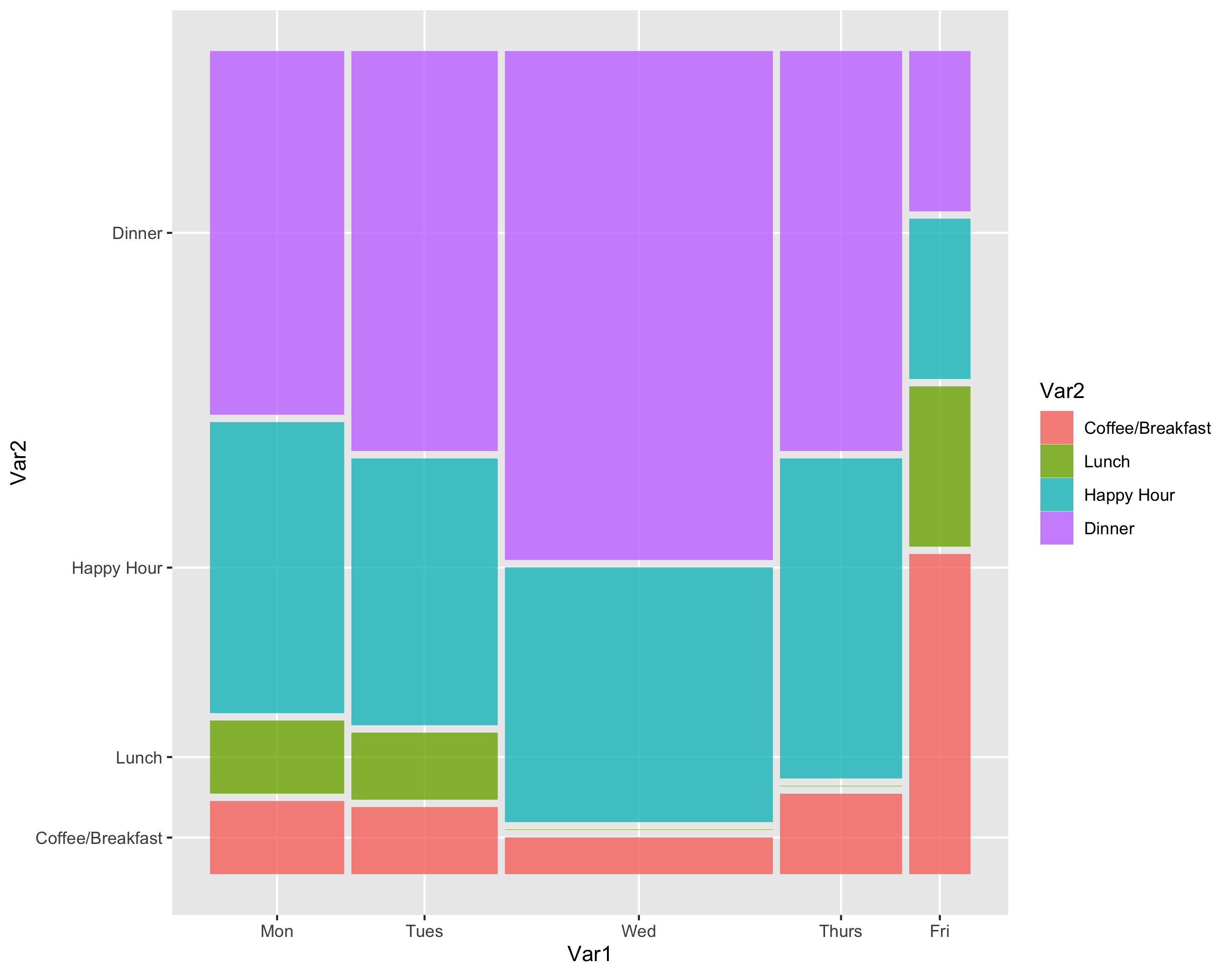
The ggmosaic package extends ggplot to provide an alternative.

enter image description here

library(ggplot2)
library(ggmosaic)

# Set up the vectors                           
days <- c("Mon","Tues","Wed","Thurs","Fri")
slots <- c("Coffee/Breakfast","Lunch","Happy Hour","Dinner")

# Create the comporessed data frame
df <- expand.grid(days, slots, stringsAsFactors = TRUE)
df$value <- c(1,1,1,1,2,1,1,0,0,1,4,4,7,4,1,5,6,14,5,1)    
df.expanded <- df[rep(row.names(df), df$value), 1:2]

#Plot the Data
ggplot(data = df.expanded) +
  geom_mosaic(aes(x = product(Var2,Var1), fill = Var2)) + 
  ggsave("mosaic.png")
Karyn answered 5/3, 2021 at 22:16 Comment(0)
C
0

Just adding an alternative approach that makes use of the excellent ggpubr package:

# Load ggpubr package
library(ggpubr)

## Borrowed from Tommy O'Dell's answer
# Set up the vectors                           
days <- c("Mon", "Tues", "Wed", "Thurs", "Fri")
slots <- c("Coffee/Breakfast", "Lunch", "Happy Hour", "Dinner")

# Create the data frame
df <- expand.grid(days, slots)
df$value <- c(1, 1, 1, 1, 2, 1, 1, NA, NA, 1, 4, 4, 7, 4, 1, 5, 6, 14, 5, 1)

## Plot the data (my contribution)
ggballoonplot(
  data = df, 
  x = "Var1", 
  y = "Var2",
  size = "value",
  size.range = c(10, 20), 
  fill = "green",
  show.label = TRUE, 
  rotate.x.text = FALSE, 
  legend = "none"
)

Created on 2021-06-12 by the reprex package (v2.0.0)

Conchaconchie answered 13/6, 2021 at 2:21 Comment(0)

© 2022 - 2024 — McMap. All rights reserved.