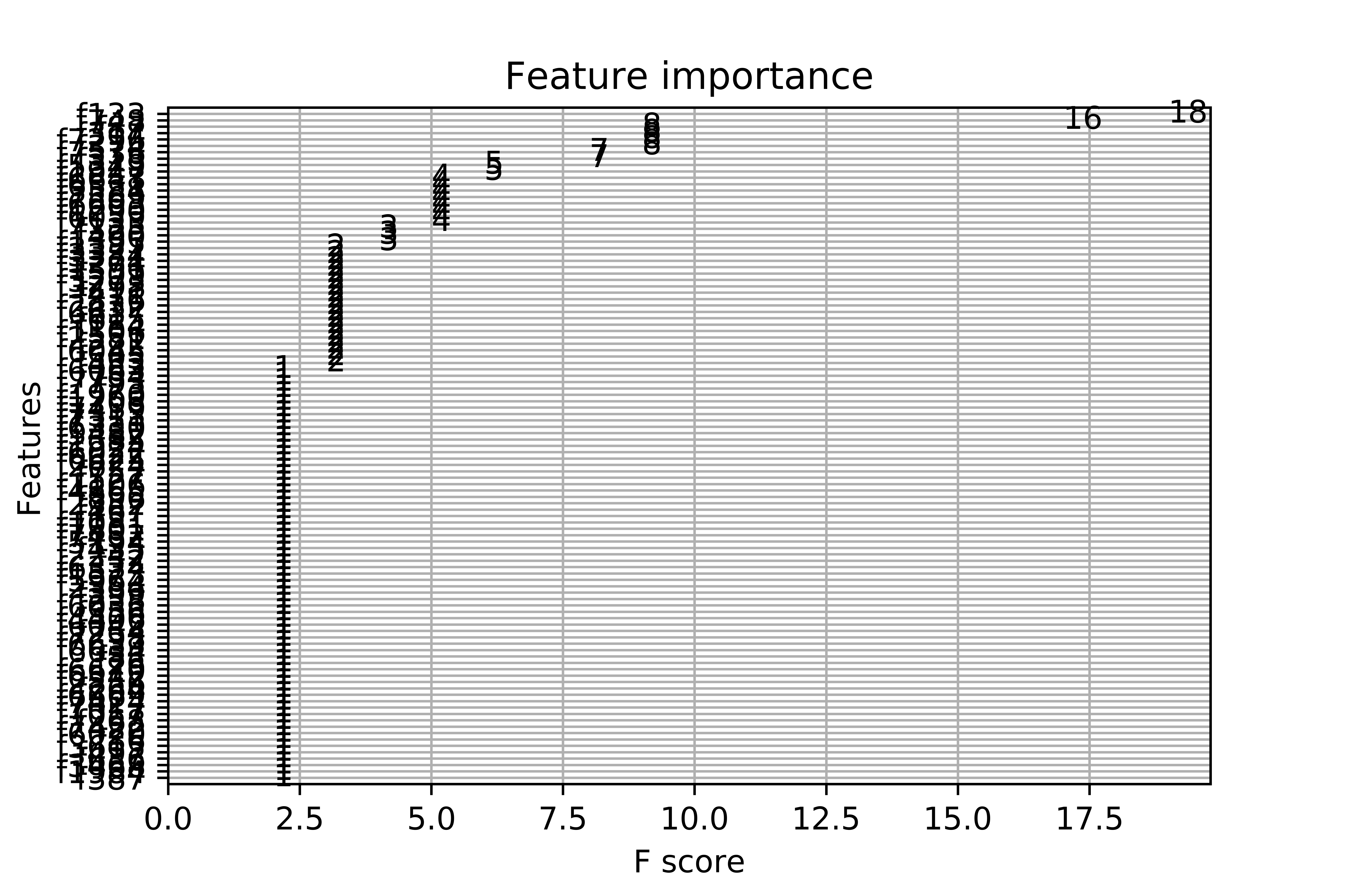
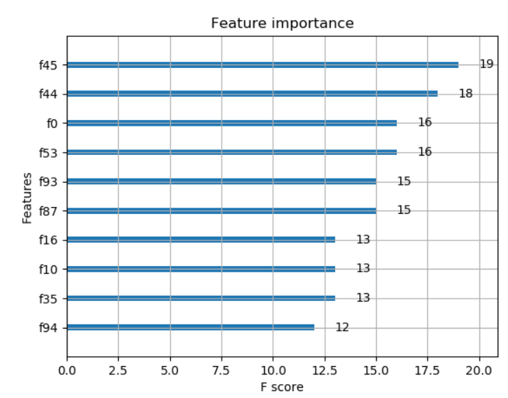
When I plot the feature importance, I get this messy plot. I have more than 7000 variables. I understand the built-in function only selects the most important, although the final graph is unreadable. This is the complete code:
import numpy as np
import pandas as pd
df = pd.read_csv('ricerice.csv')
array=df.values
X = array[:,0:7803]
Y = array[:,7804]
from xgboost import XGBClassifier
from sklearn.model_selection import train_test_split
from sklearn.metrics import accuracy_score
seed=0
test_size=0.30
X_train, X_test, y_train, y_test = train_test_split(X,Y,test_size=test_size, random_state=seed)
from xgboost import XGBClassifier
model = XGBClassifier()
model.fit(X, Y)
import matplotlib.pyplot as plt
from matplotlib import pyplot
from xgboost import plot_importance
fig1=plt.gcf()
plot_importance(model)
plt.draw()
fig1.savefig('xgboost.png', figsize=(50, 40), dpi=1000)


