How to position a View at the bottom of a ScrollView?
Asked Answered
C

3

22

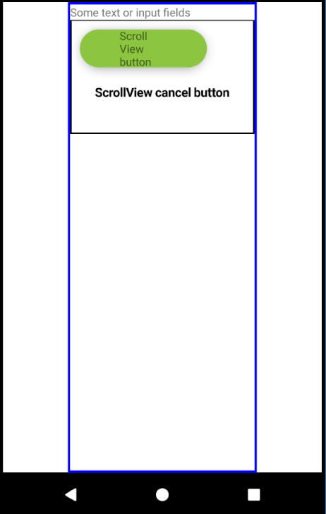
I would like to create a screen with a ScrollView with some input fields in it, and a Button (actually 2 buttons in a normal View) at the bottom of the screen. This should be pretty easy, BUT, I want to position my button at the very bottom of the screen even if there isn't enough element in the ScrollView to fill the whole screen. I could use absolute positioning, BUT my ScrollView can be bigger (higher) then my screen, and in this case, the button should be at the end of the ScrollView. (So it would be out of the screen, which means the user should scoll down to see the button).

I've tried a lot of things, but the Button always comes right after the other elements inside the ScollView.

In the picture the scrollview has a blue border, and the normal view which contains the buttons has black border.

Any suggestion is appreciated.

enter image description here

Carcinoma answered 27/9, 2018 at 14:38 Comment(2)
Can you post the code so we can have a better idea about how the view is rendered?Veroniqueverras
I have a workaround now, but thank you for your interest. If you have any suggestions please let me know.Baggage
C
77

Found the best solution.

The key is the contentContainerStyle property (doc: https://facebook.github.io/react-native/docs/scrollview#contentcontainerstyle). "These styles will be applied to the scroll view content container which wraps all of the child views. "

After setting flexGrow: 1, justifyContent: 'space-between', flexDirection: 'column' in contentContainerStyle, one can set justifyContent: 'flex-start' for the upper container view with the text, and justifyContent: 'flex-end' for the lower container view with the buttons.

<ScrollView
  contentContainerStyle={{ flexGrow: 1, justifyContent: 'space-between', flexDirection: 'column' }}
  style={{ backgroundColor: 'white', paddingBottom: 20 }}
>
  <View style={{ flex: 1, justifyContent: 'flex-start' }}>
    <Text>Some text with different length in different cases, or some input fileds.</Text>
  </View>
  <View style={{ flex: 1, justifyContent: 'flex-end' }}>
    <View>
      <TouchableOpacity style={[commonStyles.greenButton, styles.buttonPadding]}>
        <Text style={commonStyles.greenButtonTitle}>Next</Text>
      </TouchableOpacity>
    </View>
    <View>
      <TouchableOpacity style={styles.cancelButtonContainer}>
        <Text style={styles.cancelButton}>Cancel</Text>
      </TouchableOpacity>
    </View>
  </View>
</ScrollView>;
Carcinoma answered 4/10, 2018 at 15:21 Comment(2)
Works very well and is compatible with KeyboardAvoidingView.Clinician
Nice, works fine. Thanks for sharing. flex-direction: column is default in react and not needed.Rust
V
8

<ScrollView
      contentContainerStyle={{
          flexGrow: 1,
          justifyContent: 'flex-end',
      }}>
</ScrollView>

Voluntaryism answered 22/9, 2020 at 5:22 Comment(0)
C
0

I found a workaround for this.

The main idea is to set the height of the View with the texts and input fields to match exactly the height of the screen minus the View which contains the buttons.

The challenge is to calculate this height. Abhishek Kumar's answer helped me (https://mcmap.net/q/115933/-get-size-of-a-view-in-react-native) See my code below:

         import { View, ScrollView, Text, TouchableOpacity, Dimensions } from 'react-native';

         const screenHeight = Dimensions.get('window').height;

          class MyClass extends React.Component {

          constructor(props) {
            super(props);
            this.state = {buttonViewHeight: 0};
          }

          find_dimesions(layout){
            this.setState({buttonViewHeight: layout.height});
          }
          render() {
            return (
              <View style={{minHeight: screenHeight, flex: 1, alignItems: 'center'}}>
                <ScrollView style={{minHeight: screenHeight}}>
                 <View style={{minHeight: screenHeight}}>
                    <View style={{minHeight: screenHeight - this.state.buttonViewHeight, borderWidth: 2, borderColor: 'red', alignItems: 'center', flex: 1}]}>
                      <Text>Some text with different length in different cases, or some input fileds.</Text>
                    </View>
                    <View onLayout={(event) => { this.find_dimesions(event.nativeEvent.layout) }} style={{paddingBottom: 50, flex: 1, borderWidth: 2, borderColor: 'green'}}>
                      <TouchableOpacity
                        style={[commonStyles.greenButton, styles.buttonPadding]} >
                        <Text style={commonStyles.greenButtonTitle}>Next</Text>
                      </TouchableOpacity>
                      <TouchableOpacity
                        style={styles.cancelButtonContainer} >
                        <Text style={styles.cancelButton}>Cancel</Text>
                      </TouchableOpacity>
                    </View>
                  </View>
                </ScrollView>
              </View>
          }
   }

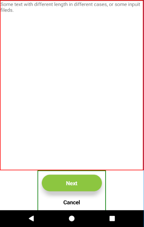
On the picture below you can see the result

This is how it looks now

This solution will cause an animation like effect as the view renders multiple times, because of the changing of the View's height. The button's View "fade in" as you open the screen.

If you find a better solution please let me know!

Carcinoma answered 28/9, 2018 at 9:31 Comment(0)

© 2022 - 2024 — McMap. All rights reserved.