Is viewport-fit=cover no longer working on the iOS Safari?
Asked Answered
J

2

23

I wish to use 100% screen width on iOS Safari for my website's header on a notched iOS/Android device and to achieve that I added the following viewport meta_tag on my page <head></head>:

<meta name='viewport' content='initial-scale=1, viewport-fit=cover'>

Then on <header> element of my page I specified a css width of 100% (or 100vmin). I don't need to use env(safe-area-insets) padding on any of my webpages because they are styled in a particular way.

This is pretty much how Apple has described the iOS Safari web api for the notched iPhones on their official documentation but it doesn't seem to be working!

Am I missing something?

Edits: I'm on iOS Safari 13.3.1 on a iPhone 11 Pro Max.

Jerejereld answered 10/2, 2020 at 16:12 Comment(0)
J
20

As of late 2019 Apple is now recommending to use a @supports(padding:max(0px)) { env() } query to detect and fix the notched environment for your website, like so:

@supports(padding:max(0px)) {
    body, header, footer {
        padding-left: min(0vmin, env(safe-area-inset-left));
        padding-right: min(0vmin, env(safe-area-inset-right));
    }
}

The query above and the css are discussed here.

Jerejereld answered 30/3, 2020 at 21:22 Comment(2)
This doesn't appear to account for portrait mode with the Dynamic Island. There is white space at the top of the screen now around the DyIsClypeate
Good point. Apple hasn't opened up the web API to handle the dynamic island on new iPhones yet.Jerejereld
G
2

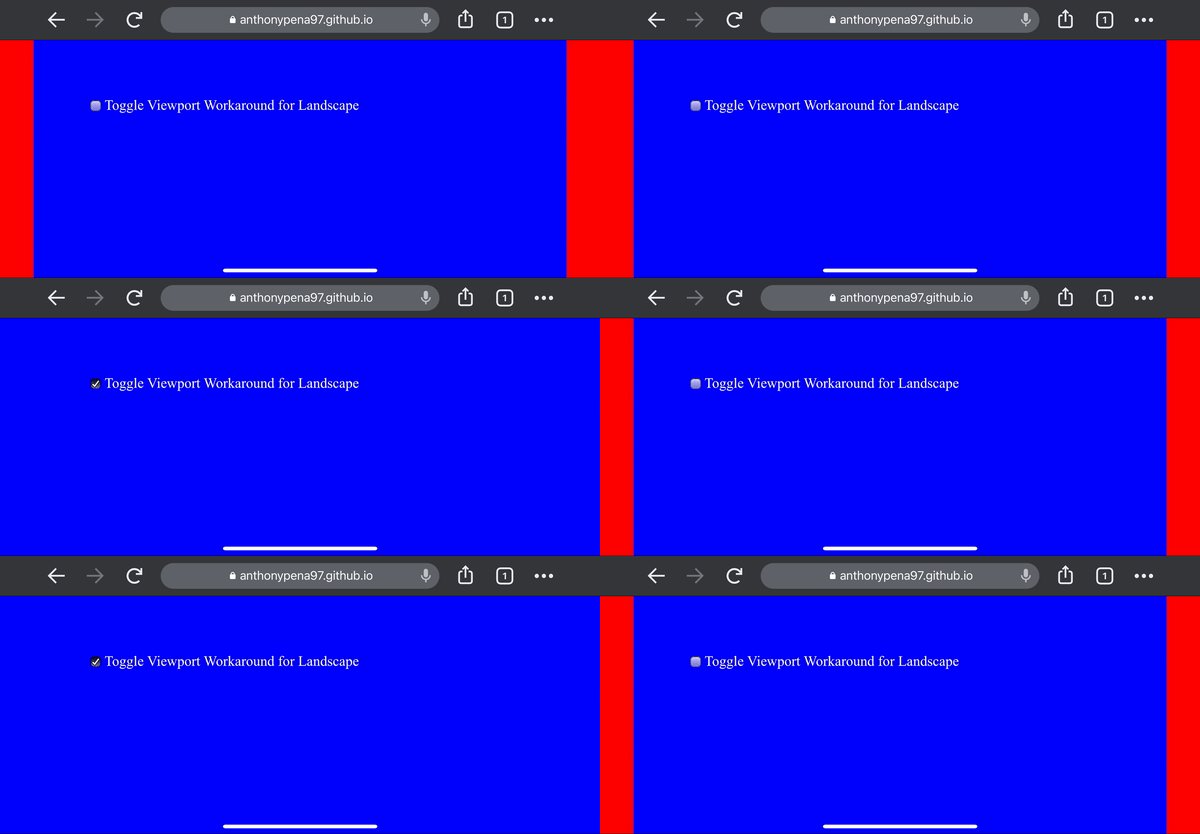
I created a workaround that doesn't rely one viewport-fit cover. I needed this for a three.js project.

In simple terms, my approach to extending the web page past the iPhone notch is to zoom on the page, and scroll to the middle.

You can read the full detail and source code on my github https://github.com/anthonypena97/chromeios-viewportfitcover

enter image description here

Gatepost answered 18/1, 2022 at 18:46 Comment(0)

© 2022 - 2024 — McMap. All rights reserved.