what does ..level.. mean in ggplot::stat_density2d
Asked Answered
A

2

23

I've seen some examples when constructing a heatmap of having the fill variable set to ..level...

Such as in this example:

library(MASS)
ggplot(geyser, aes(x = duration, y = waiting)) + 
    geom_point() + 
    geom_density2d() + 
    stat_density2d(aes(fill = ..level..), geom = "polygon")

I suspect that the ..level.. means that the fill is set to the relative amount of layers present? Also could someone link me a good example of how to interpret these 2D-density plots, what does each contour represent etc.? I have searched online but couldn't find any suitable guide.

Asaasabi answered 25/8, 2015 at 14:22 Comment(0)
S
15

Expanding on the answer provided by @hrbrmstr -- first, the call to geom_density2d() is redundant. That is, you can achieve the same results with:

library(ggplot2)
library(MASS)

gg <- ggplot(geyser, aes(x = duration, y = waiting)) + 
    geom_point() + 
    stat_density2d(aes(fill = ..level..), geom = "polygon")

Let's consider some other ways to visualize this density estimate that may help clarify what is going on:

base_plot <- ggplot(geyser, aes(x = duration, y = waiting)) + 
  geom_point()

base_plot + 
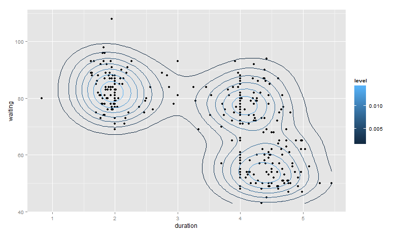
  stat_density2d(aes(color = ..level..))

Plot1

base_plot + 
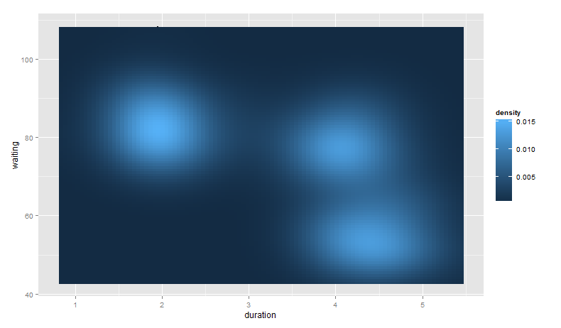
  stat_density2d(aes(fill = ..density..), geom = "raster", contour = FALSE)

Plot2

base_plot +
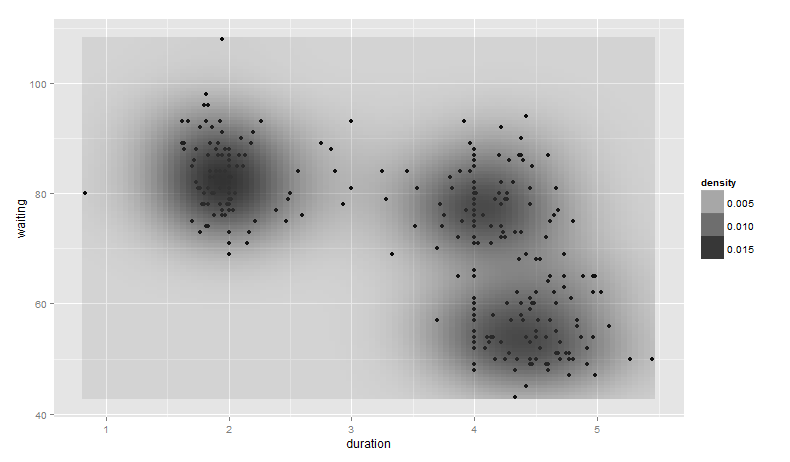
  stat_density2d(aes(alpha = ..density..), geom = "tile", contour = FALSE)

Notice, however, we can no longer see the points generated from geom_point().

Plot3

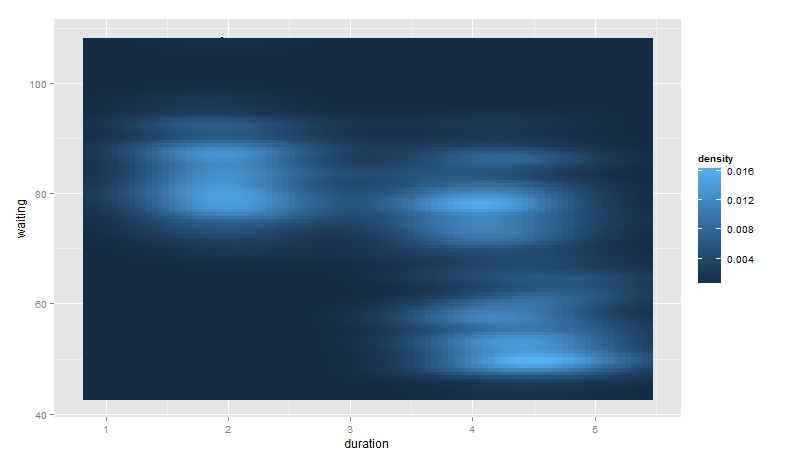
Finally, note that you can control the bandwidth of the density estimate. To do this, we pass x and y bandwidth arguments to h (see ?kde2d):

base_plot +
  stat_density2d(aes(fill = ..density..), geom = "raster", contour = FALSE,
                 h = c(2, 5))

Plot4

Again, the points from geom_point() are hidden as they are behind the call to stat_density2d().

Sholom answered 25/8, 2015 at 14:48 Comment(6)
I still don't understand how to interpret the this map, other than those with a higher density / level are more probable. Is a waiting / duration combination with a level of 0.1 twice as probable than one with a level of 0.05? How can I relate the measure to counts? It would be nice to know how it is calculated (a textbook for "dummies" recommendation would be greatly appreciated if outside the scope of this question).Dix
@Dix I would look up some basics around probability and density curves. This post from stats.stackexchange should help too. This post should also prove helpful -- we are basically visualizing two individual density plots on one surface.Sholom
very useful .. but it leads me to this question: #34939554Dix
Just one quesion, are fill = ..level.. and fill = ..density the same thing?Thierry
Fantastic, thanks! Would it be possible to color each dot according to a grouping variable?Udine
@Udine At this point, I think it would be worth asking a new question if required, but yes, it's certainly possible.Sholom
R
17

the stat_ functions compute new values and create new data frames. this one creates a data frame with a level variable. you can see it if you use ggplot_build vs plotting the graph:

library(ggplot2)
library(MASS)

gg <- ggplot(geyser, aes(x = duration, y = waiting)) + 
    geom_point() + 
    geom_density2d() + 
    stat_density2d(aes(fill = ..level..), geom = "polygon")

gb <- ggplot_build(gg)

head(gb$data[[3]])

##      fill level        x        y piece group PANEL
## 1 #132B43 0.002 3.876502 43.00000     1 1-001     1
## 2 #132B43 0.002 3.864478 43.09492     1 1-001     1
## 3 #132B43 0.002 3.817845 43.50833     1 1-001     1
## 4 #132B43 0.002 3.802885 43.65657     1 1-001     1
## 5 #132B43 0.002 3.771212 43.97583     1 1-001     1
## 6 #132B43 0.002 3.741335 44.31313     1 1-001     1

The ..level.. tells ggplot to reference that column in the newly build data frame.

Under the hood, ggplot is doing something similar to (this is not a replication of it 100% as it uses different plot limits, etc):

n <- 100
h <- c(bandwidth.nrd(geyser$duration), bandwidth.nrd(geyser$waiting))
dens <- kde2d(geyser$duration, geyser$waiting, n=n, h=h)
df <- data.frame(expand.grid(x = dens$x, y = dens$y), z = as.vector(dens$z))
head(df)

##           x  y            z
## 1 0.8333333 43 9.068691e-13
## 2 0.8799663 43 1.287684e-12
## 3 0.9265993 43 1.802768e-12
## 4 0.9732323 43 2.488479e-12
## 5 1.0198653 43 3.386816e-12
## 6 1.0664983 43 4.544811e-12

And also calling contourLines to get the polygons.

This is a decent introduction to the topic. Also look at ?kde2d in R help.

Rhaetian answered 25/8, 2015 at 14:30 Comment(2)
Thanks. But what column is ..level.. created from then?Asaasabi
Thanks, kde2d() helped me export the density map.Essieessinger
S
15

Expanding on the answer provided by @hrbrmstr -- first, the call to geom_density2d() is redundant. That is, you can achieve the same results with:

library(ggplot2)
library(MASS)

gg <- ggplot(geyser, aes(x = duration, y = waiting)) + 
    geom_point() + 
    stat_density2d(aes(fill = ..level..), geom = "polygon")

Let's consider some other ways to visualize this density estimate that may help clarify what is going on:

base_plot <- ggplot(geyser, aes(x = duration, y = waiting)) + 
  geom_point()

base_plot + 
  stat_density2d(aes(color = ..level..))

Plot1

base_plot + 
  stat_density2d(aes(fill = ..density..), geom = "raster", contour = FALSE)

Plot2

base_plot +
  stat_density2d(aes(alpha = ..density..), geom = "tile", contour = FALSE)

Notice, however, we can no longer see the points generated from geom_point().

Plot3

Finally, note that you can control the bandwidth of the density estimate. To do this, we pass x and y bandwidth arguments to h (see ?kde2d):

base_plot +
  stat_density2d(aes(fill = ..density..), geom = "raster", contour = FALSE,
                 h = c(2, 5))

Plot4

Again, the points from geom_point() are hidden as they are behind the call to stat_density2d().

Sholom answered 25/8, 2015 at 14:48 Comment(6)
I still don't understand how to interpret the this map, other than those with a higher density / level are more probable. Is a waiting / duration combination with a level of 0.1 twice as probable than one with a level of 0.05? How can I relate the measure to counts? It would be nice to know how it is calculated (a textbook for "dummies" recommendation would be greatly appreciated if outside the scope of this question).Dix
@Dix I would look up some basics around probability and density curves. This post from stats.stackexchange should help too. This post should also prove helpful -- we are basically visualizing two individual density plots on one surface.Sholom
very useful .. but it leads me to this question: #34939554Dix
Just one quesion, are fill = ..level.. and fill = ..density the same thing?Thierry
Fantastic, thanks! Would it be possible to color each dot according to a grouping variable?Udine
@Udine At this point, I think it would be worth asking a new question if required, but yes, it's certainly possible.Sholom

© 2022 - 2024 — McMap. All rights reserved.