Overlaying two histograms with plotly express
Asked Answered
D

3

23

I'd like to overlay two histograms which I currently display only one next to the other using the following simplistic code. The two dataframes are not the same length, but it still makes sense to overlay their histogram values.

import plotly.express as px

fig1 = px.histogram(test_lengths, x='len', histnorm='probability', nbins=10)
fig2 = px.histogram(train_lengths, x='len', histnorm='probability', nbins=10)
fig1.show()
fig2.show()

with pure plotly, this is the way, copied from the documentation:

import plotly.graph_objects as go

import numpy as np

x0 = np.random.randn(500)
# Add 1 to shift the mean of the Gaussian distribution
x1 = np.random.randn(500) + 1

fig = go.Figure()
fig.add_trace(go.Histogram(x=x0))
fig.add_trace(go.Histogram(x=x1))

# Overlay both histograms
fig.update_layout(barmode='overlay')
# Reduce opacity to see both histograms
fig.update_traces(opacity=0.75)
fig.show()

I just wonder if there's any particularly idiomatic way with plotly express. Hopefully this also works to exeplify the completeness and different levels of abstraction between plotly and plotly express.

Disfigure answered 18/9, 2019 at 8:44 Comment(0)
Z
33

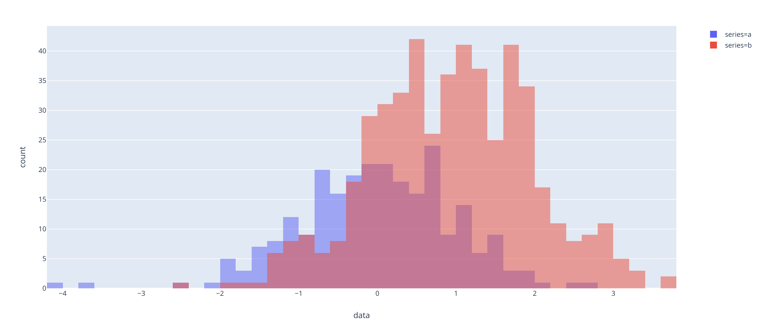
The trick is to make a single Plotly Express figure by combining the data into a tidy dataframe, rather than to make two figures and try to combine them (which is currently impossible):

import numpy as np
import pandas as pd
import plotly.express as px

x0 = np.random.randn(250)
# Add 1 to shift the mean of the Gaussian distribution
x1 = np.random.randn(500) + 1

df = pd.DataFrame(dict(
    series=np.concatenate((["a"] * len(x0), ["b"] * len(x1))), 
    data=np.concatenate((x0, x1))
))

px.histogram(df, x="data", color="series", barmode="overlay")

Yields:

enter image description here

Zarzuela answered 18/9, 2019 at 18:33 Comment(4)
Yeah I know. It's just seems like a usability regression compared to pure plotly, where you could more naturally stack figures onto the same plot without hacking the arrays like this. I'm not sure whether plotly express is trying to fill in every use case that plotly did though. I actually went back to using pure plotly for this.Disfigure
I guess it's a matter of perspective :) We see Plotly Express as a strict usability improvement: it can be used to automate the creation of many types of figures using the underlying graph_objects, while taking nothing away from the graph_objects layer (i.e. no "regressions"!). Just like Seaborn is not a 100% replacement for and takes nothing away from matplotlib, say ;) Over time we will continue to broaden the scope of what you can do with Plotly Express, likely including figure composition etc, but even then we'll take nothing away from the lower level API.Zarzuela
it seems that you don't need to make a long-form/tidy dataframe, you can have your data as separate columns, omit the color parameter (it will use the columns for this purpose) and make sure to include barmode="overlay"Rebeca
Correct, as of version 4.9 you can have the series in separate columns or vectors :) I'll update the answer.Zarzuela
I
4

You can get at the px structure and use it to create a figure. I had a desire to show a stacked histogram using the 'color' option that's in express but hard to re-create in pure plotly.

Given a dataframe (df) with utctimestamp as a time index, severity and category as things to count in the histogram I used this to get a stacked histogram:

figure_data=[]
figure_data.extend([i for i in px.histogram(df, x="utctimestamp", color="severity", histfunc="count").to_dict()['data']])
figure_data.extend([i for i in px.histogram(df, x="utctimestamp", color="category", histfunc="count").to_dict()['data']])
fig=go.Figure(figure_data)
fig.update_layout(barmode='stack')
fig.update_traces(overwrite=True, marker={"opacity": 0.7}) 
fig.show()

tl;dr px.histogram creates a list of histogram objects that you can grab as a list and render via go.Figure.

I can't post inline, but here's stacked histograms from px https://i.sstatic.net/X0dyy.jpg

Incompetence answered 19/6, 2020 at 20:7 Comment(0)
H
3

If one desires to use plotly's graph_objects module one can instead use barmode="overlay" as shown below for 2 histograms.

import plotly.graph_objects as go
fig = go.Figure(data=[go.Histogram(x=x)])
fig.add_trace(go.Histogram(x=x,))
fig.update_layout(barmode='overlay')

Hoke answered 14/1, 2022 at 17:45 Comment(0)

© 2022 - 2024 — McMap. All rights reserved.