I've been using using ggplot2 to plot climatic gridded data for years. These are usually projected NetCDF files. Cells are square in model coordinates, but depending on which projection the model uses, might not be so in the real world.
My usual approach is to remap the data first on a suitable regular grid, and then plot. This introduces a small modification to the data, usually this is acceptable.
However, I've decided this is not good enough anymore: I want to plot the projected data directly, without remapping, as other programs (e.g. ncl) can, if I am not mistaken, do, without touching the model output values.
However, I am encountering some issues. I will detail the possible solutions step-by-step below, from the simplest to the most complex, and their problems. Can we overcome them?
EDIT: thanks to @lbusett's answer I got to this nice function that encompasses the solution. If you like it please upvote @lbusett's answer!
Initial setup
#Load packages
library(raster)
library(ggplot2)

#This gives you the starting data, 's'
load(url('https://files.fm/down.php?i=kew5pxw7&n=loadme.Rdata'))
#If you cannot download the data, maybe you can try to manually download it from http://s000.tinyupload.com/index.php?file_id=04134338934836605121

#Check the data projection, it's Lambert Conformal Conic
projection(s)
#The data (precipitation) has a 'model' grid (125x125, units are integers from 1 to 125)
#for each point a lat-lon value is also assigned
pr <- s[[1]]
lon <- s[[2]]
lat <- s[[3]]

#Lets get the data into data.frames
#Gridded in model units:
pr_df_basic <- as.data.frame(pr, xy=TRUE)
colnames(pr_df_basic) <- c('lon', 'lat', 'pr')
#Projected points:
pr_df <- data.frame(lat=lat[], lon=lon[], pr=pr[])
We created two dataframes, one with model coordinates, one with real lat-lon cross points (centres) for each model cell.
Optional: using a smaller domain
If you want to more clearly see the shapes of the cells, you can subset the data and extract only a small number of model cells. Just be careful that you might need to adjust point sizes, plot limits and other amenities. You can subset like this and then redo the above code part (minus the load()):
s <- crop(s, extent(c(100,120,30,50)))
If you want to fully understand the problem maybe you want to try both the big and the small domain. the code is identical, only the point sizes and map limits change. The values below are for the big complete domain. Ok, now let's plot!
Start with tiles
The most obvious solution is to use tiles. Let's try.
my_theme <- theme_bw() + theme(panel.ontop=TRUE, panel.background=element_blank())
my_cols <- scale_color_distiller(palette='Spectral')
my_fill <- scale_fill_distiller(palette='Spectral')

#Really unprojected square plot:
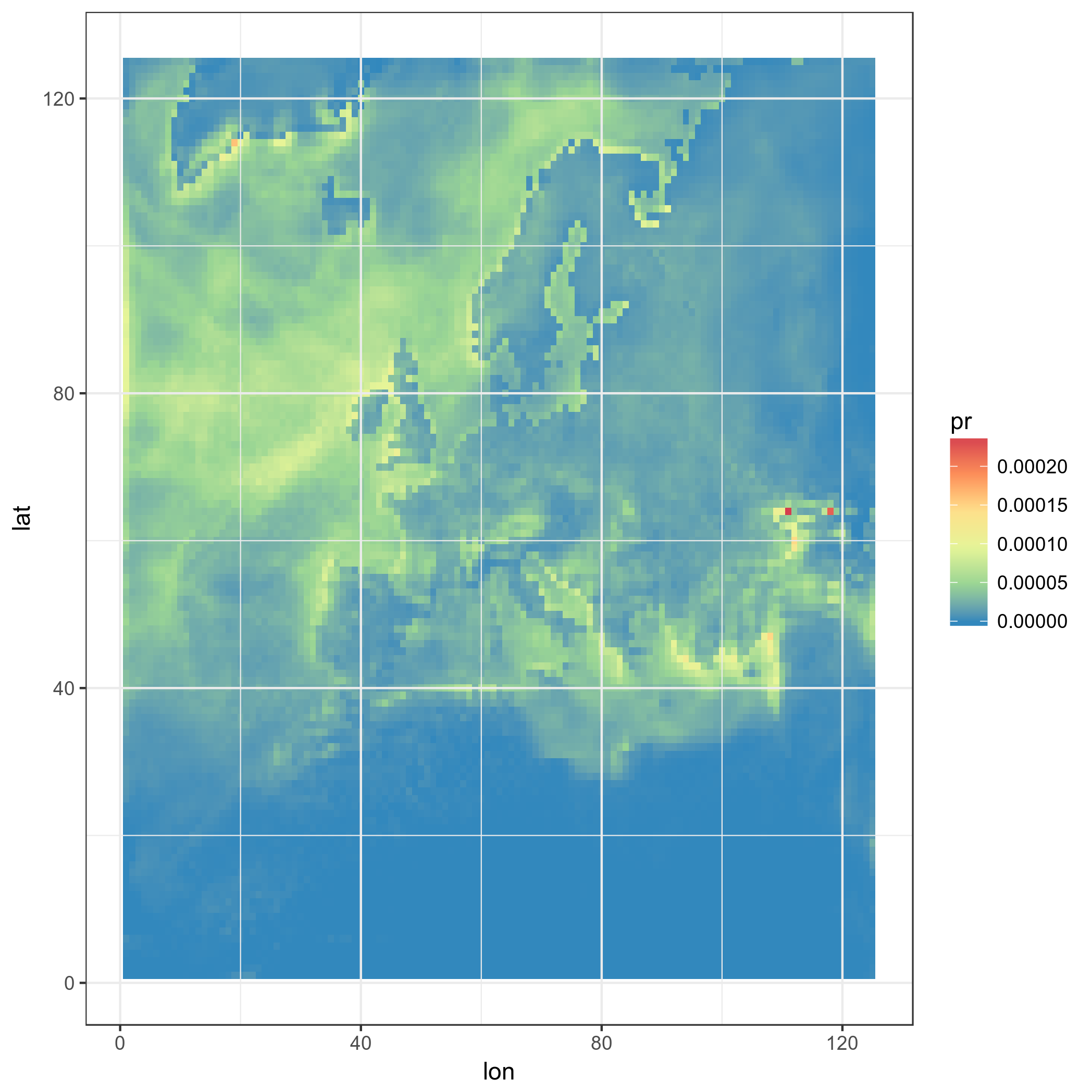
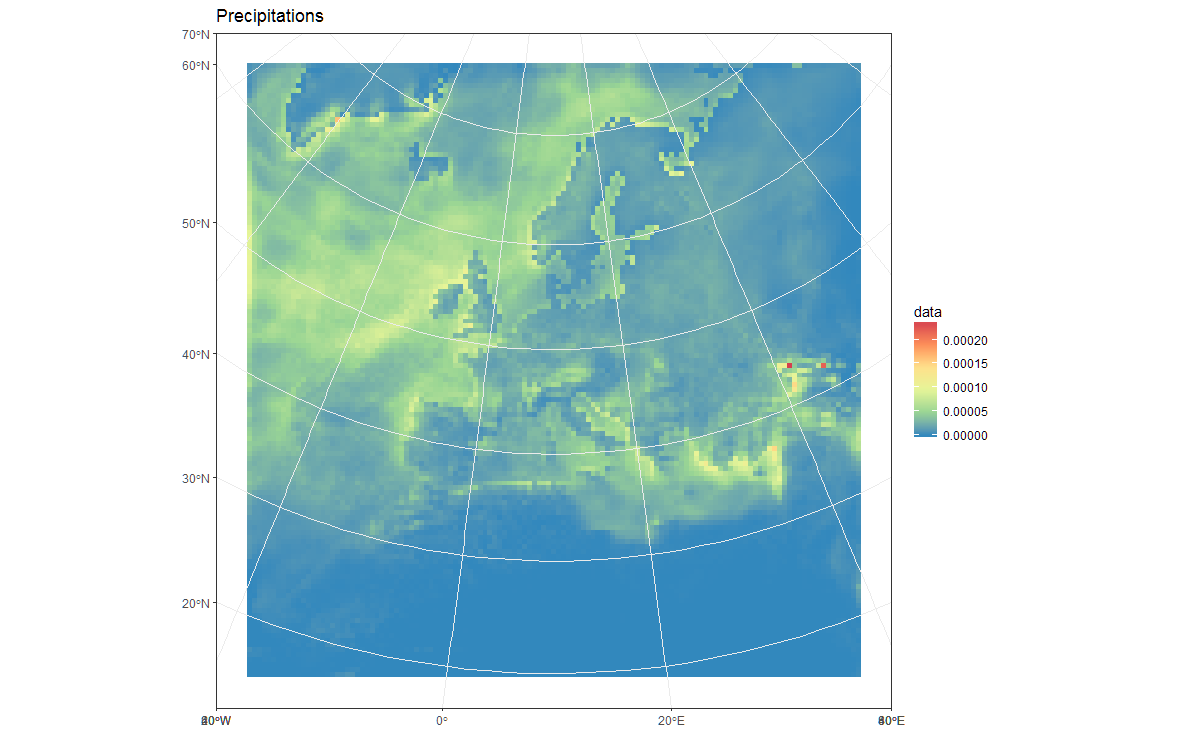
ggplot(pr_df_basic, aes(y=lat, x=lon, fill=pr)) + geom_tile() + my_theme + my_fill
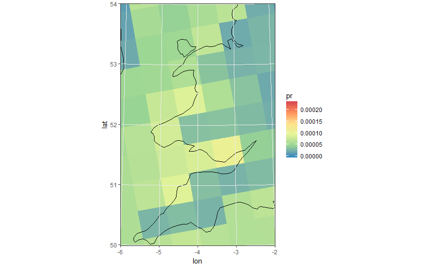
Ok, now something more advanced: we use real LAT-LON, using square tiles
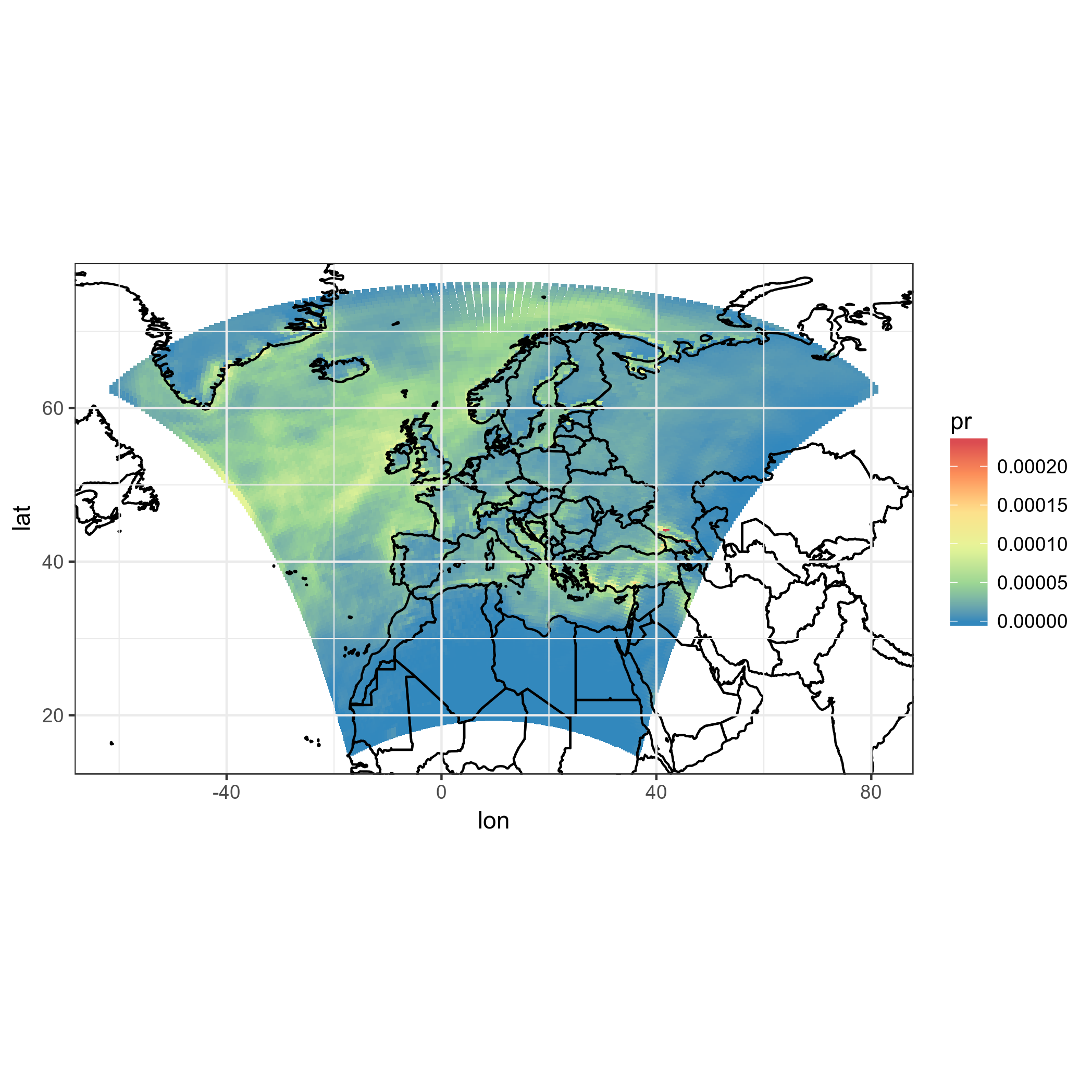
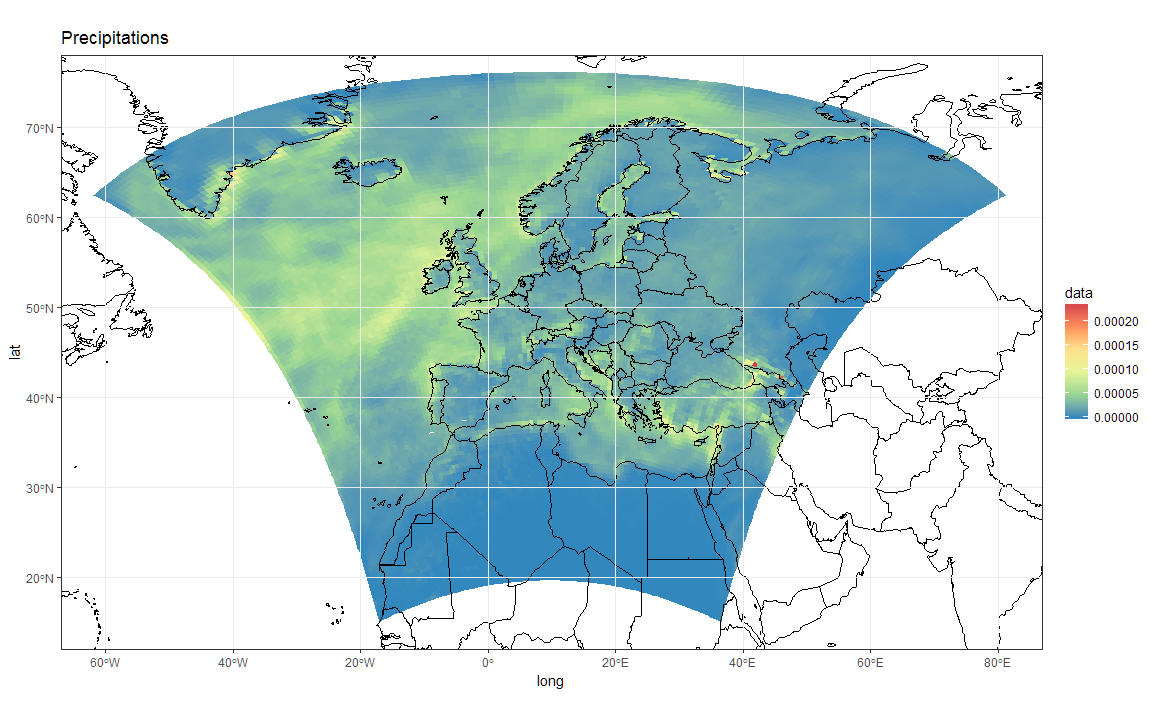
ggplot(pr_df, aes(y=lat, x=lon, fill=pr)) + geom_tile(width=1.2, height=1.2) +
    borders('world', xlim=range(pr_df$lon), ylim=range(pr_df$lat), colour='black') + my_theme + my_fill +
    coord_quickmap(xlim=range(pr_df$lon), ylim=range(pr_df$lat)) #the result is weird boxes...
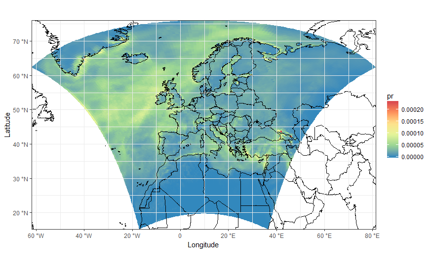
Ok, but those are not the real model squares, this is a hack. Also, model boxes diverge at the top of the domain, and are all oriented in the same way. Not nice. Let's project the squares themselves, even though we already know this is not the right thing to do... maybe it looks good.
#This takes a while, maybe you can trust me with the result
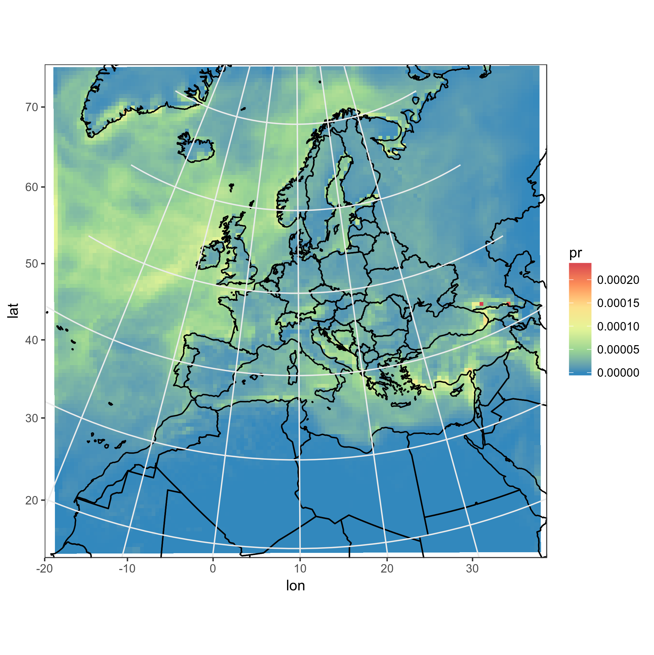
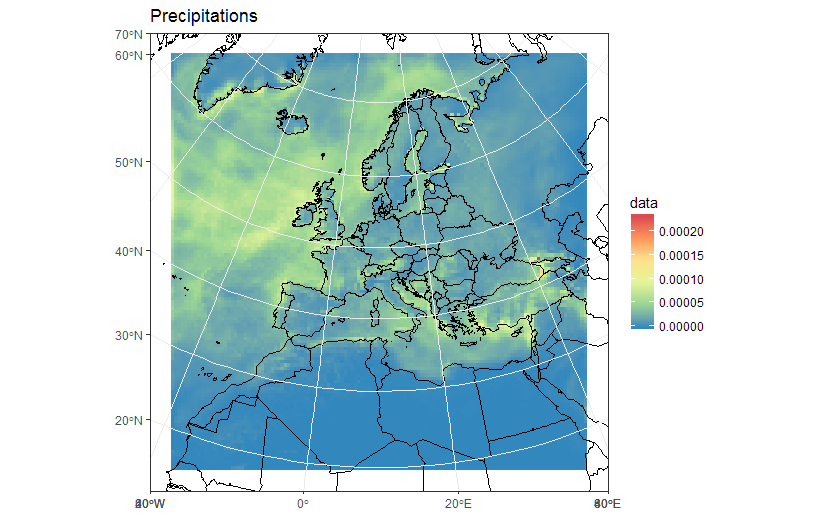
ggplot(pr_df, aes(y=lat, x=lon, fill=pr)) + geom_tile(width=1.5, height=1.5) +
    borders('world', xlim=range(pr_df$lon), ylim=range(pr_df$lat), colour='black') + my_theme + my_fill +
    coord_map('lambert', lat0=30, lat1=65, xlim=c(-20, 39), ylim=c(19, 75))
First of all, this takes a lot of time. Not acceptable. Also, again: these are not correct model cells.
Try with points, not tiles
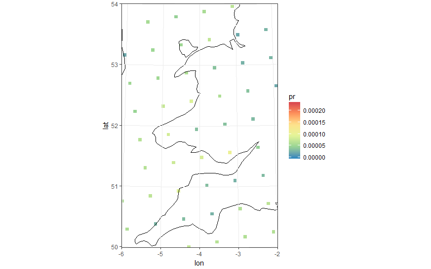
Maybe we can use round or square points instead of tiles, and project them too!
#Basic 'unprojected' point plot
ggplot(pr_df, aes(y=lat, x=lon, color=pr)) + geom_point(size=2) +
    borders('world', xlim=range(pr_df$lon), ylim=range(pr_df$lat), colour='black') + my_cols + my_theme +
    coord_quickmap(xlim=range(pr_df$lon), ylim=range(pr_df$lat))
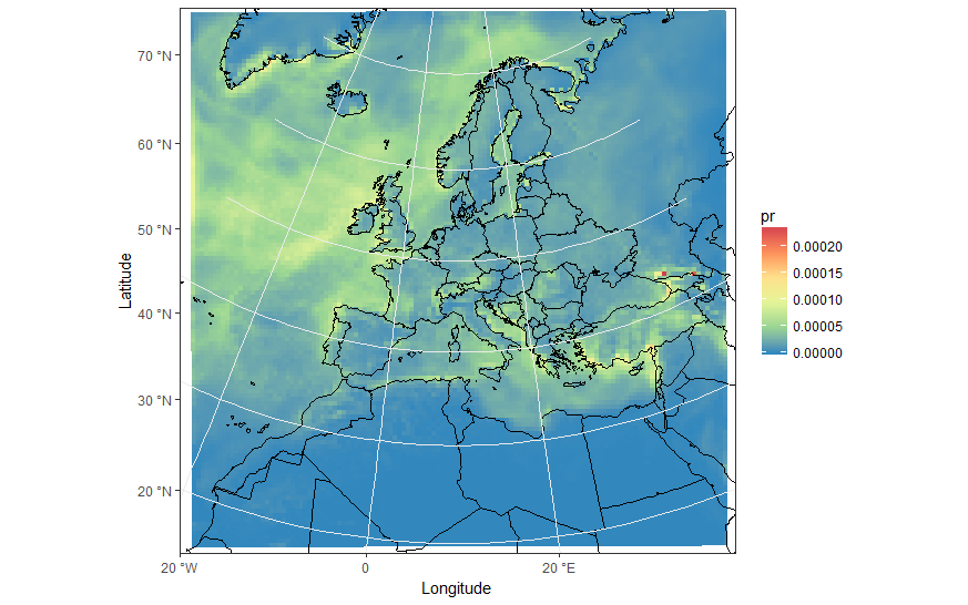
We can use square points... and project! We get closer, even though we know that it is still not correct.
#In the following plot pointsize, xlim and ylim were manually set. Setting the wrong values leads to bad results.
#Also the lambert projection values were tired and guessed from the model CRS
ggplot(pr_df, aes(y=lat, x=lon, color=pr)) +
    geom_point(size=2, shape=15) +
    borders('world', xlim=range(pr_df$lon), ylim=range(pr_df$lat), colour='black') + my_theme + my_cols +
    coord_map('lambert', lat0=30, lat1=65, xlim=c(-20, 39), ylim=c(19, 75))
Decent results, but not totally automatic and plotting points is not good enough. I want real model cells, with their shape, mutated by the projection!
Polygons, maybe?
So as you can see I am after a way of correctly plotting the model boxes as projected in the correct shape and position. Of course the model boxes, which are squares in the model, once projected become shapes which are not regular anymore. So maybe I can use polygons, and project them?
I tried to use rasterToPolygons and fortify and follow this post, but have failed to do so. I have tried this:
pr2poly <- rasterToPolygons(pr)
#http://mazamascience.com/WorkingWithData/?p=1494
pr2poly@data$id <- rownames(pr2poly@data)
tmp <- fortify(pr2poly, region = "id")
tmp2 <- merge(tmp, pr2poly@data, by = "id")
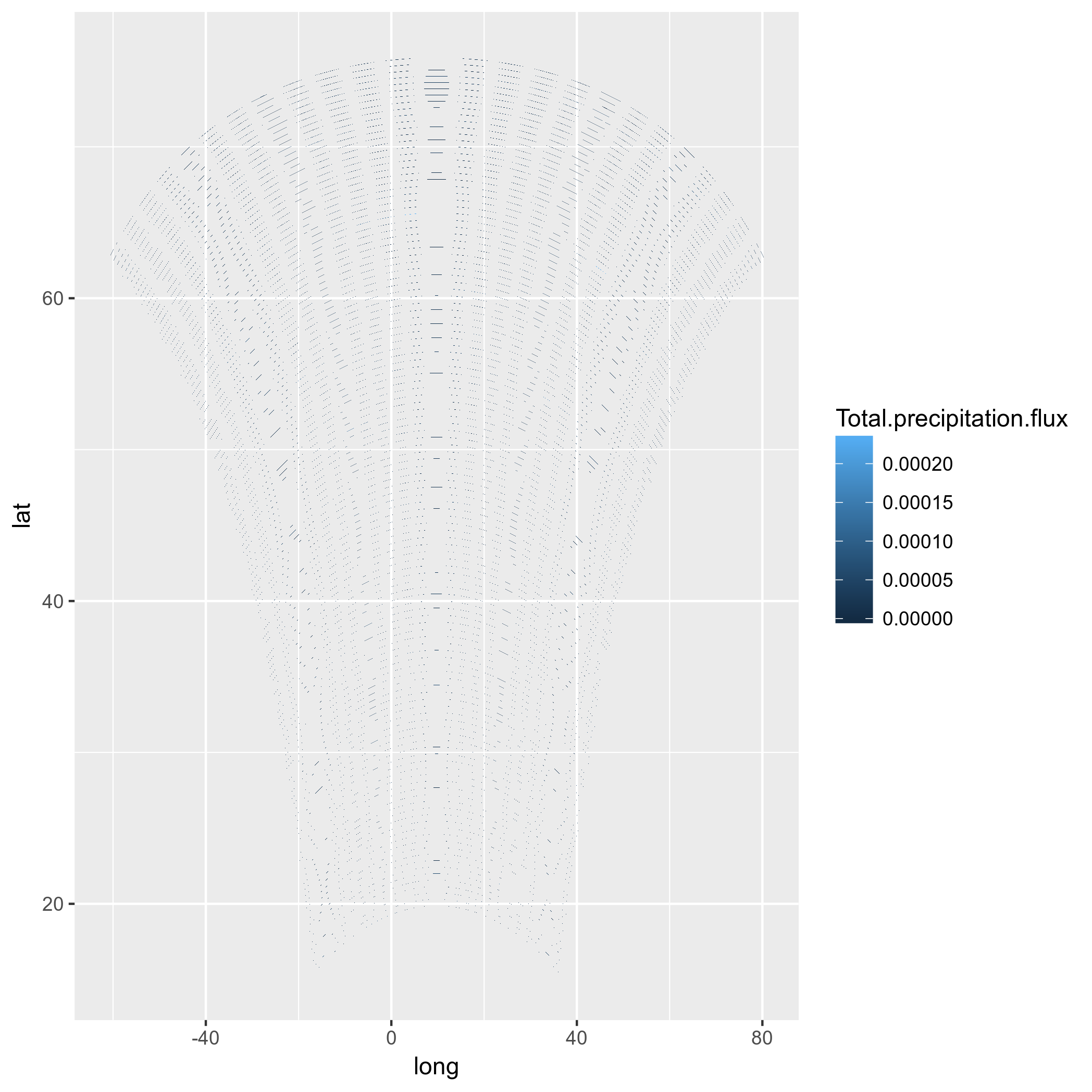
ggplot(tmp2, aes(x=long, y=lat, group = group, fill=Total.precipitation.flux)) + geom_polygon() + my_fill
Ok, let's try to substitute lat-lons...
tmp2$long <- lon[]
tmp2$lat <- lat[]
#Mh, does not work! See below:
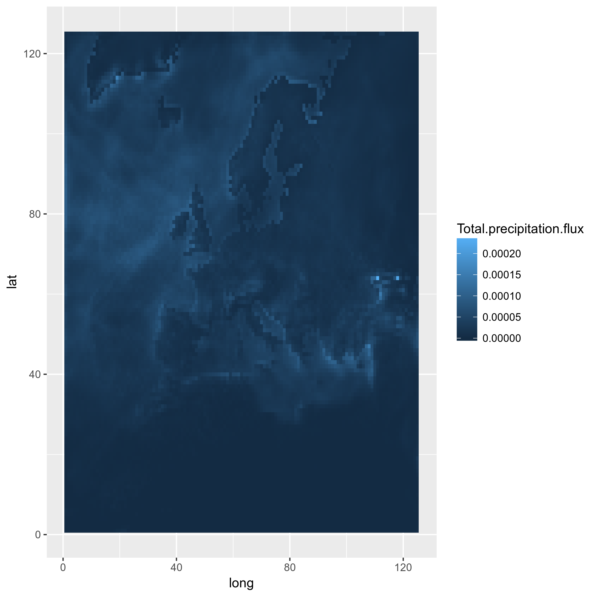
ggplot(tmp2, aes(x=long, y=lat, group = group, fill=Total.precipitation.flux)) + geom_polygon() + my_fill
(sorry that I changed the color scale in the plots)
Mmmmh, not even worth trying with a projection. Maybe I should try to compute the lat-lons of the model cell corners, and create polygons for that, and reproject that?
Conclusion
- I want to plot projected model data on its native grid, but I was not able to do so. Using tiles is incorrect, using points is hackish, and using polygons seems not to work for unknown reasons.
- When projecting via
coord_map(), gridlines and axis labels are wrong. This makes the projected ggplots unusable for publications.


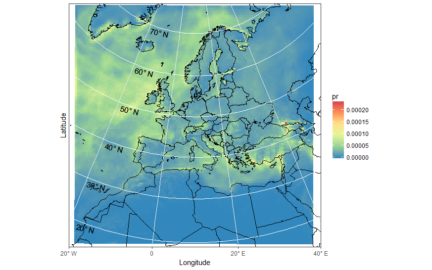
ggmap? – BoarfishreadAll()before saving. It should work now, can you test it? – Winnesresults as"+proj=lcc +lat_1=30. +lat_2=65. +lat_0=48. +lon_0=9.75 +x_0=-25000. +y_0=-25000. +ellps=sphere +a=6371229. +b=6371229. +units=m +no_defs", which is a "metric" projection. However, your coordinates are lat-long, and the resolution of the raster is 1. Where did you get the dataset ? Did you do any "spatial" elaborations on it ? – Lionellionello+units=mand I am no expert on projections, maybe there is a reason. Weird. Still, it seems to work if I reproject stuff. – Winnemapview, you end up with a completely wrong coordinates system. – LionellionelloRasterStackobject. This may lead to confusion, since for example standardrasterprocessing routines such asprojectRasterare not going to work properly. Saving it as aSpatialPixelsDataFramewould be better, in my opinion. – Lionellionelloraster. If a projection is necessary inside R, I follow these excellent instructions: gis.stackexchange.com/questions/120900/… – WinneNCLcan do more precise plots is quite annoying :) Other NetCDF plotting softwares (such as GrADS and I believe Ferret), on the other hand, just automatically remap on their internal high-res LAT-LON grid without letting the user know it. These plots are considered acceptable, but I want to do better. – Winne