Chrome Responsive Emulator - How to default zoom to 100%
Asked Answered
G

3

24

One of the most annoying things I encounter on a daily basis is constantly having to reset the zoom of the chrome device emulator.

For whatever reason, each time I change the device selection, the zoom changes from 100% to the "Fit to Window" size, which is always less than 100% and renders the page and text so tiny its unusable.

I've seen the "Edit" menu under the device listing, and this is where I would expect to find the setting to always default the zoom to 100%, however, I'm not seeing it there. What am I missing?

Galway answered 18/10, 2017 at 15:19 Comment(3)
good question. Exactly what i am searching forLitigious
I would like to know an answer to this as well ) so far it doesn't seem to be possible (in latest Chrome version at least).Legislative
Pretty late to ask something on this thread, but is the real text size on physical devices close to their size when displaying in 100% zoom in chrome? Or they're smaller in real scale? I mean, there must be a reason that the inspect tool auto-adjusts zoom value.Sadirah
D
19

I had this problem for a while. Go to the right top menu as you see in the picture. Click on "Reset to defaults". It worked for me.

chrome developer tools

Daughterly answered 5/3, 2018 at 10:35 Comment(3)
Please use "Add Image" button in the answer editor to insert images so that they would actually show in the post.Legislative
Wow thanks a lot! This saves me a lot of hair from being teared out.Stadler
Worked for me on a Mac when nothing else did, thanks!Staccato
P
6

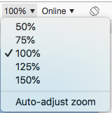
In the same menu where you are resetting the zoom percentage (the "Edit" menu you mentioned), you will see an option called "Auto-adjust zoom". Uncheck that option and set your zoom to 100%. enter image description here

Paradox answered 12/9, 2018 at 22:43 Comment(2)
The "Reset to Defaults" solution did not work for me but this one did!Lovato
This worked perfectly fine. Thanks a lotScudo
A
0

Despite older solutions, I found that the device ratio is the main problem in recreating a device viewport. The dev tools pixel device ratio input doesn't seme to work as expected. For me, the only reliable method is to use viewport size instead of resolution with pixel ratio blank. The added benefit is testing when users have a bookmarks bar open in Chrome or side pane open in Safari.

Caveat: "Auto-Adjust Zoom" and "Fit to Window" won't work with these methods... if you have a large screen and are working on a small UI use the preset zoom levels 100%, 125%, etc.

The Manual Method

Here's a walkthrough I use with a macbook pro as an example (screen res 2880x1800 pixel-ratio 2).

  1. Get a screenshot from the user with your website open on their device (make sure page zoom is reset, e.g. cmd+0 or ctrl+0)
  2. Open the screenshot, measure the pixels of the webpage only. My example user had the bookmarks bar open, and I measured the viewport as 2880 by 1514.
  3. Divide the above by the device ratio to get the viewport. Macbook Pro is 2.
    • 2880/2 = 1440
    • 1514/2 = 757
  4. Compensate for the bookmarks bar height, add 23 pixels to the height.
    • 757 + 23 = 780
  5. Create a custom responsive profile (width first):
    • Width: 1440
    • Height: 780
    • Device pixel ratio: ____ (leave blank)

Now selecting that profile will default to 100% and is an exact match to the user.

The Programmatic Method (collecting user viewports)

In supporting more devices, this is a reoccurring problem for me. I ended up automating viewport measurement by adding the JS below to measure the viewport, and it gets sent back and stored in a db with the user's session.

const vw = Math.max(document.documentElement.clientWidth || 0, window.innerWidth || 0);
const vh = Math.max(document.documentElement.clientHeight || 0, window.innerHeight || 0);

console.log(`ViewPortWidth=${vw}`); // 1440 
console.log(`ViewPortHeight=${vh}`); // 780

// Example of how to collect analytics on user viewports
const user = Users.getActiveUser(); // pretend fn call
user.addCurrentViewPort(vw, vh);
user.persist();

Later on, query the db and see what viewports your users use... add new responsive test profiles.

Animosity answered 4/1 at 18:3 Comment(0)

© 2022 - 2024 — McMap. All rights reserved.