Annotate the linear regression equation
Asked Answered
U

4

24

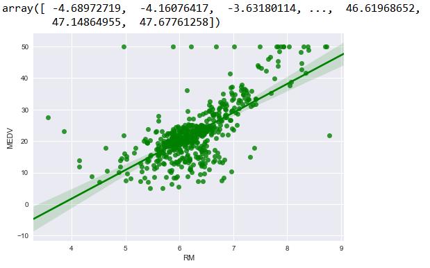
I tried fitting an OLS for Boston data set. My graph looks like below.

How to annotate the linear regression equation just above the line or somewhere in the graph? How do I print the equation in Python?

I am fairly new to this area. Exploring python as of now. If somebody can help me, it would speed up my learning curve.

OLS fit

I tried this as well.

enter image description here

My problem is - how to annotate the above in the graph in equation format?

Urinal answered 27/8, 2017 at 7:40 Comment(0)
S
36

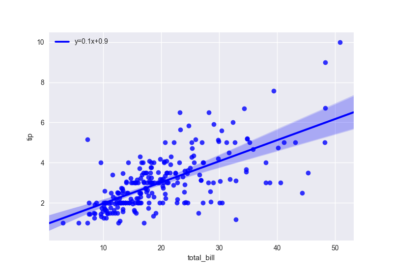
You can use coefficients of linear fit to make a legend like in this example:

import seaborn as sns
import matplotlib.pyplot as plt
from scipy import stats

tips = sns.load_dataset("tips")

# get coeffs of linear fit
slope, intercept, r_value, p_value, std_err = stats.linregress(tips['total_bill'],tips['tip'])

# use line_kws to set line label for legend
ax = sns.regplot(x="total_bill", y="tip", data=tips, color='b', 
 line_kws={'label':"y={0:.1f}x+{1:.1f}".format(slope,intercept)})

# plot legend
ax.legend()

plt.show()

enter image description here

If you use more complex fitting function you can use latex notification: https://matplotlib.org/users/usetex.html

Salep answered 27/8, 2017 at 9:59 Comment(2)
how do you know the regplot line reflects the scipy.stats regression params? It is surprising seaborn does not provide the params it calculates for making their plots...Endmost
@Endmost nor do they plan to do so unfortuantely https://mcmap.net/q/275766/-display-regression-equation-in-seaborn-regplot-duplicateDilute
M
6

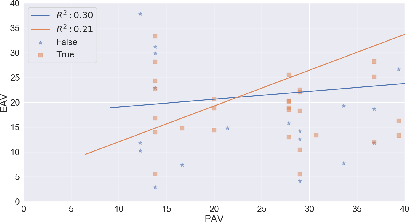
To annotate multiple linear regression lines in the case of using seaborn lmplot you can do the following.

 import pandas as pd 
 import seaborn as sns
 import matplotlib.pyplot as plt 

df = pd.read_excel('data.xlsx')
# assume some random columns called EAV and PAV in your DataFrame 
# assume a third variable used for grouping called "Mammal" which will be used for color coding
p = sns.lmplot(x=EAV, y=PAV,
        data=df, hue='Mammal', 
        line_kws={'label':"Linear Reg"}, legend=True)

ax = p.axes[0, 0]
ax.legend()
leg = ax.get_legend()
L_labels = leg.get_texts()
# assuming you computed r_squared which is the coefficient of determination somewhere else
slope, intercept, r_value, p_value, std_err = stats.linregress(df['EAV'],df['PAV'])
label_line_1 = r'$y={0:.1f}x+{1:.1f}'.format(slope,intercept)
label_line_2 = r'$R^2:{0:.2f}$'.format(0.21) # as an exampple or whatever you want[!
L_labels[0].set_text(label_line_1)
L_labels[1].set_text(label_line_2)

Result: enter image description here

Mugwump answered 14/1, 2020 at 23:21 Comment(2)
I don't get why you put 0.21 ("or whatever you want", using your words) in the label_line_2, instead of the actual r_value**2 provided by stats.linregress.Uchish
because this is an example :) of course you can do that. the question was to annotate the linear regression line, not how to write the R square value in the annotation.Mugwump
J
2

Simpler syntax.. same result.

    import seaborn as sns
    import matplotlib.pyplot as plt
    from scipy import stats
        
    slope, intercept, r_value, pv, se = stats.linregress(df['alcohol'],df['magnesium'])
        
    sns.regplot(x="alcohol", y="magnesium", data=df, 
      ci=None, label="y={0:.1f}x+{1:.1f}".format(slope, intercept)).legend(loc="best")
Jess answered 17/5, 2020 at 18:31 Comment(1)
you can use f strings for python3 here of course tooJess
H
1

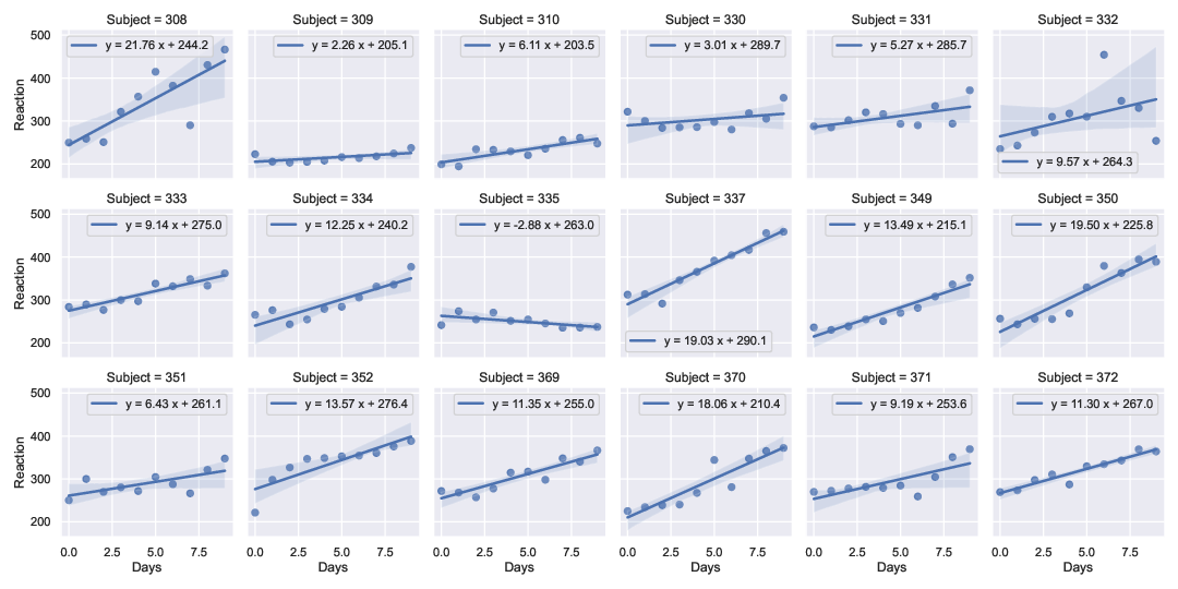
I extended the solution by @RMS to work for a multi-panel lmplot example (using data from a sleep-deprivation study (Belenky et. al., J Sleep Res 2003) available in pydataset). This allows one to have axis-specific legends/labels without having to use, e.g., regplot and plt.subplots.

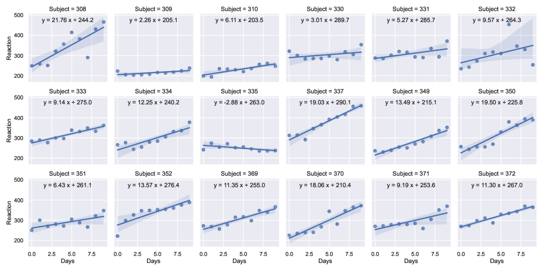
Edit: Added second method using the map_dataframe() method from FacetGrid(), as suggested in the answer by Marcos here.

import numpy as np
import scipy as sp
import pandas as pd
import seaborn as sns
import pydataset as pds
import matplotlib.pyplot as plt

# use seaborn theme
sns.set_theme(color_codes=True)

# Load data from sleep deprivation study (Belenky et al, J Sleep Res 2003)
#  ['Reaction', 'Days', 'Subject'] = [reaction time (ms), deprivation time, Subj. No.]
df = pds.data("sleepstudy")
# convert integer label to string
df['Subject'] = df['Subject'].apply(str)

# perform linear regressions outside of seaborn to get parameters
subjects = np.unique(df['Subject'].to_numpy())
fit_str = []
for s in subjects:
    ddf = df[df['Subject'] == s]
    m, b, r_value, p_value, std_err = \
        sp.stats.linregress(ddf['Days'],ddf['Reaction'])
    fs = f"y = {m:.2f} x + {b:.1f}"
    fit_str.append(fs)

method_one = False
method_two = True
if method_one:
    # Access legend on each axis to write equation
    #
    # Create 18 panel lmplot with seaborn
    g = sns.lmplot(x="Days", y="Reaction", col="Subject",
                   col_wrap=6, height=2.5, data=df,
                   line_kws={'label':"Linear Reg"}, legend=True)
    # write string with fit result into legend string of each axis
    axes = g.axes # 18 element list of axes objects
    i=0
    for ax in axes:
        ax.legend()  # create legend on axis
        leg = ax.get_legend()
        leg_labels = leg.get_texts()
        leg_labels[0].set_text(fit_str[i])
        i += 1
elif method_two:
    # use the .map_dataframe () method from FacetGrid() to annotate plot
    #  https://stackoverflow.com/questions/25579227 (answer by @Marcos)
    #
    # Create 18 panel lmplot with seaborn
    g = sns.lmplot(x="Days", y="Reaction", col="Subject",
                   col_wrap=6, height=2.5, data=df)
    def annotate(data, **kws):
        m, b, r_value, p_value, std_err = \
            sp.stats.linregress(data['Days'],data['Reaction'])
        ax = plt.gca()
        ax.text(0.5, 0.9, f"y = {m:.2f} x + {b:.1f}",
                horizontalalignment='center',
                verticalalignment='center',
                transform=ax.transAxes)
    g.map_dataframe(annotate)

# write figure to pdf
plt.savefig("sleepstudy_data_w-fits.pdf")

Output (Method 1): enter image description here

Output (Method 2): enter image description here

Update 2022-05-11: Unrelated to the plotting techniques, it turns out that this interpretation of the data (and that provided, e.g., in the original R repository) is incorrect. See the reported issue here. Fits should be done to days 2-9, corresponding to zero to seven days of sleep deprivation (3h sleep per night). The first three data points correspond to training and baseline days (all with 8h sleep per night).

Heisser answered 2/4, 2022 at 18:26 Comment(0)

© 2022 - 2024 — McMap. All rights reserved.