What is a clearfix?
Asked Answered
O

10

1080

Recently I was looking through some website's code, and saw that every <div> had a class clearfix.

After a quick Google search, I learned that it is for IE6 sometimes, but what actually is a clearfix?

Could you provide some examples of a layout with a clearfix, compared to a layout without a clearfix?

Orogeny answered 18/12, 2011 at 19:2 Comment(2)
It is not for IE 6. A clearfix ensures that a div will fully expand to proper height to enclose its floating children. webtoolkit.info/css-clearfix.htmlPropagation
This 6-minute YouTube video explained it better than these answers IMO youtube.com/…Sludgy
C
1036

If you don't need to support IE9 or lower, you can use flexbox freely, and don't need to use floated layouts.

It's worth noting that today, the use of floated elements for layout is getting more and more discouraged with the use of better alternatives.

  • display: inline-block - Better
  • Flexbox - Best (but limited browser support)

Flexbox is supported from Firefox 18, Chrome 21, Opera 12.10, and Internet Explorer 10, Safari 6.1 (including Mobile Safari) and Android's default browser 4.4.

For a detailed browser list see: https://caniuse.com/flexbox.

(Perhaps once its position is established completely, it may be the absolutely recommended way of laying out elements.)


A clearfix is a way for an element to automatically clear its child elements, so that you don't need to add additional markup. It's generally used in float layouts where elements are floated to be stacked horizontally.

The clearfix is a way to combat the zero-height container problem for floated elements

A clearfix is performed as follows:

.clearfix::after {
   content: " "; /* Older browser do not support empty content */
   visibility: hidden;
   display: block;
   height: 0;
   clear: both;
}

Or, if you don't require IE<8 support, the following is fine too:

.clearfix::after {
  content: "";
  display: table;
  clear: both;
}

Normally you would need to do something as follows:

<div>
    <div style="float: left;">Sidebar</div>
    <div style="clear: both;"></div> <!-- Clear the float -->
</div>

With clearfix, you only need the following:

<div class="clearfix">
    <div style="float: left;" class="clearfix">Sidebar</div>
    <!-- No Clearing div! -->
</div>

Read about it in this article - by Chris Coyer @ CSS-Tricks

Crackup answered 18/12, 2011 at 19:4 Comment(14)
either way for whatever reason a white space is a better practice than a dot, I have had problems with the dot on some browsers hence why I mentioned it :) a little improvement wont hurt :)Nevile
content: "\00A0"; the \00A0 represent a white space, a simple white space does not work well :) sorry. :)Nevile
@MadaraUchiha, why is display:inline-block better than floating elements? The only problem I have is that displaying with inline block causes problems with there is whitespace between the tags, which isn't always easily controllable.Demarcation
It's always easily controllable. If you don't have html access, you set font-size: 0 on the container.Dibbell
@MadaraUchiha And then you have to re-instate the font-size on the content inside the display: inline-block elements. It's pretty ridiculous how far you have to go to get two squares to sit side by side with css.Length
@Kzqai: Which is why flexbox is the preferred option when it becomes more widely supported.Dibbell
Disagree that display: inline-block is better than floats for block-based layout. Inline-blocks are, as their name implies, laid inline - most layouts are block-based and having these blocks be laid out in an inline formatting context just doesn't make sense. You also have to deal with various issues associated with inline formatting, such as inter-element whitespace, other inline elements, sizing, alignment and so on as a lot of others have pointed out. Granted, float layouts don't make a whole lot of sense either, but at least floats have the benefit of being block-based.Squadron
@BoltClock: Yes well, it depends. Each has their issues. But we're at a day and age where flexbox is a thing. So that means that both suck. You just need to choose the lesser evil to do your job.Dibbell
As mentioned in css-tricks.com (css-tricks.com/snippets/css/clear-fix), this is the best approach in using clearfix: .group:before, .group:after { content: ""; display: table; } .group:after { clear: both; } .group { zoom: 1; /* For IE 6/7 (trigger hasLayout) */ }Renshaw
I don't understand why there seem to be two kind of clearfix: one that combats the zero-heigth problem (with overflow: auto) and one that removes the need for a clear:both div. Why are they called the same thing?Frazier
@Frazier Clearfix is practically a hack, a workaround. Floats should not be used for layout, that's not what they were meant for. Assuming you don't need lower IE support, you should be using flexbox for layout.Dibbell
"Flexbox - Best". This is an opinion and one I don't necessarily agree with. Flexbox has a time and place but doesn't replace floating elements. Flexbox adds a more stable row-column-row-column approach (like tables). This is inflexible with responsive design and you should consider what works best for you. Personally, I don't like building websites with tables. For that reason I don't like using flexbox.Impel
inline-block has a noteworthy problem with whitespace sensitivity, and should go in the kludgy hack pile too. display:flex based solutions sure seem nice when you are coding them.Congeneric
@MicahWilliamson Well, as opposed to the other approaches, flexbox was literally designed for exactly this. Therefore, it's objectively better than other solutions which are considered hacks.Dibbell
F
73

The other answers are correct. But I want to add that it is a relic of the time when people were first learning CSS, and abused float to do all their layout. float is meant to do stuff like float images next to long runs of text, but lots of people used it as their primary layout mechanism. Since it wasn't really meant for that, you need hacks like "clearfix" to make it work.

These days display: inline-block is a solid alternative (except for IE6 and IE7), although more modern browsers are coming with even more useful layout mechanisms under names like flexbox, grid layout, etc.

Fjeld answered 18/12, 2011 at 19:8 Comment(2)
My practice has come to this that there is no reason to use float ever. Whenever you use it half of the things break. I would only use it when i need things to conjure up inside a div. Inline-block is awesome. New box model is awesome. So no more hacks to go vertical align.Emelinaemeline
inline-block is not a strict improvement over floats because of the inter-block spacing problem, where whitespace in the HTML translates to space characters that separate blocks. inline-block requires workarounds of its own, just like float requires clearfix.Sputum
P
46

The clearfix allows a container to wrap its floated children. Without a clearfix or equivalent styling, a container does not wrap around its floated children and collapses, just as if its floated children were positioned absolutely.

There are several versions of the clearfix, with Nicolas Gallagher and Thierry Koblentz as key authors.

If you want support for older browsers, it's best to use this clearfix :

.clearfix:before, .clearfix:after {
    content: "";
    display: table;
}

.clearfix:after {
    clear: both;
}

.clearfix {
    *zoom: 1;
}

In SCSS, you could use the following technique :

%clearfix {
    &:before, &:after {
        content:" ";
        display:table;
    }

    &:after {
        clear:both;
    }

    & {
        *zoom:1;
    }
}

#clearfixedelement {
    @extend %clearfix;
}

If you don't care about supporting older browsers, there's a shorter version :

.clearfix:after {
    content:"";
    display:table;
    clear:both;
}
Popcorn answered 18/4, 2014 at 9:35 Comment(2)
Nice answer John! What I am wondering about is why does clear make the div wrap the floated elements? Can you help me visualize it?Wensleydale
@AlexanderSuraphel : This answer explains it in detail -> #12872210Popcorn
M
18

To offer an update on the situation on Q2 of 2017.

A new CSS3 display property is available in Firefox 53, Chrome 58 and Opera 45.

.clearfix {
   display: flow-root;
}

Check the availability for any browser here: http://caniuse.com/#feat=flow-root

The element (with a display property set to flow-root) generates a block container box, and lays out its contents using flow layout. It always establishes a new block formatting context for its contents.

Meaning that if you use a parent div containing one or several floating children, this property is going to ensure the parent encloses all of its children. Without any need for a clearfix hack. On any children, nor even a last dummy element (if you were using the clearfix variant with :before on the last children).

.container {
  display: flow-root;
  background-color: Gainsboro;
}

.item {
  border: 1px solid Black;
  float: left;
}

.item1 {  
  height: 120px;
  width: 120px;
}

.item2 {  
  height: 80px;
  width: 140px;
  float: right;
}

.item3 {  
  height: 160px;
  width: 110px;
}
<div class="container">
  This container box encloses all of its floating children.
  <div class="item item1">Floating box 1</div>
  <div class="item item2">Floating box 2</div> 
  <div class="item item3">Floating box 3</div>  
</div>
Microcurie answered 20/4, 2017 at 21:2 Comment(2)
Can you describe what this does in relation to the question?Latrell
Clearfix changes floated children not influencing the parent flow by using what are clever hacks, flow-root is the real solution.Alienate
S
12

Simply put, clearfix is a hack.

It is one of those ugly things that we all just have to live with as it is really the only reasonable way of ensuring floated child elements don't overflow their parents. There are other layout schemes out there but floating is too commonplace in web design/development today to ignore the value of the clearfix hack.

I personally lean towards the Micro Clearfix solution (Nicolas Gallagher)

.container:before,
.container:after {
  content:"";
  display:table;
}
.container:after {
  clear:both;
}
.container {
  zoom:1; /* For IE 6/7 (trigger hasLayout) */
}

reference

Swivel answered 17/12, 2014 at 2:27 Comment(0)
C
6

A technique commonly used in CSS float-based layouts is assigning a handful of CSS properties to an element which you know will contain floating elements. The technique, which is commonly implemented using a class definition called clearfix, (usually) implements the following CSS behaviors:

.clearfix:after {
    content: ".";
    display: block;
    height: 0;
    clear: both;
    visibility: hidden;
    zoom: 1
}

The purpose of these combined behaviors is to create a container :after the active element containing a single '.' marked as hidden which will clear all preexisting floats and effectively reset the the page for the next piece of content.

Commemoration answered 18/12, 2011 at 19:9 Comment(0)
P
3

I tried out the accepted answer but I still had a problem with the content alignment. Adding a ":before" selector as shown below fixed the issue:

// LESS HELPER
.clearfix()
{
    &:after, &:before{
       content: " "; /* Older browser do not support empty content */
       visibility: hidden;
       display: block;
       height: 0;
       clear: both;
    }
}

LESS above will compile to CSS below:

clearfix:after,
clearfix:before {
  content: " ";
  /* Older browser do not support empty content */
  visibility: hidden;
  display: block;
  height: 0;
  clear: both;
}
Prosthodontics answered 13/1, 2016 at 0:56 Comment(0)
U
1

The other (and perhaps simplest) option for acheiving a clearfix is to use overflow:hidden; on the containing element. For example

.parent {
  background: red;
  overflow: hidden;
}
.segment-a {
  float: left;
}
.segment-b {
  float: right;
}
<div class="parent">
  <div class="segment-a">
    Float left
  </div>
  <div class="segment-b">
    Float right
  </div>
</div>

Of course this can only be used in instances where you never wish the content to overflow.

Upbear answered 19/4, 2015 at 8:39 Comment(0)
S
0

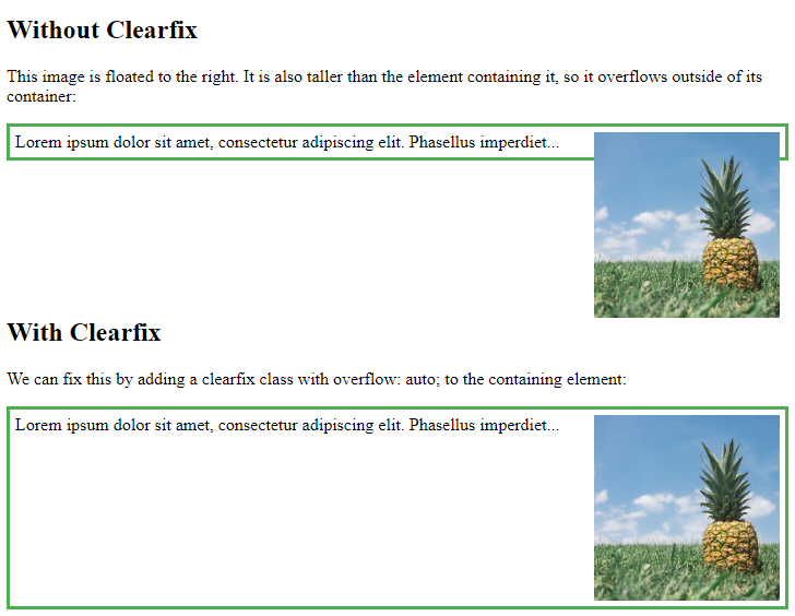
What is Clearfix?

A way for an element to clear its child elements automatically without any additional markup.

Working with properties: CSS clearfix is used to fix the overflow elements from the desired element. This can be worked with 3 properties:

  • Overflow Property
  • Height Property
  • Float Property

This all 3 CSS properties are used for fixing the overflow elements.

Why ClearFix?

  • To avoid adding unnecessary markup, an element can automatically clear or fix its elements using a clearfix.
  • It is employed in float layouts where elements are floated to form a horizontal stack.

When Clearfix?

  • When two or more floating items are placed next to one another.

When items are positioned in this fashion, the parent container has a height of 0, which can easily mess up a layout. The problem is inconsistent among browsers, which makes matters more difficult. To address all of that, the clearfix was created.

Like this:

23432423

Example(for your understanding):

<head>
<style>
div {
  border: 3px solid #4CAF50;
  padding: 5px;
}

.img1 {
  float: right;
}

.img2 {
  float: right;
}

.clearfix {
  overflow: auto;
}
</style>
</head>
<body>

<h2>Without Clearfix</h2>

<p>This image is floated to the right. It is also taller than the element containing it, so it overflows outside of its container:</p>

<div>
  <img class="img1" src="pineapple.jpg" alt="Pineapple" width="170" height="170">
  Lorem ipsum dolor sit amet, consectetur adipiscing elit. Phasellus imperdiet...
</div>

<h2 style="clear:right">With Clearfix</h2>
<p>We can fix this by adding a clearfix class with overflow: auto; to the containing element:</p>

<div class="clearfix">
  <img class="img2" src="pineapple.jpg" alt="Pineapple" width="170" height="170">
  Lorem ipsum dolor sit amet, consectetur adipiscing elit. Phasellus imperdiet...
</div>

</body>

Output of above code:

output

Is Clearfix becoming obselete?

Almost 15 years after it was first proposed and with the updates in 2007 and 2013, today the clearfix is losing relevance because today CSS Grid and Flexbox are filling in the gaps for advanced layout on the web.

Hope it helps.

Serajevo answered 30/1, 2023 at 8:46 Comment(0)
N
-1

Here is a different method same thing but a little different

the difference is the content dot which is replaced with a \00A0 == whitespace

More on this http://www.jqui.net/tips-tricks/css-clearfix/

.clearfix:after { content: "\00A0"; display: block; clear: both; visibility: hidden; line-height: 0; height: 0;}
.clearfix{ display: inline-block;}
html[xmlns] .clearfix { display: block;}
* html .clearfix{ height: 1%;}
.clearfix {display: block}

Here is a compact version of it...

.clearfix:after { content: "\00A0"; display: block; clear: both; visibility: hidden; line-height: 0; height: 0;width:0;font-size: 0px}.clearfix{ display: inline-block;}html[xmlns] .clearfix { display: block;}* html .clearfix{ height: 1%;}.clearfix {display: block}
Nevile answered 20/9, 2012 at 9:17 Comment(2)
You are overriding yourself here in at least 3 instances. .clearfix {...}, html[xmlns] .clearfix {...}, * html .clearfix {...}, and .clearfix {...} all select the same thing and overwrite each other. This is a little hacky and not really needed.Dwaindwaine
This is the old version of CSS clearfix method, was taken from css-tricks.com/snippets/css/clear-fix which I then found out, that the "."[dot] was too annoying and replaced it with a white space, hence why \00A0, I think it was because of cross browser compatibility and the knowledge of the time.Nevile

© 2022 - 2024 — McMap. All rights reserved.