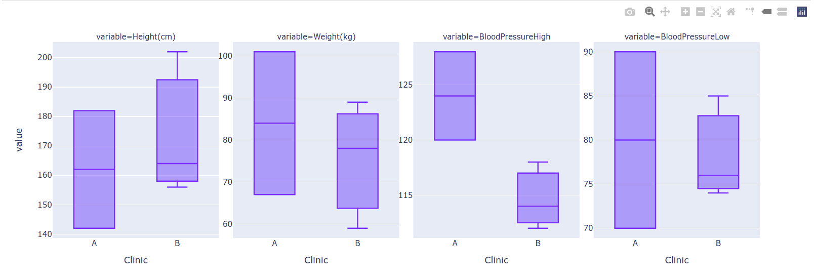
When I use Plotly express to plot different parameters with different ranges - in the example below, BloodPressureHigh, Height(cm), Weight(kg), and BloodPressureLow - using the facet_col argument, I am unable to get the resulting plot to display the unique YTicks for each of the faceted plots. Is there an easy method for the fig object to show each set of YTicks in the resulting faceted plot? Otherwise, as you can see in the resulting image, it is unclear that each box plot is on its own unique YAxis.
import plotly.express as px
import pandas as pd

temp = [
    {"Clinic": "A", "Subject": "Bill", "Height(cm)": 182, "Weight(kg)": 101, "BloodPressureHigh": 128, "BloodPressureLow": 90},
    {"Clinic": "A", "Subject": "Susie", "Height(cm)": 142, "Weight(kg)": 67, "BloodPressureHigh": 120, "BloodPressureLow": 70},
    {"Clinic": "B", "Subject": "John", "Height(cm)": 202, "Weight(kg)": 89, "BloodPressureHigh": 118, "BloodPressureLow": 85},
    {"Clinic": "B", "Subject": "Stacy", "Height(cm)": 156, "Weight(kg)": 78, "BloodPressureHigh": 114, "BloodPressureLow": 76},
    {"Clinic": "B", "Subject": "Lisa", "Height(cm)": 164, "Weight(kg)": 59, "BloodPressureHigh": 112, "BloodPressureLow": 74}
]
df = pd.DataFrame(temp)

# Melt the dataframe so I can use plotly express to plot distributions of all variables
df_melted = df.melt(id_vars=["Clinic", "Subject"])
# Plot distributions, with different parameters in different columns
fig = px.box(df_melted, x="Clinic", y="value",
       facet_col="variable", boxmode="overlay"
)
# Update the YAxes so that the faceted column plots no longer share common YLimits
fig.update_yaxes(matches=None)
# Last step needed: Add tick labels to each yaxis so that the difference in YLimits is clear?


