Changing marker style in scatter plot according to third variable
Asked Answered
J

3

25

I am dealing with a multi-column dictionary. I want to plot two columns and subsequently change color and style of the markers according to a third and fourth column.

I struggle with changing the marker style in the pylab scatter plot. My approach, which works for color, unfortunately does not work for marker style.

x=[1,2,3,4,5,6]
y=[1,3,4,5,6,7]
m=['k','l','l','k','j','l']

for i in xrange(len(m)):
    m[i]=m[i].replace('j','o')
    m[i]=m[i].replace('k','x')
    m[i]=m[i].replace('l','+')

plt.scatter(x,y,marker=m)
plt.show()
Jodhpur answered 14/9, 2013 at 10:46 Comment(0)
D
24

The problem is that marker can only be a single value and not a list of markers, as the color parmeter.

You can either do a grouping by marker value so you have the x and y lists that have the same marker and plot them:

xs = [[1, 2, 3], [4, 5, 6]]
ys = [[1, 2, 3], [4, 5, 6]]
m = ['o', 'x']
for i in range(len(xs)):
    plt.scatter(xs[i], ys[i], marker=m[i])
plt.show()

Or you can plot every single dot (which I would not recommend):

x=[1,2,3,4,5,6]
y=[1,3,4,5,6,7]
m=['k','l','l','k','j','l']

mapping = {'j' : 'o', 'k': 'x', 'l': '+'}

for i in range(len(x)):
    plt.scatter(x[i], y[i], marker=mapping[m[i]])
plt.show()
Dalhousie answered 14/9, 2013 at 11:4 Comment(1)
Aha, this is what I've just found myself wrestling with - the docs say that marker can be array-like which seems a bit misleading. Thanks for stating this clearly.Taishataisho
H
18

Adding to the answer of Viktor Kerkez and using a bit of Numpy you can do something like the following:

x = np.array([1,2,3,4,5,6])
y = np.array([1,3,4,5,6,7])
m = np.array(['o','+','+','o','x','+'])

unique_markers = set(m)  # or yo can use: np.unique(m)

for um in unique_markers:
    mask = m == um 
    # mask is now an array of booleans that can be used for indexing  
    plt.scatter(x[mask], y[mask], marker=um)
Hofer answered 15/9, 2013 at 5:27 Comment(0)
B
9

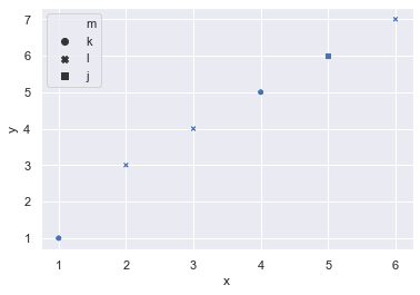
Easiest solution for me was to use pandas and seaborn:

import pandas as pd   # '0.25.3'
import seaborn as sns # '0.9.0'

data = pd.DataFrame(
    dict(x=[1,2,3,4,5,6],
    y=[1,3,4,5,6,7],
    m=['k','l','l','k','j','l'],)
)

sns.scatterplot(data=data, x='x', y='y', style='m')

plot

seaborn automatically chooses the marker style for you.

Basket answered 27/11, 2019 at 18:56 Comment(0)

© 2022 - 2024 — McMap. All rights reserved.