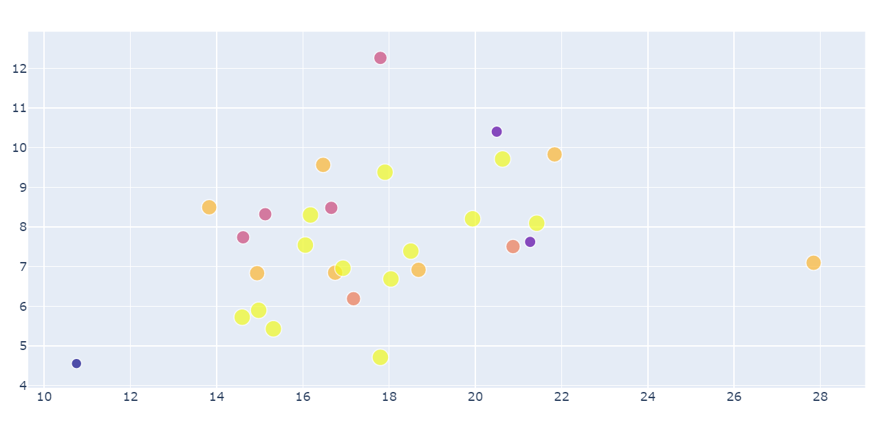
I have a very simple bubble chart, see below. the only thing i need is to be able to get the range (or the min and max) or the x and y axis generated.
trace = go.Scatter(
    x=df_test['total_points_mean'],
    y=df_test['total_points_std'],
    mode='markers',
    text=df_test['play_maker'],
    marker=dict(size=df_test['week_nunique'],
                color = df_test['week_nunique'],
                showscale=True)
)

layout = go.Layout(title='Scatter Plot')
fig = go.Figure(data=[trace],layout=layout)
From the resulting plot, the min and max of the x axis seems to be around ~10 and ~29, but i need a way to generate the exact value of the axis range.
Is there a way to access the generated axes range?


