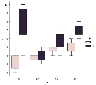
It's not adding a lot to this conversation, but after struggling with this for longer than warranted (the actual clusters are unusable), I thought I would add my implementation as another example. It's got a superimposed scatterplot (because of how annoying my dataset is), shows melt using indices, and some aesthetic tweaks. I hope this is useful for someone.
output_graph
Here it is without using column headers (I saw a different thread that wanted to know how to do this using indices):
combined_array: ndarray = np.concatenate([dbscan_output.data, dbscan_output.labels.reshape(-1, 1)], axis=1)
cluster_data_df: DataFrame = DataFrame(combined_array)

if you want to use labelled columns:
column_names: List[str] = list(outcome_variable_names)
column_names.append('cluster')
cluster_data_df.set_axis(column_names, axis='columns', inplace=True)

graph_data: DataFrame = pd.melt(
    frame=cluster_data_df,
    id_vars=['cluster'],
    # value_vars is an optional param - by default it uses columns except the id vars, but I've included it as an example
    # value_vars=['outcome_var_1', 'outcome_var_2', 'outcome_var_3', 'outcome_var_4', 'outcome_var_5', 'outcome_var_6']
    var_name='psychometric_test',
    value_name='standard deviations from the mean'
)
The resulting dataframe (rows = sample_n x variable_n (in my case 1626 x 6 = 9756)):
| index |
cluster |
psychometric_tst |
standard deviations from the mean |
| 0 |
0.0 |
outcome_var_1 |
-1.276182 |
| 1 |
0.0 |
outcome_var_1 |
-1.118813 |
| 2 |
0.0 |
outcome_var_1 |
-1.276182 |
| 9754 |
0.0 |
outcome_var_6 |
0.892548 |
| 9755 |
0.0 |
outcome_var_6 |
1.420480 |
If you want to use indices with melt:
graph_data: DataFrame = pd.melt(
    frame=cluster_data_df,
    id_vars=cluster_data_df.columns[-1],
    # value_vars=cluster_data_df.columns[:-1],
    var_name='psychometric_test',
    value_name='standard deviations from the mean'
)
And here's the graphing code:
(Done with column headings - just note that y-axis=value_name, x-axis = var_name, hue = id_vars):
# plot graph grouped by cluster
sns.set_theme(style="ticks")
fig = plt.figure(figsize=(10, 10))
fig.set(font_scale=1.2)
fig.set_style("white")

# create boxplot
fig.ax = sns.boxplot(y='standard deviations from the mean', x='psychometric_test', hue='cluster', showfliers=False,
                     data=graph_data)

# set box alpha:
for patch in fig.ax.artists:
    r, g, b, a = patch.get_facecolor()
    patch.set_facecolor((r, g, b, .2))

# create scatterplot
fig.ax = sns.stripplot(y='standard deviations from the mean', x='psychometric_test', hue='cluster', data=graph_data,
                       dodge=True, alpha=.25, zorder=1)

# customise legend:
cluster_n: int = dbscan_output.n_clusters
## create list with legend text
i = 0
cluster_info: Dict[int, int] = dbscan_output.cluster_sizes  # custom method
legend_labels: List[str] = []
while i < cluster_n:
    label: str = f"cluster {i+1}, n = {cluster_info[i]}"
    legend_labels.append(label)
    i += 1
if -1 in cluster_info.keys():
    cluster_n += 1
    label: str = f"Unclustered, n = {cluster_info[-1]}"
    legend_labels.insert(0, label)

## fetch existing handles and legends (each tuple will have 2*cluster number -> 1 for each boxplot cluster, 1 for each scatterplot cluster, so I will remove the first half)
handles, labels = fig.ax.get_legend_handles_labels()
index: int = int(cluster_n*(-1))
labels = legend_labels
plt.legend(handles[index:], labels[0:])
plt.xticks(rotation=45)
plt.show()

asds
Just a note: Most of my time was spent debugging the melt function. I predominantly got the error "*only integer scalar arrays can be converted to a scalar index with 1D numpy indices array*". My output required me to concatenate my outcome variable value table and the clusters (DBSCAN), and I'd put extra square brackets around the cluster array in the concat method. So I had a column where each value was an invisible List[int], rather than a plain int. It's pretty niche, but maybe it'll help someone.
- List item


sns.boxplotsince 0.6. – Ninebark