SwiftUI stop Divider from expanding vertically in HStack
Asked Answered
R

3

27

I'm using SwiftUI to create something like an alert popup, which I present from UIKit code using UIHostingController. The view looks like this:

VStack(spacing: 0) {
    // Some text ...   

    HStack(spacing:0) {
        Button(action: self.onCancel) { Text("Cancel") }
           .padding().inExpandingRectangle().fixedSize(horizontal: false, vertical: true)

        // This divider is the problem
        Divider() // .fixedSize()

        Button(action: self.onDelete) {  Text("Delete") }
           .padding().inExpandingRectangle().fixedSize(horizontal: false, vertical: true)
    }
}.frame(minHeight: 0)

The inExpandingRectangle is something I found in another stackoverflow question. It centers the text in each side of the HStack.

extension View {
    func inExpandingRectangle() -> some View {
        ZStack {
            Rectangle().fill(Color.clear)
            self
        }
    }
}

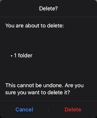
It looks like this. Garbage.

enter image description here

If I put the .fixedSize() on the divider, it does this. Not horrible, but the divider is stupid looking and doesn't expand to the size of the buttons.

enter image description here

Rosecan answered 8/4, 2020 at 5:36 Comment(0)
B
31

Here is a demo of possible simplified alternate, without that artificial extension. Tested with Xcode 11.4 / iOS 13.4.

demo

Divider() // or Rectangle().fill(Color.gray).frame(height: 1)
HStack {
    Button(action: {}) { Text("Cancel").fixedSize() }
        .padding().frame(maxWidth: .infinity)

    Divider() // or Rectangle().fill(Color.gray).frame(width: 1)

    Button(action: {}) {  Text("Delete").fixedSize() }
        .padding().frame(maxWidth: .infinity)

}.fixedSize(horizontal: false, vertical: true)

Note: It worth also to consider custom divider, like

Rectangle().fill(Color.gray).frame(width: 1) // or any other color

than might give much appropriate visual feedback, like

demo2

Bestraddle answered 8/4, 2020 at 6:57 Comment(4)
It works, thank you. I hope someday we get an a detailed explanation of how SwiftUI layout really works. As it is, I just randomly try things and hope it works, which is not a fun way to write code.Rosecan
@RobN Watch this, over and over: Stanford University's iOS class, lecture 5. youtube.com/watch?v=ayQl_F_uMS4Dygal
@Dygal Thanks, I watched that video. It's very useful, but a big question for me remains: what exactly do they mean by "flexible"? They say the container offers the subviews space, in order of least to most flexible. But how is that flexibility defined? The view protocol has no var flexibility: Double property.Rosecan
@RobN Layout Behavior 1. Some views pull in to be as small as possible to fit their content. (I will refer to these as “pull-in” views.) For e.g Button Z/H/VStack, Text, etc. 2. Some views push out to fill all available space. (I will refer to these as “push-out” views.) Knowing these two behaviors can help you predict what will happen when using the different views. For e.g - ColorAfterpiece
B
11

Putting a fixedSize() modifier on the HStack instead of the Divider fixies the problem.

    var body : some View {
        VStack(spacing: 0) {
            // Some text ...
            Text("gsfdsfkajflkasdjflkas,jdflaskjf")
            HStack(spacing:0) {
                Button(action: {print("hi")}) { Text("Cancel") }
                    .padding().inExpandingRectangle().fixedSize(horizontal: true, vertical: true)

                // This divider is the problem
                Divider()


                Button(action: {print("hello")}) {  Text("Delete") }
                    .padding().inExpandingRectangle().fixedSize(horizontal: true, vertical: true)
            }.fixedSize()        <------- Insert this
        }.frame(minHeight: 0)
    }

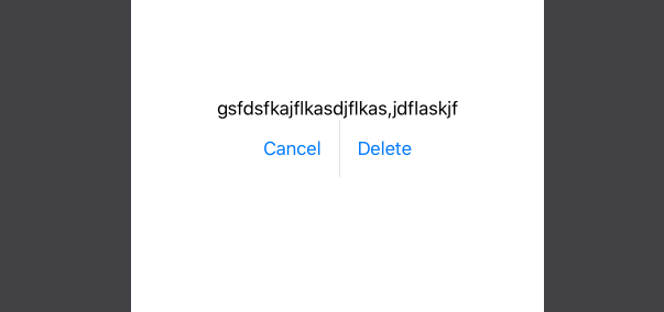
Result:

enter image description here

Baier answered 8/4, 2020 at 6:7 Comment(2)
Thanks. I needed a slight variation: .fixedWidth(horizontal: false, vertical: true) on the HStack, to keep the button text centered, but this answer helped.Rosecan
I used .fixedSize(horizontal: false, vertical: true)Fortuitous
A
0

You can try below code hope its help you (Xcode 11.2.1)

Note: Change Font, Frame and Color as per your requirement

var body: some View {

    VStack(spacing: 0) {

        Text("Delete")
            .font(Font.system(size: 20, weight: .bold))

        Text("Are you sure you want to delete ?")
            .font(Font.system(size: 18, weight: .regular))
            .padding([.top,.bottom], 15)

        Rectangle().fill(Color.gray.opacity(0.5)).frame(height:0.5)

        HStack(spacing:0) {

            Button(action: {
                //Your action
            }) {
                Text("Cancel")
                    .foregroundColor(Color.black)
                    .font(Font.system(size: 18, weight: .medium))
            }
            .frame(minWidth: 150, maxWidth: .infinity, minHeight: 40, maxHeight: 40, alignment: .center)

            Rectangle().fill(Color.gray.opacity(0.5)).frame(width:0.5,height:20)

            Button(action: {
                //Your action
            }) {
                Text("Delete")
                    .font(Font.system(size: 18, weight: .medium))
                    .foregroundColor(Color.red)
            }
            .frame(minWidth: 150, maxWidth: .infinity, minHeight: 40, maxHeight: 40, alignment: .center)
        }
    }
}

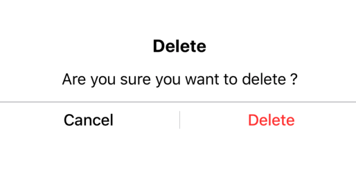
Output :

enter image description here

Arlinda answered 8/4, 2020 at 8:8 Comment(0)

© 2022 - 2024 — McMap. All rights reserved.