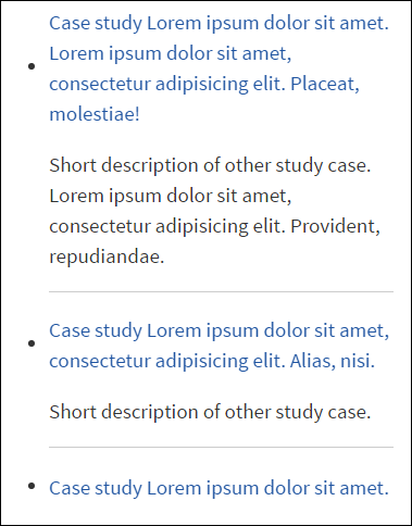
Does anyone know the CSS that makes the bullet point sit at the top of a multi-line bulleted list? For some reason with the template that I am using the bullet point centers to the left instead of simply sitting next to the first word if I have more than one line of text.
Bullets center with unordered list
Asked Answered
Can you show your code or provide a link? –
Reni
Are you sure it is bullets not background images? –
Udine
As above. The bullet point from an <li> tag should sit at the top, is it using an image? Could you provide a working sample please? –
Tanguy
I think it's pretty clear what Logan asks. –
Crenelation
Sorry I didn't get back to you guys until now... Yes the bullet is looking for an image. The CSS code is: .content-a ul li { margin: 0 0 3px 0; padding: 0 0 0 13px; background: transparent url(../images/bullet-a.png) no-repeat 0 25%; } When I was playing around with the code it was originally set to 100% but what I found was 25% fit the bullets much better. Although it is still not exact. At 25% the bullet point still sits a couple pixels below the top line and on a single line the bullet point sits a couple pixels above the line of text. –
Bagger
Set the list style position to inside the list item, see this demo fiddle.
CSS:
ul {
    list-style-position: inside;
}
This didn't work for me for some reason but
li { list-style-position: inside; } did. Could be related to the rest of the stylesheet (I'm using a template). Sorted, anyway. –
Mulholland This is not an answer per-se but it may give others an insight to a similar visual situation with a different set of circumstances.
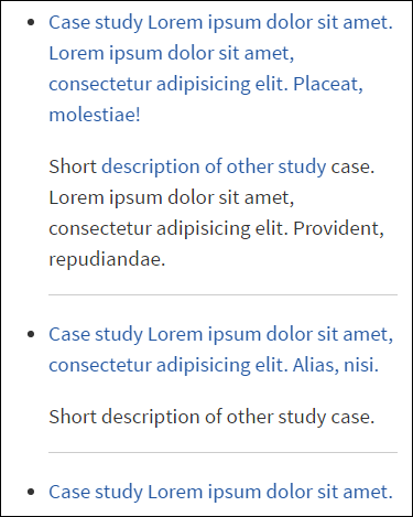
I had the same issue, like so:
My HTML looked like this:
<ul>
    <li>
        <a href="#">Link with several lines. Lorem ipsum dolor sit amet, consectetur adipisicing elit. Mollitia, commodi!</a>
        <p>Lorem ipsum dolor sit amet.</p>
    </li>
    <li>
        <a href="#">Link with several lines. Lorem ipsum dolor sit amet, consectetur adipisicing elit. Mollitia, commodi!</a>
        <p>Lorem ipsum dolor sit amet.</p>
    </li>
</ul>
And the CSS like this:
a {
    display: inline-block;
    vertical-align: middle;
}
See the offending part? The vertical-align: middle; declaration.
There are two solutions:
Solution 1
Remove the vertical-align: middle; declaration altogether.
Solution 2
Change the value: vertical-align: middle; to vertical-align: top;.
Result (as expected in the beginning):
Hope this helps.
You could do something like this:
(css)
li div:before
{
   background-image:url('bullet.png');
}

(html)
<ul>
    <li>
        <div>
            text<br />
            more text
        </div>

    </li>
</ul>
© 2022 - 2024 — McMap. All rights reserved.


