ChartJS New Lines '\n' in X axis Labels or Displaying More Information Around Chart or Tooltip with ChartJS V2
Asked Answered
C

4

27

I'm using chart.js (V2) to try to build a bar chart that has more information available to user without having to hover over or click anywhere. I've provided two examples of how I hope to edit my chart.

Two edited versions of what I hope to achieve

As can be seen, I hope to place (somewhere), some extra information outside of the labels. I had hope that by adding '\n' to the labels I might have been able to get what I was looking for similar to option A.

Some edited code is provided blow:

var barChartData = {

        labels: playerNames,
        datasets: [{
            label: 'Actual Score/Hour',
            backgroundColor: "rgba(0, 128, 0,0.5)",
            data: playerScores
          }, {
            label: 'Expected Score/Hour',
            backgroundColor: "rgba(255,0,0,0.5)",
            data: playerExpected
        }]
    };
function open_win(linktosite) {
           window.open(linktosite)
      }
        canvas.onclick = function(evt){
            var activePoints = myBar.getElementsAtEvent(evt);
            console.log(activePoints);
            linktosite = 'https://www.mytestsite.com/' + activePoints[1]['_model']['label'];
            open_win(linktosite);
}; 
window.onload = function() {
        var ctx = document.getElementById("canvas").getContext("2d");
        window.myBar = new Chart(ctx, {
            type: 'bar',
            data: barChartData,
            options: {
                title:{
                    display:true,
                    text:"Player Expected and Actual Score per Hour"
                },
                tooltips: {
                    mode: 'label'
                },
                responsive: true,
                scales: {
                    xAxes: [{
                        stacked: false,
                    }],
                    yAxes: [{
                        stacked: false
                    }]
                },
                animation: {
                    onComplete: function () {
                        var ctx = this.chart.ctx;
                        ctx.textAlign = "center";
                        Chart.helpers.each(this.data.datasets.forEach(function (dataset) {

                            Chart.helpers.each(dataset.metaData.forEach(function (bar, index) {
                                // console.log("printing bar" + bar);
                                ctx.fillText(dataset.data[index], bar._model.x, bar._model.y - 10);
                                }),this)
                                }),this);
                    }
                }
            }
        });
        // Chart.helpers.each(myBar.getDatasetMeta(0).data, function(rectangle, index) {
        // rectangle.draw = function() {
        //     myBar.chart.ctx.setLineDash([5, 5]);
        //     Chart.elements.Rectangle.prototype.draw.apply(this, arguments);
        //     }
        // }, null);            
    };

At this point I'd be satisfied with having the extradata anywhere on the bar. Any help would be appreciated. Thanks~

Cuccuckold answered 7/5, 2016 at 15:57 Comment(0)
G
53

Chart.js v2.1.5 allows for multi-line labels using nested arrays (v2.5.0 fixes it for radar graphs):

...
data: {
    labels: [["Jake", "Active: 2 hrs", "Score: 1", "Expected: 127", "Attempts: 4"], 
             ["Matt", "Active: 2 hrs", "Score: 4", "Expected: 36", "Attempts: 4"]],
    ...

However, this does mean that you will have to pre-calculate the label values.

Gui answered 15/2, 2017 at 21:3 Comment(0)
V
16

var config = {
  type: 'line',
  data: {
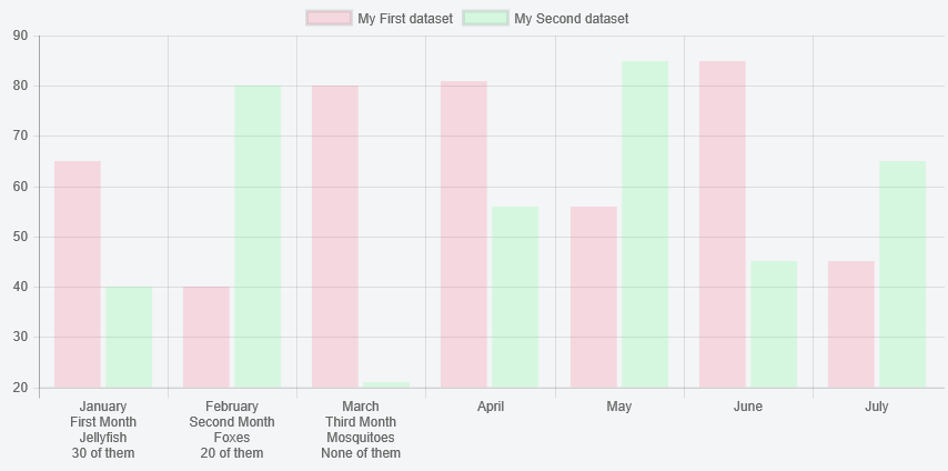
    labels: [["January","First Month","Jellyfish","30 of them"], ["February","Second Month","Foxes","20 of them"], ["March","Third Month","Mosquitoes","None of them"], "April", "May", "June", "July"],
    datasets: [{
      label: "My First dataset",
      data: [65, 40, 80, 81, 56, 85, 45],
      backgroundColor: "rgba(255,99,132,0.2)",
    }, {
      label: "My Second dataset",
      data: [40, 80, 21, 56, 85, 45, 65],
      backgroundColor: "rgba(99,255,132,0.2)",
    }]
  },
  scales : {
      xAxes : [{
          gridLines : {
              display : false,
              lineWidth: 1,
              zeroLineWidth: 1,
              zeroLineColor: '#666666',
              drawTicks: false
          },
          ticks: {
              display:true,
              stepSize: 0,
              min: 0,
              autoSkip: false,
              fontSize: 11,
              padding: 12
          }
      }],
      yAxes: [{
          ticks: {
              padding: 5
          },
          gridLines : {
              display : true,
              lineWidth: 1,
              zeroLineWidth: 2,
              zeroLineColor: '#666666'
          }
      }]
  },
                    spanGaps: true,
                    responsive: true,
                    maintainAspectRatio: true
};

var ctx = document.getElementById("myChart").getContext("2d");
new Chart(ctx, config);
<div class="myChart">
<script src="https://cdnjs.cloudflare.com/ajax/libs/Chart.js/2.7.2/Chart.bundle.js"></script>

<canvas id="myChart"></canvas>
          </div>

If a label is an array as opposed to a string i.e. [["June","2015"], "July"] then each element is treated as a separate line. The appropriate calculations are made to determine the correct height and width, and rotation is still supported.

charJS version 2.7.2 used this also works in https://github.com/jtblin/angular-chart.js

Vulgarity answered 28/3, 2018 at 16:50 Comment(5)
Do you know any option to change distance between next lines between: January and First Month? I use fontSize: 16 so this distance is too big for my situation, but I can't change it.Yuonneyup
@Yuonneyup did you ever figure this out? Struggling with that nowChristalchristalle
@AdamMoisa finally I create a fork of this library because I need more then configure permit me. So I do all changes straight in libraryYuonneyup
Could you easily explain how you made this specific feature work cleanly? Really having a hard time w itChristalchristalle
See jsfiddle.net/Abeeee/ugn3x52e for resizable working example using an dated x axis that uses the array solution along with a ticks callback to see [guess] how much space is available.Guise
A
10

If you are using Chart.js v2.7.1, the above solution might not work.

The solution that actually worked for us was adding a small plugin right in the data and options level:

const config = {
  type: 'bar',
  data: {
    // ...
  },
  options: {
    // ...
  },
  plugins: [{
    beforeInit: function (chart) {
      chart.data.labels.forEach(function (label, index, labelsArr) {
        if (/\n/.test(label)) {
          labelsArr[index] = label.split(/\n/)
        }
      })
    }
  }]
};

A full description of how to fix this issue can be found here.

Acarid answered 13/3, 2018 at 11:46 Comment(2)
nice solution !Racklin
apexcharts.com/docs/…Laburnum
H
7

With Chart.js v2.1, you can write a chart plugin to do this


Preview

enter image description here


Script

Chart.pluginService.register({
    beforeInit: function (chart) {
        var hasWrappedTicks = chart.config.data.labels.some(function (label) {
            return label.indexOf('\n') !== -1;
        });

        if (hasWrappedTicks) {
            // figure out how many lines we need - use fontsize as the height of one line
            var tickFontSize = Chart.helpers.getValueOrDefault(chart.options.scales.xAxes[0].ticks.fontSize, Chart.defaults.global.defaultFontSize);
            var maxLines = chart.config.data.labels.reduce(function (maxLines, label) {
                return Math.max(maxLines, label.split('\n').length);
            }, 0);
            var height = (tickFontSize + 2) * maxLines + (chart.options.scales.xAxes[0].ticks.padding || 0);

            // insert a dummy box at the bottom - to reserve space for the labels
            Chart.layoutService.addBox(chart, {
                draw: Chart.helpers.noop,
                isHorizontal: function () {
                    return true;
                },
                update: function () {
                    return {
                        height: this.height
                    };
                },
                height: height,
                options: {
                    position: 'bottom',
                    fullWidth: 1,
                }
            });

            // turn off x axis ticks since we are managing it ourselves
            chart.options = Chart.helpers.configMerge(chart.options, {
                scales: {
                    xAxes: [{
                        ticks: {
                            display: false,
                            // set the fontSize to 0 so that extra labels are not forced on the right side
                            fontSize: 0
                        }
                    }]
                }
            });

            chart.hasWrappedTicks = {
                tickFontSize: tickFontSize
            };
        }
    },
    afterDraw: function (chart) {
        if (chart.hasWrappedTicks) {
            // draw the labels and we are done!
            chart.chart.ctx.save();
            var tickFontSize = chart.hasWrappedTicks.tickFontSize;
            var tickFontStyle = Chart.helpers.getValueOrDefault(chart.options.scales.xAxes[0].ticks.fontStyle, Chart.defaults.global.defaultFontStyle);
            var tickFontFamily = Chart.helpers.getValueOrDefault(chart.options.scales.xAxes[0].ticks.fontFamily, Chart.defaults.global.defaultFontFamily);
            var tickLabelFont = Chart.helpers.fontString(tickFontSize, tickFontStyle, tickFontFamily);
            chart.chart.ctx.font = tickLabelFont;
            chart.chart.ctx.textAlign = 'center';
            var tickFontColor = Chart.helpers.getValueOrDefault(chart.options.scales.xAxes[0].fontColor, Chart.defaults.global.defaultFontColor);
            chart.chart.ctx.fillStyle = tickFontColor;

            var meta = chart.getDatasetMeta(0);
            var xScale = chart.scales[meta.xAxisID];
            var yScale = chart.scales[meta.yAxisID];

            chart.config.data.labels.forEach(function (label, i) {
                label.split('\n').forEach(function (line, j) {
                    chart.chart.ctx.fillText(line, xScale.getPixelForTick(i + 0.5), (chart.options.scales.xAxes[0].ticks.padding || 0) + yScale.getPixelForValue(yScale.min) +
                        // move j lines down
                        j * (chart.hasWrappedTicks.tickFontSize + 2));
                });
            });

            chart.chart.ctx.restore();
        }
    }
});

and then

...
data: {
    labels: ["January\nFirst Month\nJellyfish\n30 of them", "February\nSecond Month\nFoxes\n20 of them", "March\nThird Month\nMosquitoes\nNone of them", "April", "May", "June", "July"],
         ...

Note - we assume that the maximum content of one line will fit between the ticks (i.e. that no rotation logic is needed. I'm sure it's possible to incorporate rotation logic too, but it would be a tad more complicated)

You should format the tooltips to not show the x axis label, or format it to show a shorter version of the label.


Fiddle - http://jsfiddle.net/m0q03wpy/

Hel answered 8/5, 2016 at 11:40 Comment(0)

© 2022 - 2024 — McMap. All rights reserved.