Drawing multiple edges between two nodes with networkx
Asked Answered
M

6

27

I need to draw a directed graph with more than one edge (with different weights) between two nodes. That is, I have nodes A and B and edges (A,B) with length=2 and (B,A) with length=3.

I have tried both using G=nx.Digraph and G=nx.Multidigraph. When I draw it, I only get to view one edge and only one of the labels. Is there any way to do it?

Marlenemarler answered 1/4, 2014 at 12:25 Comment(2)
See #15054186 and #14943939 for info.Mauro
#49341020Borkowski
F
37

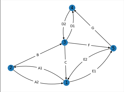
Here is how to get an outcome similar to the following: Final graph

Some properties of this are:

  • When there is a single edge between two nodes, it is straight.
  • Labels are positioned perfectly in the middle of the edges.
  • The current solution works for DiGraphs only. MultiGraphs, MultiDiGraphs, and self loops are not supported.

Setting it up

The following lines are initial code to start the example

import matplotlib.pyplot as plt
import networkx as nx

G = nx.DiGraph()
edge_list = [(1,2,{'w':'A1'}),(2,1,{'w':'A2'}),(2,3,{'w':'B'}),(3,1,{'w':'C'}),
             (3,4,{'w':'D1'}),(4,3,{'w':'D2'}),(1,5,{'w':'E1'}),(5,1,{'w':'E2'}),
             (3,5,{'w':'F'}),(5,4,{'w':'G'})]
G.add_edges_from(edge_list)
pos=nx.spring_layout(G,seed=5)
fig, ax = plt.subplots()
nx.draw_networkx_nodes(G, pos, ax=ax)
nx.draw_networkx_labels(G, pos, ax=ax)
fig.savefig("1.png", bbox_inches='tight',pad_inches=0)

Which results in:

Graph with only nodes

Drawing edges

The draw_networkx_edges function of NetworkX is able to draw only a subset of the edges with the edgelist parameter. To use this, we group the edges into two lists and draw them separately. Thanks to AMangipinto's answer for connectionstyle='arc3, rad = 0.1'.

curved_edges = [edge for edge in G.edges() if reversed(edge) in G.edges()]
straight_edges = list(set(G.edges()) - set(curved_edges))
nx.draw_networkx_edges(G, pos, ax=ax, edgelist=straight_edges)
arc_rad = 0.25
nx.draw_networkx_edges(G, pos, ax=ax, edgelist=curved_edges, connectionstyle=f'arc3, rad = {arc_rad}')
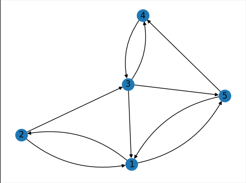
fig.savefig("2.png", bbox_inches='tight',pad_inches=0)

Which results in:

Graph without labels

Drawing edge labels

The draw_networkx_edge_labels function of NetworkX assumes the edges to be straight and there is no parameter to change this. Since NetworkX is open-souce, I copied the function and created a modified my_draw_networkx_edge_labels. This function is down at the appendix.

Assuming you save this function to a file called my_networkx.py, you can draw edge labels as:

import my_networkx as my_nx
edge_weights = nx.get_edge_attributes(G,'w')
curved_edge_labels = {edge: edge_weights[edge] for edge in curved_edges}
straight_edge_labels = {edge: edge_weights[edge] for edge in straight_edges}
my_nx.my_draw_networkx_edge_labels(G, pos, ax=ax, edge_labels=curved_edge_labels,rotate=False,rad = arc_rad)
nx.draw_networkx_edge_labels(G, pos, ax=ax, edge_labels=straight_edge_labels,rotate=False)
fig.savefig("3.png", bbox_inches='tight',pad_inches=0)

Where we once again seperated curved from straight. The result is the first figure in this answer.

Appendix

The function draw_networkx_edge_labels of NetworkX finds the positions of the labels assuming straight lines:

(x, y) = (
    x1 * label_pos + x2 * (1.0 - label_pos),
    y1 * label_pos + y2 * (1.0 - label_pos),
)

To find the middle point of a quadratic Bezier curve we can use the following code. First we find the middle control point (ctrl_1 in the code) of the Bezier curve according to the definition in matplotlib:

The curve is created so that the middle control point (C1) is located at the same distance from the start (C0) and end points(C2) and the distance of the C1 to the line connecting C0-C2 is rad times the distance of C0-C2.

Due to this definition, the function my_draw_networkx_edge_labels requires an extra parameter called rad.

pos_1 = ax.transData.transform(np.array(pos[n1]))
pos_2 = ax.transData.transform(np.array(pos[n2]))
linear_mid = 0.5*pos_1 + 0.5*pos_2
d_pos = pos_2 - pos_1
rotation_matrix = np.array([(0,1), (-1,0)])
ctrl_1 = linear_mid + rad*rotation_matrix@d_pos

The functions starting with "ax.transData" are necessary since 90 degree angles in the axis domain do not correspond to 90 degrees in the display. So we had to transform coordinates to and from the display coordinate system.

bezier_mid can be calculated with Bezier curve rules:

ctrl_mid_1 = 0.5*pos_1 + 0.5*ctrl_1
ctrl_mid_2 = 0.5*pos_2 + 0.5*ctrl_1
bezier_mid = 0.5*ctrl_mid_1 + 0.5*ctrl_mid_2
(x, y) = ax.transData.inverted().transform(bezier_mid)

Complete my_draw_networkx_edge_labels:

def my_draw_networkx_edge_labels(
    G,
    pos,
    edge_labels=None,
    label_pos=0.5,
    font_size=10,
    font_color="k",
    font_family="sans-serif",
    font_weight="normal",
    alpha=None,
    bbox=None,
    horizontalalignment="center",
    verticalalignment="center",
    ax=None,
    rotate=True,
    clip_on=True,
    rad=0
):
    """Draw edge labels.

    Parameters
    ----------
    G : graph
        A networkx graph

    pos : dictionary
        A dictionary with nodes as keys and positions as values.
        Positions should be sequences of length 2.

    edge_labels : dictionary (default={})
        Edge labels in a dictionary of labels keyed by edge two-tuple.
        Only labels for the keys in the dictionary are drawn.

    label_pos : float (default=0.5)
        Position of edge label along edge (0=head, 0.5=center, 1=tail)

    font_size : int (default=10)
        Font size for text labels

    font_color : string (default='k' black)
        Font color string

    font_weight : string (default='normal')
        Font weight

    font_family : string (default='sans-serif')
        Font family

    alpha : float or None (default=None)
        The text transparency

    bbox : Matplotlib bbox, optional
        Specify text box properties (e.g. shape, color etc.) for edge labels.
        Default is {boxstyle='round', ec=(1.0, 1.0, 1.0), fc=(1.0, 1.0, 1.0)}.

    horizontalalignment : string (default='center')
        Horizontal alignment {'center', 'right', 'left'}

    verticalalignment : string (default='center')
        Vertical alignment {'center', 'top', 'bottom', 'baseline', 'center_baseline'}

    ax : Matplotlib Axes object, optional
        Draw the graph in the specified Matplotlib axes.

    rotate : bool (deafult=True)
        Rotate edge labels to lie parallel to edges

    clip_on : bool (default=True)
        Turn on clipping of edge labels at axis boundaries

    Returns
    -------
    dict
        `dict` of labels keyed by edge

    Examples
    --------
    >>> G = nx.dodecahedral_graph()
    >>> edge_labels = nx.draw_networkx_edge_labels(G, pos=nx.spring_layout(G))

    Also see the NetworkX drawing examples at
    https://networkx.org/documentation/latest/auto_examples/index.html

    See Also
    --------
    draw
    draw_networkx
    draw_networkx_nodes
    draw_networkx_edges
    draw_networkx_labels
    """
    import matplotlib.pyplot as plt
    import numpy as np

    if ax is None:
        ax = plt.gca()
    if edge_labels is None:
        labels = {(u, v): d for u, v, d in G.edges(data=True)}
    else:
        labels = edge_labels
    text_items = {}
    for (n1, n2), label in labels.items():
        (x1, y1) = pos[n1]
        (x2, y2) = pos[n2]
        (x, y) = (
            x1 * label_pos + x2 * (1.0 - label_pos),
            y1 * label_pos + y2 * (1.0 - label_pos),
        )
        pos_1 = ax.transData.transform(np.array(pos[n1]))
        pos_2 = ax.transData.transform(np.array(pos[n2]))
        linear_mid = 0.5*pos_1 + 0.5*pos_2
        d_pos = pos_2 - pos_1
        rotation_matrix = np.array([(0,1), (-1,0)])
        ctrl_1 = linear_mid + rad*rotation_matrix@d_pos
        ctrl_mid_1 = 0.5*pos_1 + 0.5*ctrl_1
        ctrl_mid_2 = 0.5*pos_2 + 0.5*ctrl_1
        bezier_mid = 0.5*ctrl_mid_1 + 0.5*ctrl_mid_2
        (x, y) = ax.transData.inverted().transform(bezier_mid)

        if rotate:
            # in degrees
            angle = np.arctan2(y2 - y1, x2 - x1) / (2.0 * np.pi) * 360
            # make label orientation "right-side-up"
            if angle > 90:
                angle -= 180
            if angle < -90:
                angle += 180
            # transform data coordinate angle to screen coordinate angle
            xy = np.array((x, y))
            trans_angle = ax.transData.transform_angles(
                np.array((angle,)), xy.reshape((1, 2))
            )[0]
        else:
            trans_angle = 0.0
        # use default box of white with white border
        if bbox is None:
            bbox = dict(boxstyle="round", ec=(1.0, 1.0, 1.0), fc=(1.0, 1.0, 1.0))
        if not isinstance(label, str):
            label = str(label)  # this makes "1" and 1 labeled the same

        t = ax.text(
            x,
            y,
            label,
            size=font_size,
            color=font_color,
            family=font_family,
            weight=font_weight,
            alpha=alpha,
            horizontalalignment=horizontalalignment,
            verticalalignment=verticalalignment,
            rotation=trans_angle,
            transform=ax.transData,
            bbox=bbox,
            zorder=1,
            clip_on=clip_on,
        )
        text_items[(n1, n2)] = t

    ax.tick_params(
        axis="both",
        which="both",
        bottom=False,
        left=False,
        labelbottom=False,
        labelleft=False,
    )

    return text_items
Federate answered 6/12, 2021 at 12:47 Comment(1)
It could be cool to add an application for self loops too but good job!Draughtboard
L
29

An improvement to the reply above is adding the connectionstyle to nx.draw, this allows to see two parallel lines in the plot:

import networkx as nx
import matplotlib.pyplot as plt
G = nx.DiGraph() #or G = nx.MultiDiGraph()
G.add_node('A')
G.add_node('B')
G.add_edge('A', 'B', length = 2)
G.add_edge('B', 'A', length = 3)

pos = nx.spring_layout(G)
nx.draw(G, pos, with_labels=True, connectionstyle='arc3, rad = 0.1')
edge_labels=dict([((u,v,),d['length'])
             for u,v,d in G.edges(data=True)])

plt.show()

See here the result

Lunalunacy answered 26/1, 2020 at 10:12 Comment(5)
Maybe you can check answer from Francesco Sgaramella on this same post, he was adding also labels to the plot.Lunalunacy
thanks your answer helped. The answer by Francesco Sgaramella is helpful to show the weights on edges but it shows only the weights for A -> B and not the one for B-> A, any suggestion how to show both? did you solve your problem? @mdexpReligiose
@Religiose it worked fine for me by using the connectionstyle param from this answer and the nx.draw_networkx_edge_label from Francesco's answer. I had to tweak the label_pos parameter because weigths were overlapping in the middle and only one was shown (but there were actually two one on top of the other).Kinna
Unfortunately I did not manage to place the label on top of the corresponding arch, but my solution was enough for my problemKinna
@Kinna Thanks for the explanation. Now I understand that the overlap between weight labels is the problem and not the values. Although your problem is solved but in case I solve the solution I will share it here.Religiose
S
12

Try the following:

import networkx as nx
import matplotlib.pyplot as plt
G = nx.DiGraph() #or G = nx.MultiDiGraph()
G.add_node('A')
G.add_node('B')
G.add_edge('A', 'B', length = 2)
G.add_edge('B', 'A', length = 3)

pos = nx.spring_layout(G)
nx.draw(G, pos)
edge_labels=dict([((u,v,),d['length'])
             for u,v,d in G.edges(data=True)])
nx.draw_networkx_edge_labels(G, pos, edge_labels=edge_labels, label_pos=0.3, font_size=7)
plt.show()

This will return you this graph with two edges and the length shown on the edge:

enter image description here

Salto answered 4/4, 2014 at 12:17 Comment(2)
This is possibly the worst enemy when it comes to visualizing and reading weighted graphs. It's ugy, unreadable, and in directed graph - hell knows which edge is which.Stetson
what is the difference between length and weight?Gemmule
S
7

You can use matplotlib directly using the node positions you have calculated.

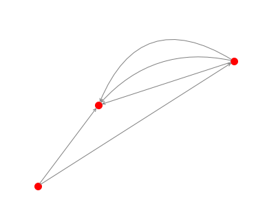
G=nx.MultiGraph ([(1,2),(1,2),(1,2),(3,1),(3,2)])
pos = nx.random_layout(G)
nx.draw_networkx_nodes(G, pos, node_color = 'r', node_size = 100, alpha = 1)
ax = plt.gca()
for e in G.edges:
    ax.annotate("",
                xy=pos[e[0]], xycoords='data',
                xytext=pos[e[1]], textcoords='data',
                arrowprops=dict(arrowstyle="->", color="0.5",
                                shrinkA=5, shrinkB=5,
                                patchA=None, patchB=None,
                                connectionstyle="arc3,rad=rrr".replace('rrr',str(0.3*e[2])
                                ),
                                ),
                )
plt.axis('off')
plt.show()

enter image description here

Sextodecimo answered 11/3, 2020 at 17:43 Comment(2)
how do you add the edge label (text) for each arrow?Infection
This is pure gold. Thank you so much.Septuplet
D
2

Add the following code to AMangipinto's solution to add edge labels in both directions (see link for picture):

edge_labels = dict([((u, v,), f'{d["length"]}\n\n{G.edges[(v,u)]["length"]}')
                for u, v, d in G.edges(data=True) if pos[u][0] > pos[v][0]])

nx.draw_networkx_edge_labels(G, pos, edge_labels=edge_labels, font_color='red')

The "if pos[u][0] > pos[v][0]" only adds an edge label in one direction. We add both lengths to the single label otherwise we would over write the first label on an edge. Note: The label won't show if the nodes have the same x position.

plot with edge labels

Daugava answered 13/3, 2020 at 23:35 Comment(1)
This only works if the curvature of the arc is very small.Landre
L
2

enter image description here

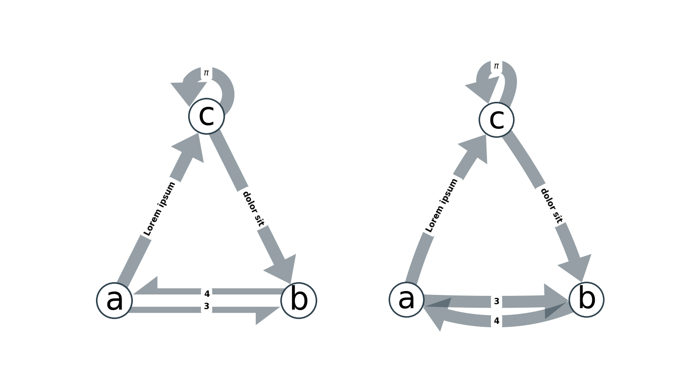
There are two common ways to draw bi-directional edges between two nodes:

  1. Draw both edges as straight lines, each parallel to but slightly offset from the direct line connecting the nodes.
  2. Draw both edges as curved lines; ensure that they arc in different directions. In both cases, labels can simply be placed at the centre of the two lines.

Both approaches don't mesh well with the current state of the networkx drawing utilities:

  1. The first approach requires a good choice of offset between the parallel edges. Common choices in other libraries include the average edge width or a third of the node size. However, node positions in networkx are given in data coordinates whereas node sizes and edge widths are given in display coordinates. This makes computation of the offset cumbersome, and -- more importantly -- the layout breaks if the figure is resized (as the transformation from data coordinates to display coordinates changes).

  2. As outlined in other answers, networkx can draw curved edges by setting the correct connectionstyle. However, this feature was added relatively recently to networkx and hence the function that draws the labels still assumes straight edges. If the edges only have a very small arc (i.e. are still basically straight), then the labels can be fudged to the approximate correct positions by adding newline characters in the right places to the labels, as demonstrated by @PaulMenzies answer. However, this approach generally yields suboptimal results and breaks if the curvature is high.

If you are open to use other plotting utilities built on matplotlib, I have an implementation of both approaches in my module netgraph. netgraph is fully compatible with networkx and igraph Graph objects, so it should be easy and fast to generate good looking graphs.

#!/usr/bin/env python
import numpy as np
import matplotlib.pyplot as plt
import networkx as nx

from netgraph import Graph # pip install netgraph

triangle = nx.DiGraph([('a', 'b'), ('a', 'c'), ('b', 'a'), ('c', 'b'), ('c', 'c')])

node_positions = {
    'a' : np.array([0.2, 0.2]),
    'b' : np.array([0.8, 0.2]),
    'c' : np.array([0.5, 0.8]),
}

edge_labels = {
    ('a', 'b') : 3,
    ('a', 'c') : 'Lorem ipsum',
    ('b', 'a') : 4,
    ('c', 'b') : 'dolor sit',
    ('c', 'c') : r'$\pi$'
}

fig, (ax1, ax2) = plt.subplots(1, 2, figsize=(14,14))

Graph(triangle, node_labels=True, edge_labels=edge_labels,
      edge_label_fontdict=dict(size=12, fontweight='bold'),
      node_layout=node_positions, edge_layout='straight',
      node_size=6, edge_width=4, arrows=True, ax=ax1)

Graph(triangle, node_labels=True, edge_labels=edge_labels,
      edge_label_fontdict=dict(size=12, fontweight='bold'),
      node_layout=node_positions, edge_layout='curved',
      node_size=6, edge_width=4, arrows=True, ax=ax2)

plt.show()
Landre answered 8/6, 2021 at 16:4 Comment(2)
Sadly, the labels and the curves are not working for me, it looks like it is all merged together.Ovipositor
@Ovipositor If you raise an issue with a minimal reproducible example on my github, then I will look into it.Landre

© 2022 - 2024 — McMap. All rights reserved.