geom_smooth in ggplot2 not working/showing up
Asked Answered
M

2

28

I am trying to add a linear regression line to my graph, but when it's run, it's not showing up. The code below is simplified. There are usually multiple points on each day. The graph comes out fine other than that.

    b<-data.frame(day=c('05/22','05/23','05/24','05/25','05/26','05/27','05/28','05/29','05/30','05/31','06/01','06/02','06/03','06/04','06/05','06/06','06/07','06/08','06/09','06/10','06/11','06/12','06/13','06/14','06/15','06/16','06/17','06/18','06/19','06/20','06/21','06/22','06/23','06/24','06/25'),
                  temp=c(10.1,8.7,11.4,11.4,11.6,10.7,9.6,11.0,10.0,10.7,9.5,10.3,8.4,9.0,10.3,11.3,12.7,14.5,12.5,13.2,16.5,19.1,14.6,14.0,15.3,13.0,10.1,8.4,4.6,4.3,4.7,2.7,1.6,1.8,1.9))


gg2 <- ggplot(b, aes(x=day, y=temp, color=temp)) +
  geom_point(stat='identity', position='identity', aes(colour=temp),size=3)


gg2<- gg2 + geom_smooth(method='lm') + scale_colour_gradient(low='yellow', high='#de2d26') 

gg2 <-gg2 + labs(title=filenames[s], x='Date', y='Temperture (Celsius)') + theme(axis.text.x=element_text(angle=-45, vjust=0.5))


gg2

It's probably something really simple, but I can't seem to figure it out. Or it's the fact I am using a date for the x-axis, but I'm not receiving any errors. If it is due to the date, I'm not sure how to approach it. Thanks.

Morrismorrison answered 22/2, 2016 at 17:49 Comment(1)
you need to make day a numerical variable, as in ...ggplot(b, aes(x = as.numeric(day),...Commute
B
37

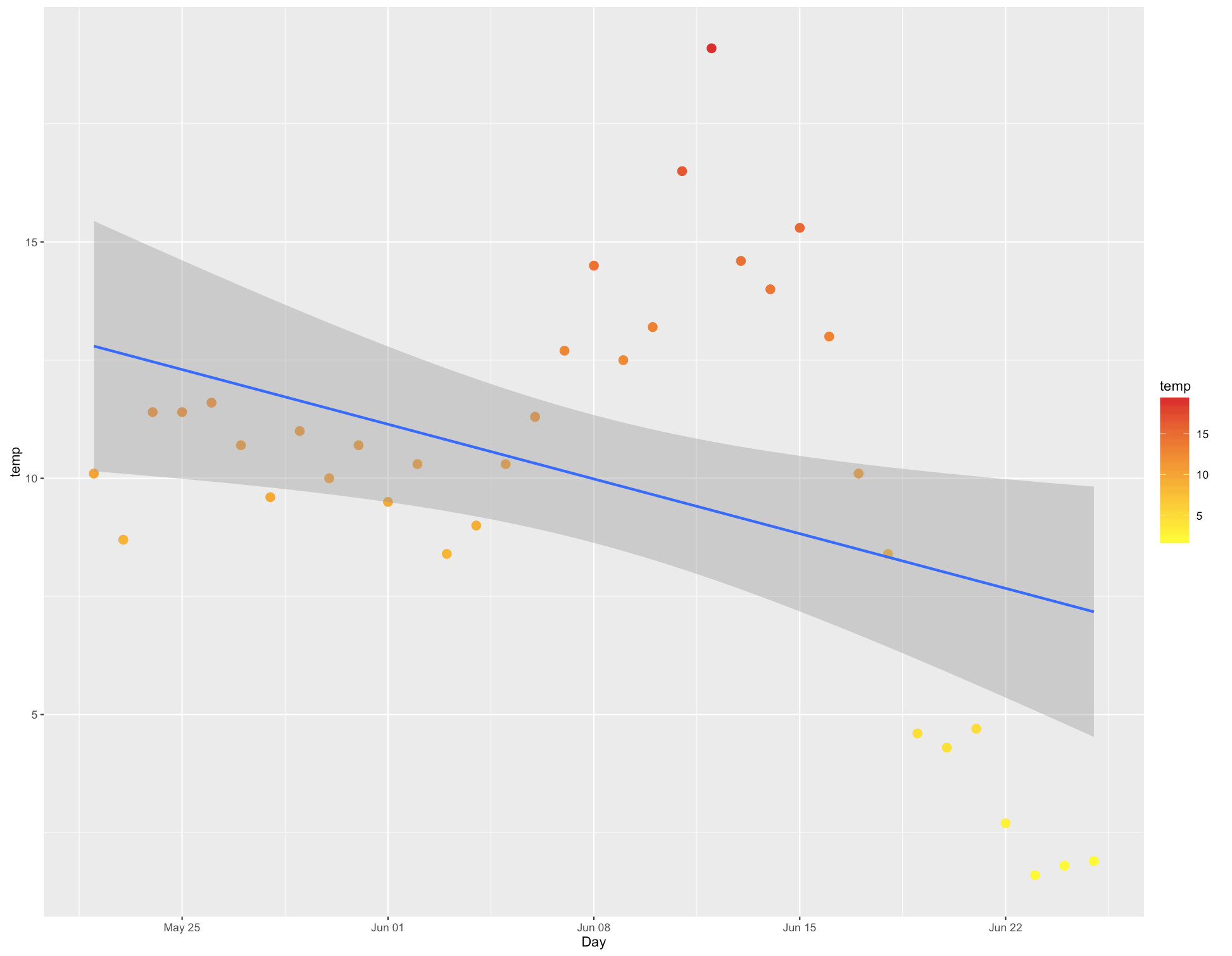
Currently your date is a factor since you entered in in as a character vector. See class(b$day).

Once you change it to a date, the linear regression will run fine.

b$Day <- as.Date(b$day, format='%m/%d')
# If dates are from 2015, 
# b$Day <- as.Date(b$day, format='%m/%d') - 366
# check with head(b$Day)

gg2 <- ggplot(b, aes(x=Day, y=temp, color=temp)) +
  geom_point(stat='identity', position='identity', aes(colour=temp),size=3)

gg2<- gg2 + geom_smooth(method='lm') + 
  scale_colour_gradient(low='yellow', high='#de2d26') 

gg2 <-gg2 + labs(title=filenames[s], x='Date', y='Temperture (Celsius)') + 
  theme(axis.text.x=element_text(angle=-45, vjust=0.5))

g2

Plot with regression line

Bullyboy answered 22/2, 2016 at 18:14 Comment(2)
Thank you very much. I figured it was something simple that I was missing.Morrismorrison
Lifesaver! Thanks.Mobilize
A
3
# sample data
d <- data.frame(expand.grid(x=letters[1:4], g=factor(1:2)), y=rnorm(8))   
# Try the below three different scripts to draw.
ggplot(d, aes(x=x, y=y, colour=g)) + geom_line() + geom_point()
ggplot(d, aes(x=x, y=y, colour=g, group=g))+ geom_line() + geom_point()
ggplot(d, aes(x=x, y=y, colour=g, group=1)) + geom_line() + geom_point()

Key rules: geom_line() tries to connect data points that belong to same group. different levels of factor variable belong to different group.

Amaze answered 16/11, 2018 at 16:54 Comment(0)

© 2022 - 2024 — McMap. All rights reserved.