Joining means on a boxplot with a line
Asked Answered
P

2

28

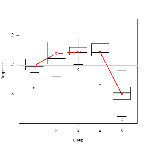
I have a boxplot showing multiple boxes. I want to connect the mean for each box together with a line. The boxplot does not display the mean by default, instead the middle line only indicates the median. I tried

ggplot(data, aes(x=xData, y=yData, group=g)) 
    + geom_boxplot() 
    + stat_summary(fun.y=mean, geom="line")

This does not work.

Interestingly enough, doing

stat_summary(fun.y=mean, geom="point") 

draws the median point in each box. Why would "line" not work?

Something like this but using ggplot2, https://aliquote.org/pub/RMB/c4_sols/RMB_c4_sols.html#Fig.%203

enter image description here

Pahlavi answered 21/10, 2010 at 17:0 Comment(4)
if anyone can tell the rationale for group=1 in Bernd's solution, it would be great.Pahlavi
My guess is that group=1 disabled group aesthetic, because if it is enabled, then lines are drawn separately for each group, which in the case of mean would be just one point, hence there would be no lines to draw.Pahlavi
Yes, I think you are right. I found a good explanation in Hadley Wickham's book and updated my answer.Update
Obviously this is an old post, but the link to the image is broken, so there's no longer an example of the desired plotStefanistefania
U
41

Is that what you are looking for?

library(ggplot2)

x <- factor(rep(1:10, 100))
y <- rnorm(1000)
df <- data.frame(x=x, y=y)

ggplot(df, aes(x=x, y=y)) + 
geom_boxplot() + 
stat_summary(fun=mean, geom="line", aes(group=1))  + 
stat_summary(fun=mean, geom="point")

Update:

Some clarification about setting group=1: I think that I found an explanation in Hadley Wickham's book "ggplot2: Elegant Graphics for Data Analysis. On page 51 he writes:

Different groups on different layers.

Sometimes we want to plot summaries based on different levels of aggregation. Different layers might have different group aesthetics, so that some display individual level data while others display summaries of larger groups.

Building on the previous example, suppose we want to add a single smooth line to the plot just created, based on the ages and heights of all the boys. If we use the same grouping for the smooth that we used for the line, we get the first plot in Figure 4.4.

p + geom_smooth(aes(group = Subject), method="lm", se = F)

This is not what we wanted; we have inadvertently added a smoothed line for each boy. This new layer needs a different group aesthetic, group = 1, so that the new line will be based on all the data, as shown in the second plot in the figure. The modified layer looks like this:

p + geom_smooth(aes(group = 1), method="lm", size = 2, se = F)

[...] Using aes(group = 1) in the smooth layer fits a single line of best fit across all boys."

Update answered 21/10, 2010 at 18:23 Comment(2)
Äh, I knew that question would come :-) Sorry but I must admit that I have no idea. Some weeks ago I had a similar problem and found that solution somewhere which worked for me.Update
This needs fun.y=mean instead of fun=meanBharal
B
1

Another longer approach (in case if the data is in two different ) is:

library(dplyr); library(ggplot2)
#> 
#> Attaching package: 'dplyr'
#> The following objects are masked from 'package:stats':
#> 
#>     filter, lag
#> The following objects are masked from 'package:base':
#> 
#>     intersect, setdiff, setequal, union

x <- factor(rep(1:10, 100)); y <- rnorm(1000);
df <- data.frame(x=x, y=y);
df_for_line <- df %>% group_by(x) %>% summarise(mean_y = mean(y));
ggplot(df, aes(x = x, y = y)) + geom_boxplot() + 
    geom_path(data = df_for_line, aes(x = x, y = mean_y, group = 1))

Created on 2021-04-15 by the reprex package (v1.0.0)


Again, `group = 1` is the key.
Buroker answered 14/4, 2020 at 20:50 Comment(0)

© 2022 - 2024 — McMap. All rights reserved.