Relation between dp - sp and PX
Asked Answered
A

4

19

I am not asking what is the difference between dp,sp and px.

I am designing a website based on google's new material design, all the measurements are in dp (for grid) and sp(for text). My question is how do they translate to pixels. I have been designing websites for more than 4 years and all the measurements (grid and font) are in pixels.

For Example:

  1. A headline is 24sp, how many pixels does it equate to? (its not 24px, I've tried matching them, it's around 28px but there has to be a standard measuring systems).
  2. Grid Guideline: "All components align to an 8 dp square baseline grid." - how many pixels does it equate to?

1px = ?dp =?sp on a desktop or any average monitor or mobile device?

Acclimatize answered 1/7, 2014 at 4:16 Comment(0)
A
10

I recommend reading Google's definitions of dp and sp, which can be found in the Android docs, here and here.

There's also some helpful information in the wonderful Designer's Guide to DPI.

Acadia answered 4/7, 2014 at 2:0 Comment(1)
@War10ck Thanks. Fixed.Acadia
A
6

I think the answer is going to be:

1px = 1dp = 1sp on any average monitor or mobile device.

How did I come up with this?

Because a pixel is a pixel, for andriod dp and sp are used because they are used for native apps which have to scale and the dpi of each screen is different based on device. For desktops all of this is same, off course the website has to be compatible/responsive for mobile devices but since the website loads in a browser, some additional media quires (based on guidelines) will do the job.

If anybody has some other logical conclusion, please share

Acclimatize answered 1/7, 2014 at 16:3 Comment(0)
G
5

A safe rule of thumb is to use 1 px = 1 dp.

This should give you a good safe size on just about any device. It will appear a bit large on some devices, notably the iPad (regular).

Here's why:

"A dp corresponds to the physical size of a pixel at 160 dpi" (https://developer.android.com/training/multiscreen/screendensities.html#TaskUseD)

160 dpi means:

160 dots = 1 inch

Therefore:

160 dp = 1 inch (25.4 mm)

So when Google recommends that buttons have a touchable target height of 48 dp, they're saying that they need to be 0.3 inches (7.6 mm) tall.

So how many px is this? Well, that depends on the device.

Examples for 48 dp (7.6 mm) button height:

  • iPad mini: 48 px Why: The iPad mini screen is about 120 mm wide and uses 768 px to fill that space. You therefore need 162 px to take up an inch (25.4 mm), or 48 px for your button height of 7.6 mm.

  • Kindle Fire (7"): 43 px

  • Kindle Fire (6"): 50 px

  • iPhone: 48 px

  • Nexus 7: 48 px

  • Regular iPad: 39 px

(I may have fudged the rounding up/down a tiny bit.. I like 48 better than 49!)

Screen mm and CSS px width for examples: I calculated the screen width using the CSS px screen dimensions and diagonal length.

  • iPad mini: 1024 x 768 resolution and 201 mm diagonal = 120 mm width.
  • Kindle Fire 7": 858 x 533 resolution and 178 mm diagonal = 94 mm width.
  • Kindle Fire 6": 853 x 533 resolution and 152 mm diagonal = 81 mm width.
  • iPhone: 568 x 320 resolution and 102 mm diagonal = 50 mm width.
  • Nexus 7: 960 * 600 resolution and 178 mm diagonal = 94 mm width.
  • iPad regular: 1024 x 768 resolution and 246 mm diagonal = 148 mm width.

Note that for calculating the px height of the button you need to use the device CSS px dimensions. These numbers are not necessarily the same as the resolutions stated in the specs.

Gunshy answered 14/9, 2016 at 16:32 Comment(0)
O
0

All are roughly equivalent for most use cases.

Source

To preserve the visible size of your UI on screens with different densities, you must design your UI using density-independent pixels (dp) as your unit of measurement. One dp is a virtual pixel unit that's roughly equal to one pixel on a medium-density screen (160dpi; the "baseline" density). Android translates this value to the appropriate number of real pixels for each other density.

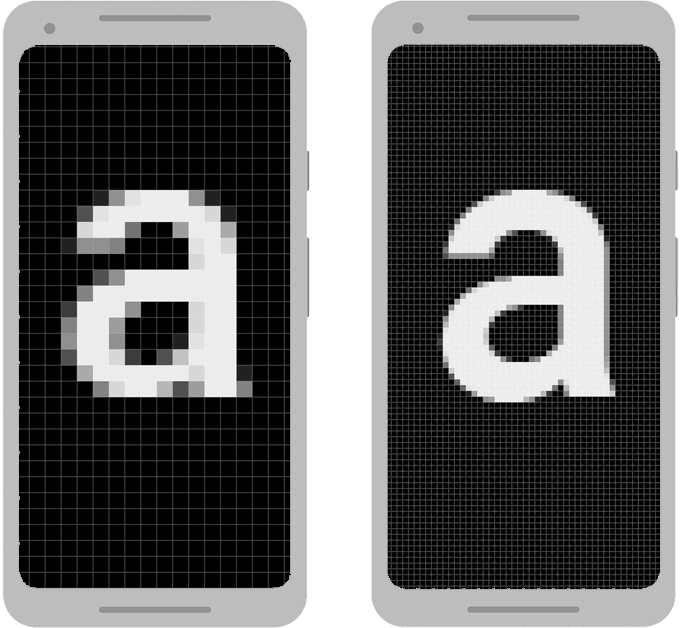
For example, consider the two devices in figure 1. If you were to define a view to be "100px" wide, it will appear much larger on the device on the left. So you must instead use "100dp" to ensure it appears the same size on both screens.

When defining text sizes, however, you should instead use scalable pixels (sp) as your units (but never use sp for layout sizes). The sp unit is the same size as dp, by default, but it resizes based on the user's preferred text size.

Figure 1. Two screens of the same size may have a different number of pixels

enter image description here

Opalina answered 11/6, 2019 at 7:59 Comment(0)

© 2022 - 2024 — McMap. All rights reserved.