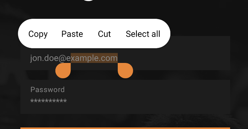
Both: handle and selection background can be altered with a help of composition local provider.
An example color definition (prefer colorTheme rather than using a color definition directly):
val Ecstasy = Color(0xFFF58220)
Selection colors definition:
val selectionColors = TextSelectionColors(
  backgroundColor = Ecstasy.copy(alpha = 0.37f),
  handleColor = Ecstasy
)
It works with BasicTextField (a BasicTextField2 renamed in Compose 1.7.0-beta) but I see no reasons why it shouldn't work with TextField or any MaterialTextField-s.
CompositionLocalProvider(
  LocalTextSelectionColors provides selectionColors
) {
  BasicTextField(...)
}
As using composition provider for every single use of the text field can be annoying, you can always consider implementing your own composable.
This is exactly what the documentation advices:
Write Jetpack Compose applications with ready to use building blocks and extend foundation to build your own design system pieces.
If composable does not work as expected, it is always possible to create one that fits the requirements.
- There is a foundation layer with text field basics.
- There is material layer with Material specification implementation.
- There might be your design system level implementation that uses local text selection composition provider under the hood.
Then it becomes possible to use the design system level composable instead of calling BasicTextField directly.
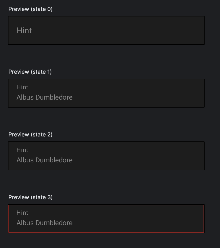
Recently I've created a text field that follows the requirements:
- starts from the filled text field type (the second option is outlined)
- redefines the shape to not use any corner radius
- resets the indication color for error
- draws a red border for error state instead
- in the future it will also replace the original error text with a custom design wrapped in its own background and an anchor at the top
The results are:
![enter image description here]()
![enter image description here]()
An implementation is as simple as the following one:
fun TextField(
modifier: Modifier = Modifier,
state: TextFieldUiState,
onValueChange: Consumer<String>,
label: String? = null,
keyboardActions: KeyboardActions = KeyboardActions(),
keyboardOptions: KeyboardOptions = KeyboardOptions.Default,
maxLines: Int = Int.MAX_VALUE,
singleLine: Boolean = false,
visualTransformation: VisualTransformation = VisualTransformation.None,
colors: TextFieldColors = TextFieldDefaults.colors()
) {
val textStyle =
TextStyle(color = colors.focusedTextColor)
val borderWidth = when (state.isError()) {
true -> 1.dp
false -> 0.dp
}
val borderColor = when (state.isError()) {
true -> colors.errorIndicatorColor
false -> Transparent
}
CompositionLocalProvider(
LocalTextSelectionColors provides colors.textSelectionColors
) {
BasicTextField(
value = state.value,
onValueChange = onValueChange,
modifier = modifier.border(
width = borderWidth,
color = borderColor
),
enabled = state.enabled,
keyboardActions = keyboardActions,
keyboardOptions = keyboardOptions,
singleLine = singleLine,
maxLines = maxLines,
textStyle = textStyle,
cursorBrush = SolidColor(colors.cursorColor),
visualTransformation = visualTransformation,
decorationBox = @Composable { innerTextField ->
DecorationBox(
value = state.value,
visualTransformation = visualTransformation,
innerTextField = innerTextField,
label = label?.let { { Text(text = it) } },
shape = RectangleShape,
singleLine = singleLine,
enabled = state.enabled,
interactionSource = remember { MutableInteractionSource() },
colors = colors
)
}
)
}
}
}
Most of the theming is done through the custom implementation of TextFieldDefaults.colors() that defines TextSelectionColors as one of its properties.


