Vertical line artefacts in 2D lineplot
Asked Answered
C

3

2

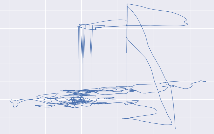
I'm trying to create a 2D line chart with seaborn, but I get several artefacts as seen here, i.e. lines that suddenly shoot down or up with barely-visible vertical lines: borked lineplot
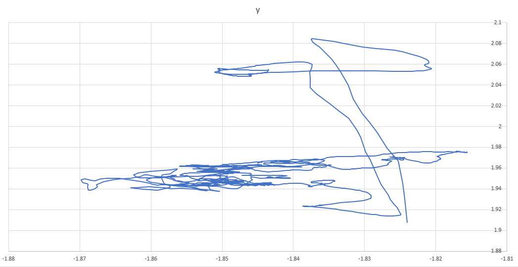
Excel on the other hand produces a correct visualisation from the same file: correct lineplot
My code follows the seaborn examples (a sample test.csv can be found here):

import seaborn as sns
import pandas as pd
import matplotlib.pyplot as plt

data = pd.read_csv('test.csv')
sns.set()
lp = sns.lineplot(x=data['x'], y=data['y'], sort=False, lw=1)
plt.show()

Am I doing something wrong, or is matplotlib unable to handle overlapping values?

Coup answered 4/10, 2019 at 20:38 Comment(3)
Use plt.plot(data['x'].values, data['y'].values, lw=1) instead. Meaning, matplotlib itself is perfectly capable of producing the desired plot.Pastore
@Pastore That's true, thanks! Can you post that as an answer? Seems to me like there's a bug in seaborn then.Coup
No there is no bug. But a sns.lineplot by default is not meant to draw lines in 2D space. You can check the documentation and make sure to understand all parameters.Pastore
P
5

By default, Seaborn calculates the mean of multiple observations of the y variable at the same x level. This behaviour can be disabled/controlled using the estimator=None parameter.

When adding this to the original code and data, we can observe that the artifacts are no longer present.

data = pd.read_csv('test.csv')
sns.set()
lp = sns.lineplot(x=data['x'], y=data['y'], sort=False, lw=1, estimator=None)
plt.show()

Output

Project answered 15/1, 2022 at 14:29 Comment(0)
P
1

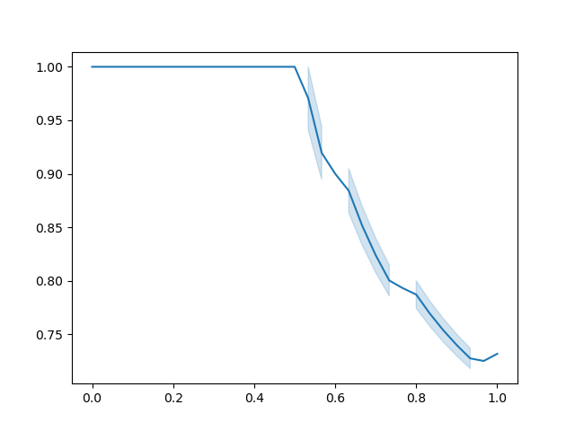
It seems that in your data some points have the same x values. line_plot will see them as a single point with different samples, so it will compute the mean as the actual point and plot the error bar. The vertical artifacts are such error bars.

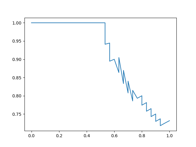
A hacky solution is adding a random tiny shift to your x values. In my case, I was trying to plot a PR curve and I encountered the same problem. I simply added an alternating shift to make sure there are no vertical segments:

  precision, recall, unused_thresholds = sklearn.metrics.precision_recall_curve(
      y_true, y_pred)

  shift_recall = np.empty_like(recall)
  shift_recall[::2] = shift
  shift_recall[1::2] = -shift

  line_plot = sns.lineplot(x=recall + shift_recall, y=precision)

Before the fix: PR Curve with vertical artifacts

After the fix: PR Curve without vertical artifacts

Petersburg answered 30/9, 2021 at 18:30 Comment(0)
H
0

If you still want to use an estimator to aggregate while plotting rather than in the data, you can use errorbar=None to hide the vertical artefacts.

Something like:

plt.figure(figsize=(15,5))
sns.lineplot(
    data=df_sample,
    x='event_year_month',
    y='incidents',
    hue='person_id',
    palette='tab10',
    estimator='sum',
    errorbar=None
)
plt.xticks(rotation=90)
plt.show()

Passing estimator=None hides the error bars but also plots all the data points, which might not be what you want, rather an aggregation along the abscissa. Tested on 0.13.2.

Haughay answered 21/3 at 12:51 Comment(0)

© 2022 - 2024 — McMap. All rights reserved.