Customizing VS Code's Char-len Ruler:
The following answer is far more recent than the other answers provided for this question, therefore; it is important to note that this answer contains information & content not provided by any of the other answers. I have formatted the question below into 4 configurations. Each configuration builds on top of the last configuration, consequently; The first configuration is simple, and offers a simple result, whereas the last configuration is more complex and offers much more.
For your convenience, I have included images at the bottom of each configuration's example. The images allow you to view a configuration, then see the result that the configuration has. This is important, because without the images you would have to bounce back and forth between here & your editor to see what each configuration looks like.
Config #1 | The Obvious Single Ruler Config
The obvious setting is the setting that has been suggested many times over. I will mention it here, just because it is the correct place to start.
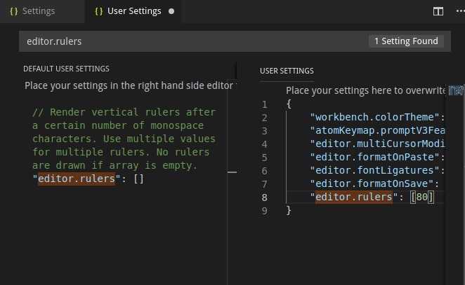
- Add the following JSON Property to your
settings.json file.
{
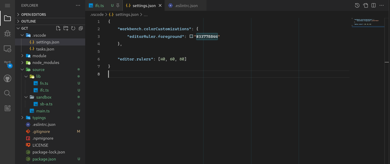
    "editor.rulers": [80]
}
PLEASE NOTE! It may be required that you reload the instance of VS Code (semantically speaking: some refer to this as reloading the window) being configured to get the newly added configuration to render as expected. (to see how to reload your window quickly, scroll to the end of this answer).
Once the configuration takes, your editor should look like this:
![Image demonstrates the result when the editor.ruler setting in VS Code is configured with a single value]()
Config #2 | Multiple Rulers
Obviously the ruler takes an array as its assigned value. The array allows VSC users to add multiple rulers.
- Be simply adding one value to the configuration in the last example (as shown in the snippet below) we can add another ruler.
{
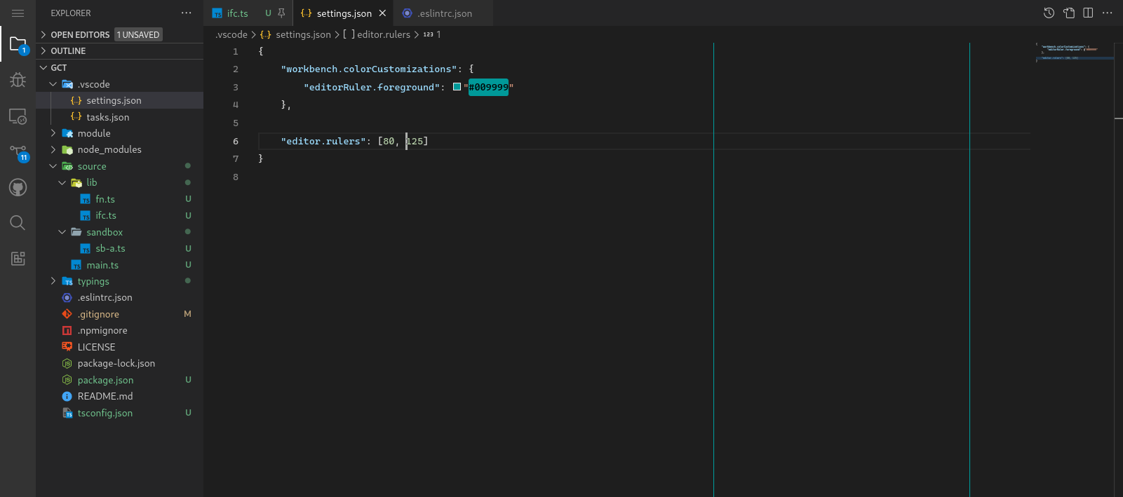
    "editor.rulers": [80, 125]
}
The screen shot I took is a bit short, but it communicates the point well enough. You can see that there are now two vertical lines, rather than a single line. Many front-end developers opt for this configuration because 125 is often used as the preferred line-length for HTML, and 80 is the preferred line-length for JavaScript embedded in HTML documents.
![Image demonstrates the result when the editor.ruler setting in VS Code is configured with more than one value]()
Config #3 | Coloring the Ruler
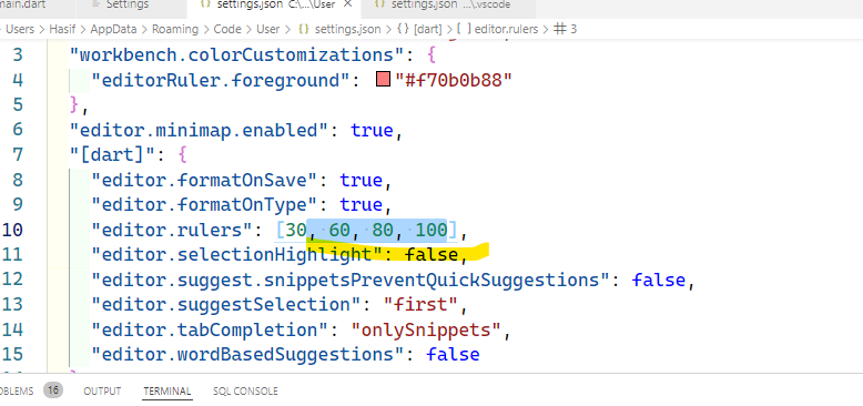
This configuration demonstrates the whimsy side of playing with VS Code's configuration; and the ruler is certainly one of the more whimsical editor-features that VS Code ships with. This configuration shows you how to color the configuration we used above. To be able to custom color the rulers, it is required that an additional setting be added to the configuration, take a look below:
{
    "workbench.colorCustomizations": {
        "editor-ruler.foreground": "#0099AA"
    },

    "editor.rulers": [80, 125]
}
Below you can see the awesomeness of the pacific blue color!
![enter image description here]()
Config #4 | Coloring the Ruler so it works w/ Code
So, as awesome as beautiful pacific-blue rulers are, they are not always practical. The opaque — and in this case highly contrasted — rulers streak right behind are code which can greatly decrease the readability of your code. For this very reason, developers generally opt for a configuration that places a single ruler at the desired line length, however, there is another way. By adjusting the previous configuration ever so slightly, we can render the rulers in a way that is much less intrusive. Take a look at the configuration below.
Do you see the subtle change?
{
    "workbench.colorCustomizations": {
        "editor-ruler.foreground": "#0099AA33"
    },

    "editor.rulers": [80, 125]
}
Below demonstrates where the change was made:
The new configuration's adjusted chromatic value (the color/hue) renders transparently (or not at 100% opacity), in-other-words; the rulers are rendered to be partially transparent (approximately 25% transparency).
The change has a rather significant effect because opaque rulers hinder readability, and can distract the programmer from her code. A programmer may opt for transparent rulers because transparent rulers will allow her to measure the length of her code at any length intervals she chooses, without hindering the readability of the code.
See the transparent rulers below? You might want to click on the image to see the larger view.
![Example shows a colored ruler in VS Code]()
Config #5 | The Ultimate Customized Ruler
The problem with transparent rulers is that they are not quite as fancy as the other rulers, fortunately, there's a way to get the best of both worlds. This example uses two images (or screen-shots): One image that shows the configuration, just like the other images you have been viewing above, and the other is a final image showing the configuration I use. The configuration I use is shown as a way to help put into perspective what you're able to accomplish with a good ruler configuration.
Below is a crazy sort of configuration...
{
    "workbench.colorCustomizations": {
        "editorRuler.foreground": "#00999922"
    },

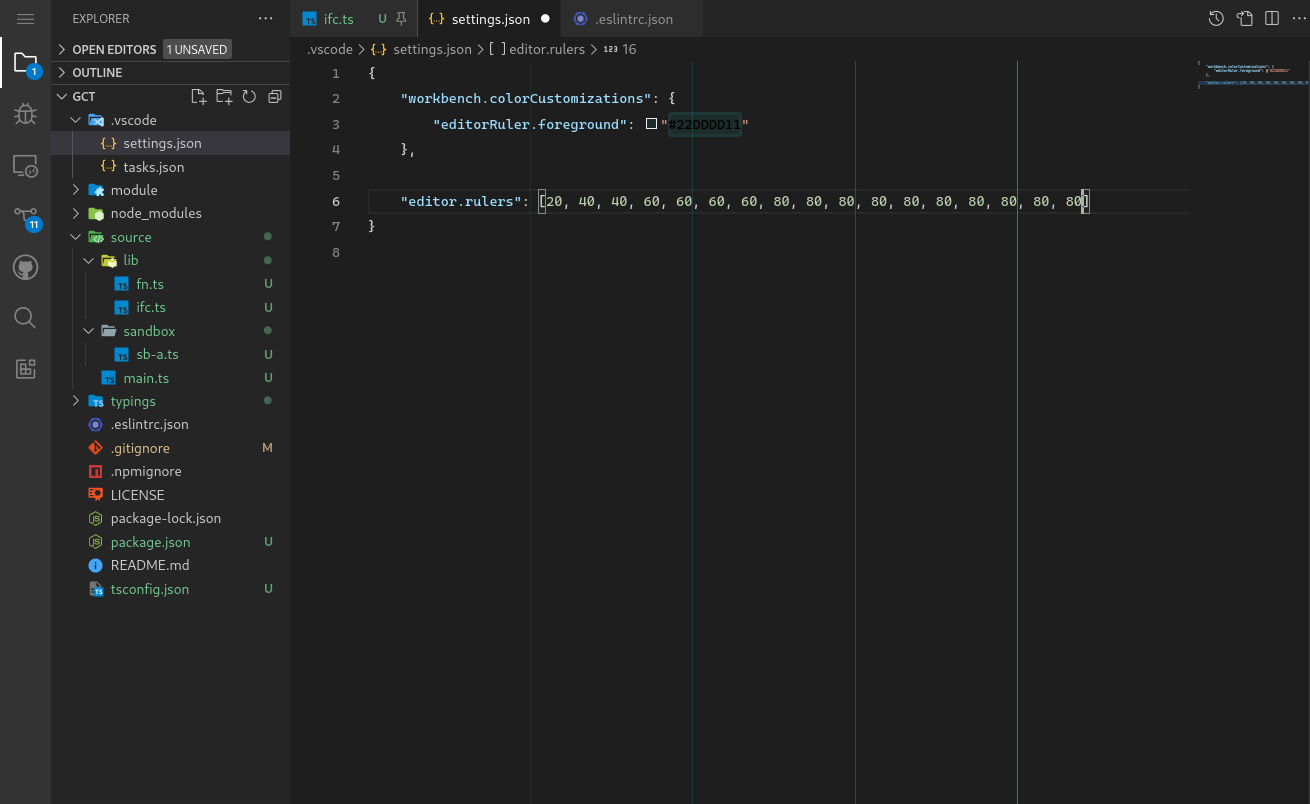
    "editor.rulers": [
        20, 40, 40, 60, 60, 60, 60, 80, 80, 80, 80, 80, 80, 80, 80, 80, 80
    ]
}
I KNOW CRAZY RIGHT?!
This configuration, looks nutter-butter, but it actually produces a very interesting, and highly customized sort of result. I really like this example because it offers a great demonstration of how the ruler array-property configuration works, and what can be accomplished with it.
Here is the result:
![Multiple Transparent Rulers]()
Notice what is happening?
Each ruler is brighter than the last. The rulers are doing this because we are laying several transparent rulers over each other. With ever layer the rulers color becomes more saturated. This is an extremely fun effect to play with.
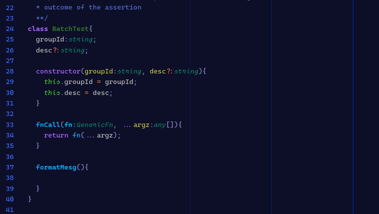
Like I said above, I will show you I use this effect to configure my environment:
![Customized rulers in a customized environment]()
Note that I make all of the rulers very transparent except for the last two. This offers a snazy environment, while still keeping things practical. Having several rulers also helps me to format and organize my code. I am so use to having them now that I can hardly stand to work in an environment without them.
If I work on a project with a style-guide that enforces an 80 character limit, I often will place one line at 80, and another at 90. I write my code such that it breaks before, or at, 80 chars, however I don't like the 80 char limit personally, I feel that the standard should be 85 - 90 chars. 80 really makes developers feel like there pushed into a box. So if I don't like the way a line looks at 80, I will extend it to 90. Before I commit, I look at the file and I can quickly see everywhere I went over 80, I add line-breaks, the commit. then I use ctrl+z to reset the line breaks so the extend past 80.
Another purpose, Is when I comment, I prefer to end my comments at 70, it helps me visually distinguish between comments and code. When you have the extra lines, there is a good chance you'll start using them to do all sorts of your own little formatting customs.
The resource below only pertains to those who are in need of instruction on reloading there instance of VS Code.
RELOADING YOUR WINDOW IN VS CODE
To reload your window, press F1 to open the Quick-input Menu. You should see the menu drop open, type Developer: Reload Window, then select the Developer: Reload Window option from the drop-down menu.

