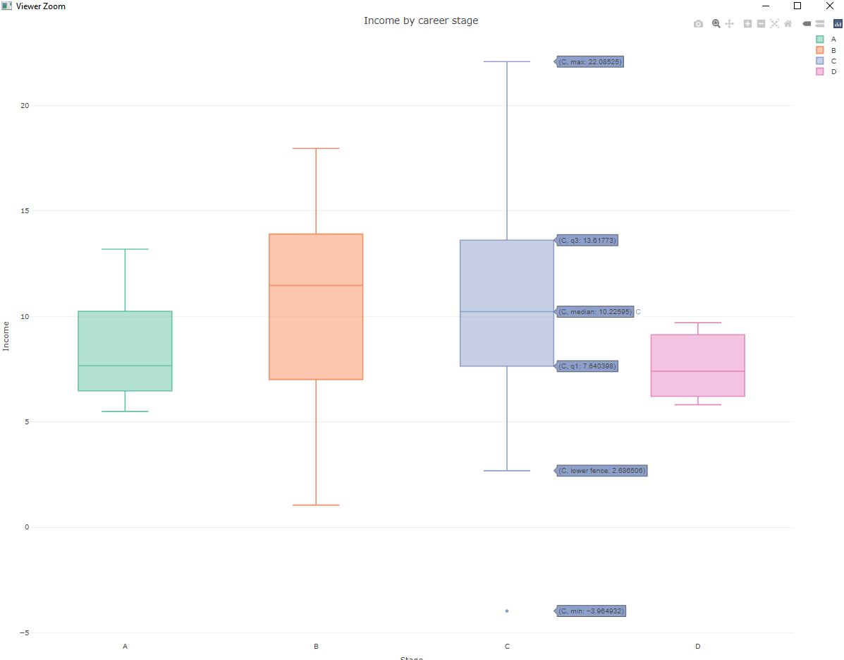
For the same code, labels (q1, median) appear on one computer but don't appear on another computer
Asked Answered
U

1

1

I made a simple box plot using the plotly library:

library(plotly)
library(ggplot2)

var_1 <- rnorm(100, 10, 5)
var_2 <- sample(LETTERS[1:4], 100, replace = TRUE, prob = c(0.1, 0.2, 0.65, 0.05))

df <- data.frame(var_1, var_2)
df$var_2 <- as.factor(df$var_2)


p5 <- plot_ly(df,
              y = ~var_1,
              color = ~var_2,
              type = "box") %>% 
  layout(title = "Income by career stage",
         xaxis = list(title = "Stage",
                      zeroline = FALSE),
         yaxis = list(title = "Income",
                      zeroline = FALSE))
p5

enter image description here

When I run the code on one computer, the labels (median, q1, etc) appear on the plotly boxplot. But when I try this on another computer, these same labels do not show up (the corresponding numbers show up, but the labels are all replaced with either "A", "B", "C" or "D" for the given column). Is there a more definite way (e.g. manually specify) to tell the computer to "make sure" that these labels appear?

Unspoiled answered 3/1, 2021 at 7:9 Comment(5)
could you post sessionInfo from both PCs?Handsome
Thank you for your reply ! On the computer where the labels show up: R version 4.0.1 ... and on the computer (this computer has no internet or usb ports) where the labels don't show up : R version 3.4.1 . I am suspecting that in an older version of R, the labels for plotly box plots don't automatically show up. I am trying to research online if there was a way (perhaps through the "trace") to manually specify the labels (median, quartiles etc) to show up?Unspoiled
@missuse: do you have any ideas about this?Unspoiled
I think it would be more prudent if you tried to solve the problem of the obsolete R and plotly versions on one of the PCs then spending time to find a hack for the old version of the package.Handsome
Thank you ... i will keep trying to see if there is a way to modify the trace to manually specify these attributesUnspoiled
A
0

You can explicitely add the option hovermode = "closest" for layout function then the hovering labels will be mandatory to display. If hovermade = FALSE then they won't be shown. So the code would be like this:

library(plotly)
library(ggplot2)

var_1 <- rnorm(100, 10, 5)
var_2 <- sample(LETTERS[1:4], 100, replace = TRUE, prob = c(0.1, 0.2, 0.65, 0.05))

df <- data.frame(var_1, var_2)
df$var_2 <- as.factor(df$var_2)


p5 <- plot_ly(df,
              y = ~var_1,
              color = ~var_2,
              type = "box") %>% 
  layout(title = "Income by career stage",
         xaxis = list(title = "Stage",
                      zeroline = FALSE),
         yaxis = list(title = "Income",
                      zeroline = FALSE),
         hovermode = "closest")
p5  

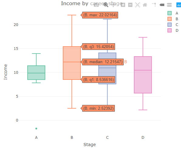
Output:

plotly bar graph

Alembic answered 25/7, 2022 at 11:43 Comment(0)

© 2022 - 2024 — McMap. All rights reserved.