How to plot on secondary y-Axis with plotly express
Asked Answered
L

2

32

How do I utilize plotly.express to plot multiple lines on two yaxis out of one Pandas dataframe?

I find this very useful to plot all columns containing a specific substring:

    fig = px.line(df, y=df.filter(regex="Linear").columns, render_mode="webgl")

as I don't want to loop over all my filtered columns and use something like:

    fig.add_trace(go.Scattergl(x=df["Time"], y=df["Linear-"]))

in each iteration.

Larisalarissa answered 11/7, 2020 at 19:18 Comment(2)
Thanks vestland for the suggestion but in the question and answer plotly express isn't utilized at all. Instead it uses multiple times go.Scatter( x=df["x"], y=df["y"]). What I wanted through plotly express is px.line(df, y=<list of column labels>) to plot all specific columns at once. Plotly express does not support adding lines straight to secondary_y by now. Therefore the indirect approach as shown in my answer below. I will clarify this in the question soon. For one very familiar with plotly this might be a nobrainer. For me it took some time :)Larisalarissa
You seem to be right!Sea
L
60

It took me some time to fiddle this out, but I feel this could be useful to some people.

# import some stuff
import plotly.express as px
from plotly.subplots import make_subplots
import pandas as pd
import numpy as np

# create some data
df = pd.DataFrame()
n = 50
df["Time"] = np.arange(n)
df["Linear-"] = np.arange(n)+np.random.rand(n)
df["Linear+"] = np.arange(n)+np.random.rand(n)
df["Log-"] = np.arange(n)+np.random.rand(n)
df["Log+"] = np.arange(n)+np.random.rand(n)
df.set_index("Time", inplace=True)

subfig = make_subplots(specs=[[{"secondary_y": True}]])

# create two independent figures with px.line each containing data from multiple columns
fig = px.line(df, y=df.filter(regex="Linear").columns, render_mode="webgl",)
fig2 = px.line(df, y=df.filter(regex="Log").columns, render_mode="webgl",)

fig2.update_traces(yaxis="y2")

subfig.add_traces(fig.data + fig2.data)
subfig.layout.xaxis.title="Time"
subfig.layout.yaxis.title="Linear Y"
subfig.layout.yaxis2.type="log"
subfig.layout.yaxis2.title="Log Y"
# recoloring is necessary otherwise lines from fig und fig2 would share each color
# e.g. Linear-, Log- = blue; Linear+, Log+ = red... we don't want this
subfig.for_each_trace(lambda t: t.update(line=dict(color=t.marker.color)))
subfig.show()

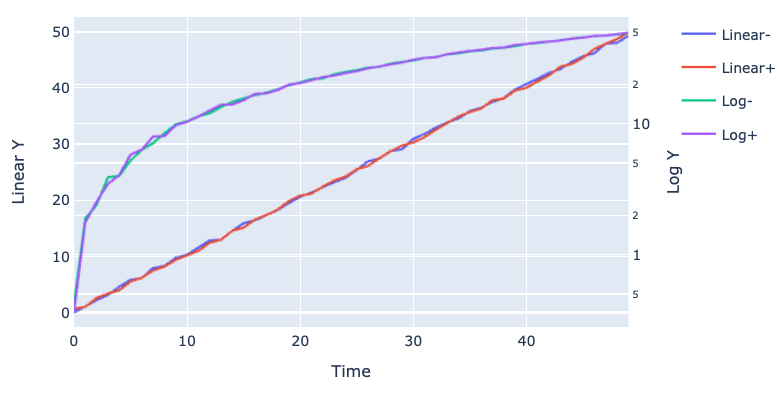
Finished graph

The trick with

subfig.for_each_trace(lambda t: t.update(line=dict(color=t.marker.color)))

I got from nicolaskruchten here: https://stackoverflow.com/a/60031260

Larisalarissa answered 11/7, 2020 at 19:18 Comment(2)
If you're not happy with the colors resulting from for_each_trace, it's possible to update them individually. This, subfig.data[0].line.update({'color': 'black'}), updates the first line to black, for example.Strephon
How can I share guide lines between y axis? two y axis should have different tick but same guide line/Assiduity
A
5

Thank you derflo and vestland! I really wanted to use Plotly Express as opposed to Graph Objects with dual axis to more easily handle DataFrames with lots of columns. I dropped this into a function. Data1/2 works well as a DataFrame or Series.

import plotly.express as px
from plotly.subplots import make_subplots
import pandas as pd

def plotly_dual_axis(data1,data2, title="", y1="", y2=""):
    # Create subplot with secondary axis
    subplot_fig = make_subplots(specs=[[{"secondary_y": True}]])

    #Put Dataframe in fig1 and fig2
    fig1 = px.line(data1)
    fig2 = px.line(data2)
    #Change the axis for fig2
    fig2.update_traces(yaxis="y2")

    #Add the figs to the subplot figure
    subplot_fig.add_traces(fig1.data + fig2.data)

    #FORMAT subplot figure
    subplot_fig.update_layout(title=title, yaxis=dict(title=y1), yaxis2=dict(title=y2))

    #RECOLOR so as not to have overlapping colors
    subplot_fig.for_each_trace(lambda t: t.update(line=dict(color=t.marker.color)))


    return subplot_fig

UPDATE:

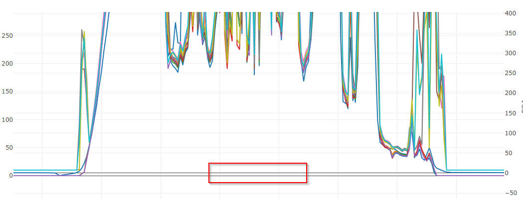
This is great for creating a plot with dual axis, but I also wanted to call out the behavior of gridlines and zero points. These y-axis are totally separate. So by default, the zero points will not align (see red box) and neither will the gridlines:

enter image description here

You may be able to align the zeroes fairly easily by utilizing rangemode = 'tozero' in your yaxis dictionaries when applying a layout. See the layout-yaxis Plotly Documentation. However, this won't work if you have negative values.

The good folk at plotly are currently working on gridline alignment. There are some great examples of this at work in this Github repo.

Accusatory answered 16/2, 2023 at 21:22 Comment(0)

© 2022 - 2024 — McMap. All rights reserved.