Material UI v1 - set table column widths
Asked Answered
B

7

33

I want to set column widths on a Material UI table using css (not inside react using "classes"). But I don't understand how the column widths are controlled. I try to set widths on the TH columns but it doesn't work.

See example: Material ui table example (See style.css)

I don't understand how the table column widths are controlled on the "Simple Table" on the Material UI table: Simple table (you can see that the first column is wider than the others. How?)

So how does it work, and how can I modify the settings?

Beabeach answered 6/7, 2018 at 18:58 Comment(0)
F
57

Try using colgroup, worked for me in Material-UI V1

<Table>
   <colgroup>
      <col style={{width:'10%'}}/>
      <col style={{width:'20%'}}/>
      <col style={{width:'70%'}}/>
   </colgroup>
   <TableHead>
      <TableRow>
         <TableCell>Head1</TableCell>
         <TableCell>Head2</TableCell>
         <TableCell>Head3</TableCell>
      </TableRow>
   </TableHead>
   <TableBody>
      <TableRow>
         <TableCell>Data1</TableCell>
         <TableCell>Data2</TableCell>
         <TableCell>Data3</TableCell>
      </TableRow>
   </TableBody>
</Table>
Fatherless answered 10/7, 2018 at 15:24 Comment(2)
also, the simple table example they have , the columns are all the same, its just that the ones after the first are "numeric", so right justifiedFatherless
Is this different from writing the widths inside each TableCell in the TableHead?Prudi
D
15

I had success with the following:

<Table>
<colgroup>
    <col width="10%" />
    <col width="10%" />
    <col width="60%" />
    <col width="10%" />
    <col width="10%" />
</colgroup>
<TableHead>....
    ... yada yada...
</Table>

Or, more specifically, given an array of widths colWidths:

<Table key={this.props.key + "_table"} className={classes.table}>
    <colgroup>
        {this.props.colWidths.map((colWidth, i) => <col key={"colWidth_"+i} width={colWidth}/>)}
    </colgroup>
    <TableHead>
        <TableRow>
            {tableHeaders}
        </TableRow>
    </TableHead>
    <TableBody>
        {tableRows}
    </TableBody>
</Table>
Daughter answered 24/7, 2018 at 15:38 Comment(0)
C
14

setting the width using percentages works just fine.

            <TableHead>
              <TableRow>
                {columns.map((column) => (
                  <TableCell
                    key={column.id}
                    align={column.align}
                    width="10%"
                  >
                    {column.label}
                  </TableCell>
                ))}
              </TableRow>
            </TableHead>
Castlereagh answered 4/5, 2020 at 0:47 Comment(0)
C
5

The solution that worked for me was using tableLayout: 'fixed' as well as fixed pixel value widths for the columns.

the colgroup option did not work.

Cottontail answered 17/9, 2018 at 21:56 Comment(0)
A
5

To give width to each column, colspan is better solution than fixing the width, it will make table responsive depending on screen/grid size. So you can put colSpan={4} for example on column components. And to fix column width within the colspan table-layout: fixed style will help. So the table will be responsive but with the fixed width for columns.

Agora answered 31/1, 2019 at 14:34 Comment(1)
Could you include an example of this?Coprolite
B
2

My solution is wrapping TableCell content with Box component and set the Box's style, from my github comment:https://github.com/mui-org/material-ui/issues/1911#issuecomment-759935300

...
const useStyles = makeStyles((theme: Theme) => createStyles({
  ...
  longTextStyle: {
    wordWrap: 'break-word',
    maxWidth: 1000,
  },
  ...
}));
...
<TableCell>
  <Box className={classes.longTextStyle}>
    {longText}
  </Box>
</TableCell>
...
Baccate answered 14/1, 2021 at 6:13 Comment(0)
S
1

It seems a bit more difficult than my first assumption without creating a sort of domino effect based on how the table components are based, however I did find this discussion which has many looking to do the same thing with many different methods. I'd sort through there and just see what works best for your particular use case (without seeing your code I don't know what would be safest to recommend).

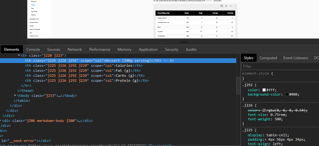
As well, if we inspect on the table you gave an example of we can get a decent idea (a bit confusing at first glance) how they achieved this.

table first child 70% example

I'd blindly recommend something like <Table fixedHeader={false} style={{ width: "auto", tableLayout: "auto" }}> to allow your table to size dynamically based on the content rather than keeping equal sizing.

Hope this at least helps point you in the right direction! Please let me know if not.

Sunstroke answered 6/7, 2018 at 19:36 Comment(3)
Do not post images of code or errors! Images and screenshots can be a nice addition to a post, but please make sure the post is still clear and useful without them. If you post images of code or error messages make sure you also copy and paste or type the actual code/message into the post directly.Fraxinella
The post is still clear without it. "As well, if we inspect on the table you gave an example of we can get a decent idea (a bit confusing at first glance) how they achieved this." states that if he were to inspect element on the table he provided, he'd get a general idea of how they achieved this. The image offers nothing of substance, simply accent. The article you linked to refers to users simply posting screenshots of code rather than their code and has no relevance here.Sunstroke
Your answer is unfortunately obsolete for v1Heterography

© 2022 - 2024 — McMap. All rights reserved.